Building a strong customer experience is no longer merely an advantage for SaaS companies, but a necessity. At every stage of the value journey, customers expect to get the information and help they need quickly and directly. A poorly implemented knowledge base for a SaaS company risks confusing or frustrating customers to the point that they may look for alternative solutions.
We’ve curated 10 of the best SaaS knowledge base examples for helping support customers while providing a world-class customer experience.
Ready to build an inspiring SaaS knowledge base? Use Stonly to build a powerful knowledge base for your SaaS platform without any hassle. Start a FREE Trial.
What is a SaaS knowledge base?
A SaaS knowledge base is a collection of information about the product, carefully curated to help customers with self-serve problem resolution. It is also frequently referred to as a help center. The knowledge base guides take a particular aspect of the product with which customers may experience difficulties and walks them through a path to resolution without having to contact support.
Knowledge base software like Stonly help SaaS companies build a fantastic self-serve support solution that can be presented to customers anywhere using a no-code widget. Check out this guide to see examples of the best knowledge bases.
What makes a good knowledge base for SaaS
The most important element of a good knowledge base for SaaS companies is directing customers to the information they need quickly to resolve their issues via self-service. A good knowledge base should reflect your user-centric focus. If you’re in SaaS, you value a quality user experience. You need to make sure you match your product’s strong user experience in the knowledge base when your customers are looking for help.
Each SaaS knowledge base should do the following:
1. Focus on the most frequently asked questions (FAQs)
When organizing your knowledge base, make sure that the most frequent issues and questions are the most accessible. Combine your intuition with an analysis of your data to find out which questions customers ask most frequently. You can look at your support tickets, collect information from your sales and product teams who talk with customers and prospects frequently or even look at common Google search terms.
2. Build interactive guides to better help users find answers
When writing your support guides, remember that your customer’s attention is a gift. You may only get one chance to resolve their concerns before they decide to look for a competitive product. Make sure that your support guides are user-friendly, thorough, and simple. The best way to do this is by organizing the guides into simple steps, that walk them through the steps one at a time.
3. Make the knowledge base easy and obvious to find
One of the easiest ways to frustrate a customer is by making troubleshooting issues with your product difficult to find. Make the knowledge base easy for customers to find. One of the best ways to do this is using a knowledge base widget tool to make your support guides available to users throughout your product. Stonly is a great option to add this type of functionality.
Related article: 10 Steps for Creating an Effective SaaS User Adoption Strategy
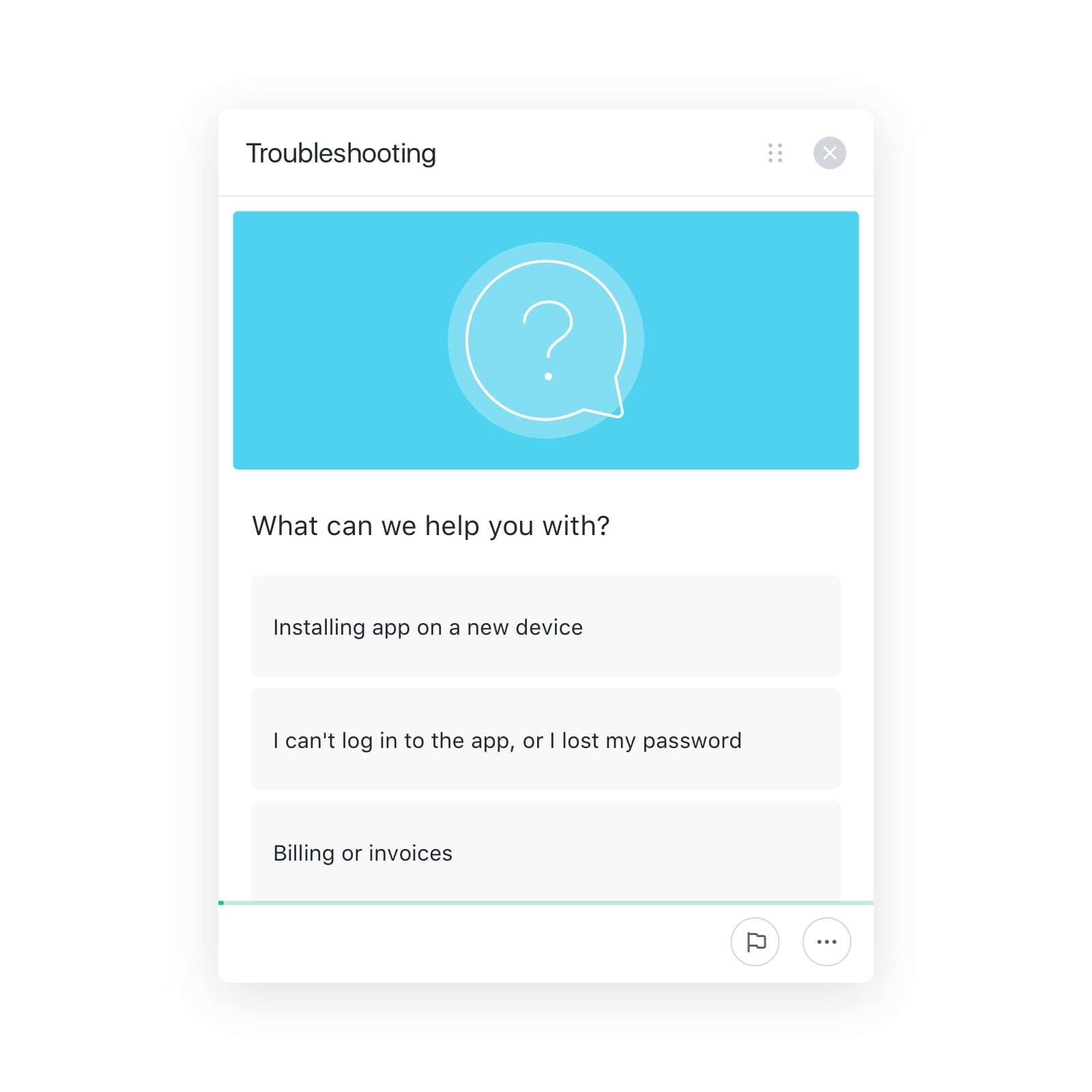
4. Ensure that the information is relevant and up-to-date
Having old or outdated content on your troubleshooting guides is one of the easiest ways to lose credibility in a customers’ eyes. Regularly analyze the knowledge base analytics and review the content to ensure that your guides represent the current state of your product. Invest time into making updates to the guides as frequently as you make updates to your product.
10 inspiring SaaS knowledge base examples
Without any further ado, let us present 10 of the best SaaS knowledge base examples that demonstrate the best practices mentioned above. These innovative examples inspire trust and facilitate a great customer experience. Let’s dive in.
1. Stonly
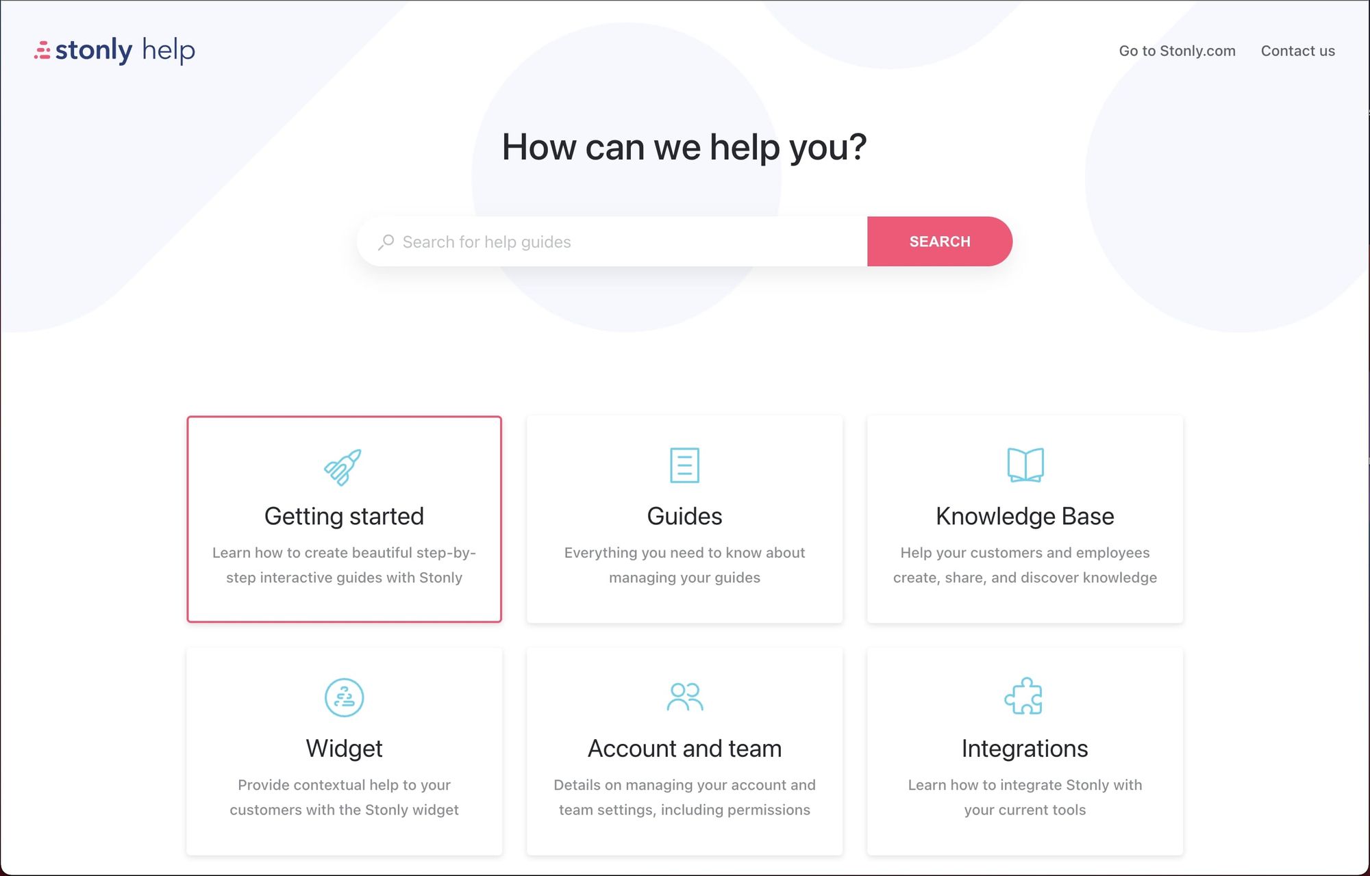
Not only is Stonly a fantastic tool for creating an inspiring user-focused knowledge base, but our own knowledge base showcases our expertise.
Our knowledge base (built, of course, using Stonly) makes getting help simple.
- It provides a good user-centric organization to help users find the category they need quickly.
- It’s full of interactive, step-by-step guides that help our customers self-solve their issues.
- It includes a powerful search feature that helps users navigate to the specific guide they need.
- It can be embedded in-app so the troubleshooting guides are always available wherever customers need them.
We include images, gifs, and videos alongside simple, step-by-step content to make finding help easy.
We also provide our help center right where we know customers need it - on our site and in our app. Our entire knowledge base is always available in our widget.
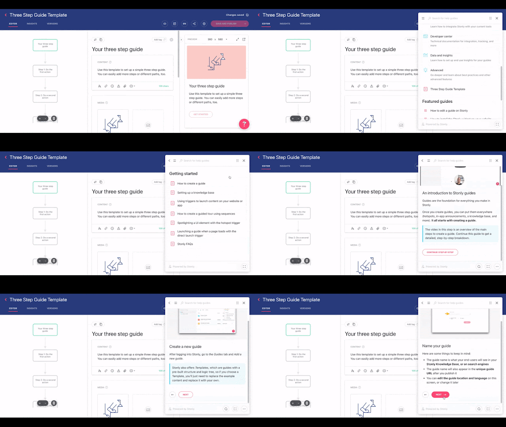
And we provide specific guides from our knowledge base exactly where we know customers have questions, using no-code tooltips.
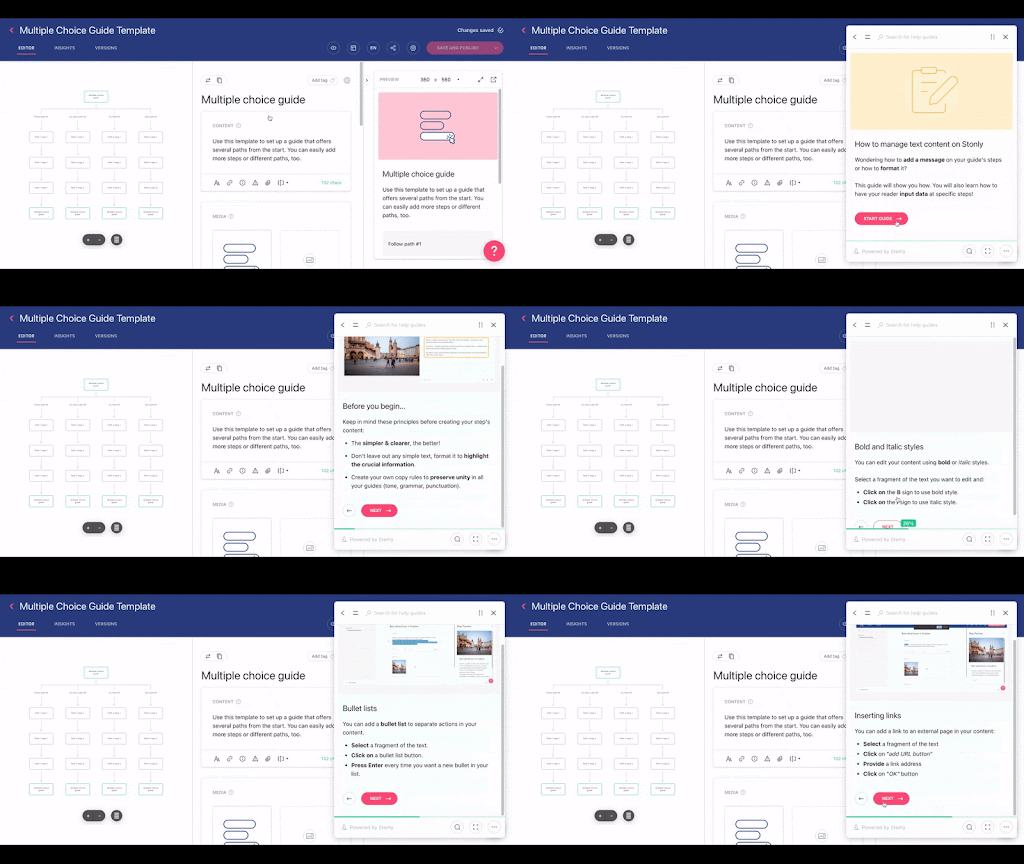
Key takeaways
- The information architecture is extremely intuitive, with search front and center and top-level “browse” content simple and targeted.
- The design is inviting, clutter-free, and simple. Customers who may already be overwhelmed will feel confident that they can find the help they need.
- The widget allows for users to find help throughout the website and app without needing to hunt for it or navigate several different browser tabs.
2. Yousign
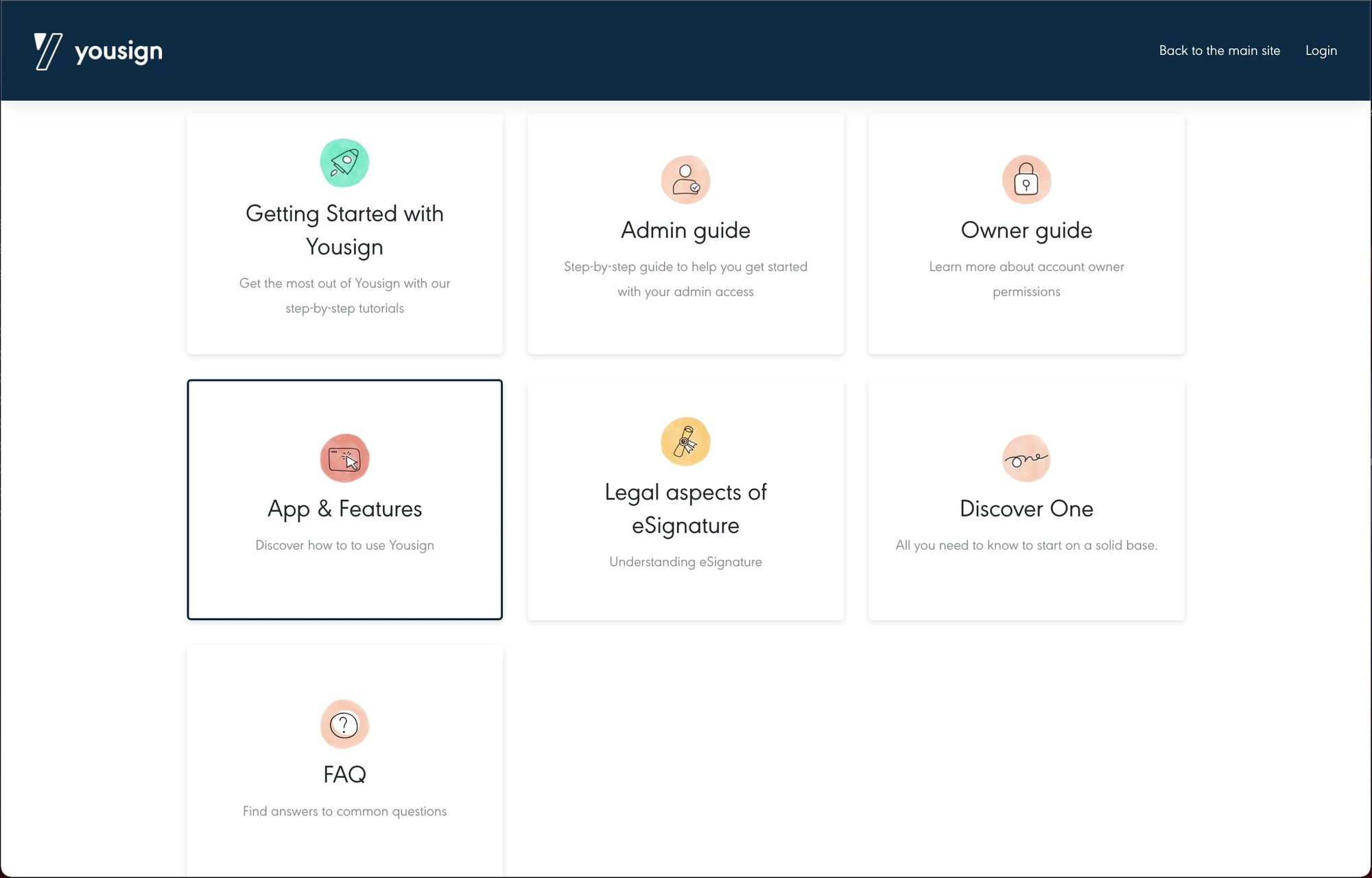
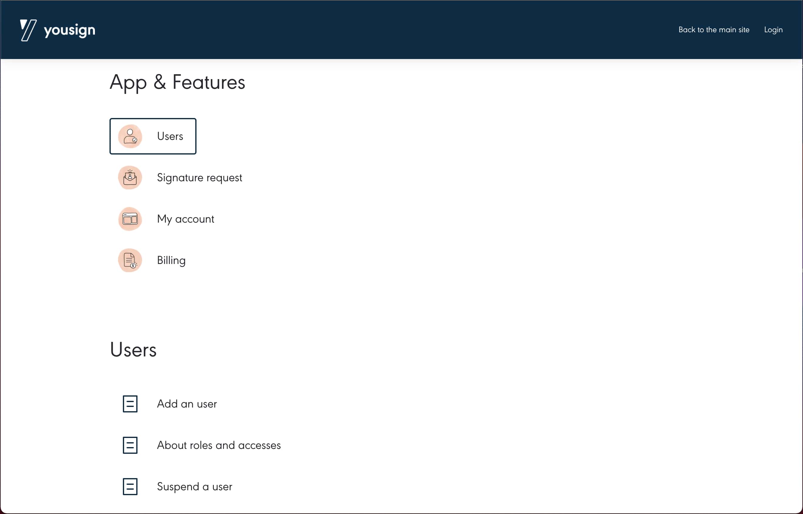
Yousign does a fantastic job organizing its knowledge base content into an intuitive flow that makes navigation easy for customers. The knowledge base for this SaaS product contains dozens of guides. Presenting all of these guides to customers would be overwhelming and cause additional frustration trying to find the right one. And since Yousign uses Stonly for their knowledge base, each guide is interactive which makes solving problems incredibly simple and easy.
Key takeaways
- The information architecture is well organized, with top-level categories simple and recognizable, with nested categories and guides underneath.
- Even though there are dozens of guides, customers are taken step-by-step to the guide they need instead of having to scroll through a whole list.
3. Dashlane
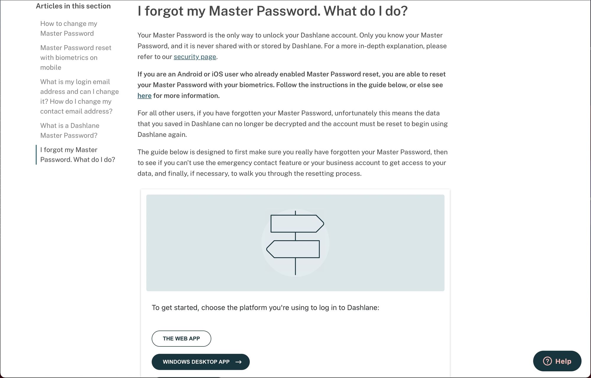
Dashlane’s knowledge base is a great example of helping users resolve issues through simple navigation and step-by-step interactive guides. They emphasize their most-viewed articles in their navigation and make it simple to drill into the interactive content.

Each guide presents the help resolution steps one at a time, using button interactivity to help customers move through the steps to fully resolve the issue. This presents a significantly more user-friendly approach at problem resolution than requiring customers to scroll through lengthy, text-heavy support articles.
Key takeaways
- The navigation and organization are crystal clear for customers, so they have a sense of where they are in the knowledge base and how to find related articles to answer additional questions.
- The support guides use step-by-step interactivity instead of long sections of text to guide customers to resolution.
4. Autopay
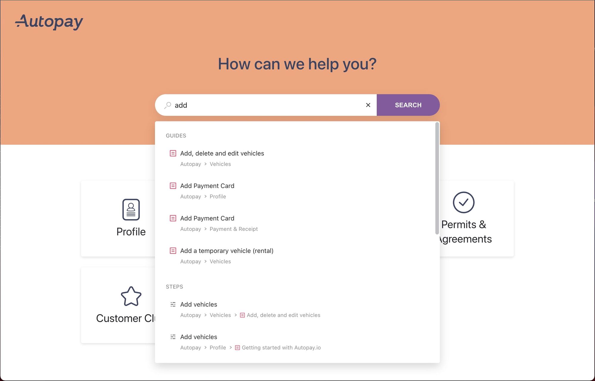
Autopay’s knowledge base does a great job organizing its content to be searchable. One of the most important ways to make a knowledge base accessible to customers is to anticipate the language they will use to ask questions or bring up issues. Even if you have the most helpful content in the world, if it isn’t labeled in a way that customers will recognize, they will never find it. Because Autopay’s articles are titles using specific search terms in the customers’ language, it is incredibly easy for customers to search and find the guides and even individual steps they need to solve their issues.
Key takeaways
- The articles are titled and written specifically to appeal to customers, using language and terms they are familiar with and will recognize.
- The search functionality works well because the titles of the articles already match the most common search terms from customers.
Feeling inspired by these SaaS knowledge base examples? Use Stonly to build similar knowledge bases for your SaaS platform without any hassle. Start a FREE Trial.
5. Lengow
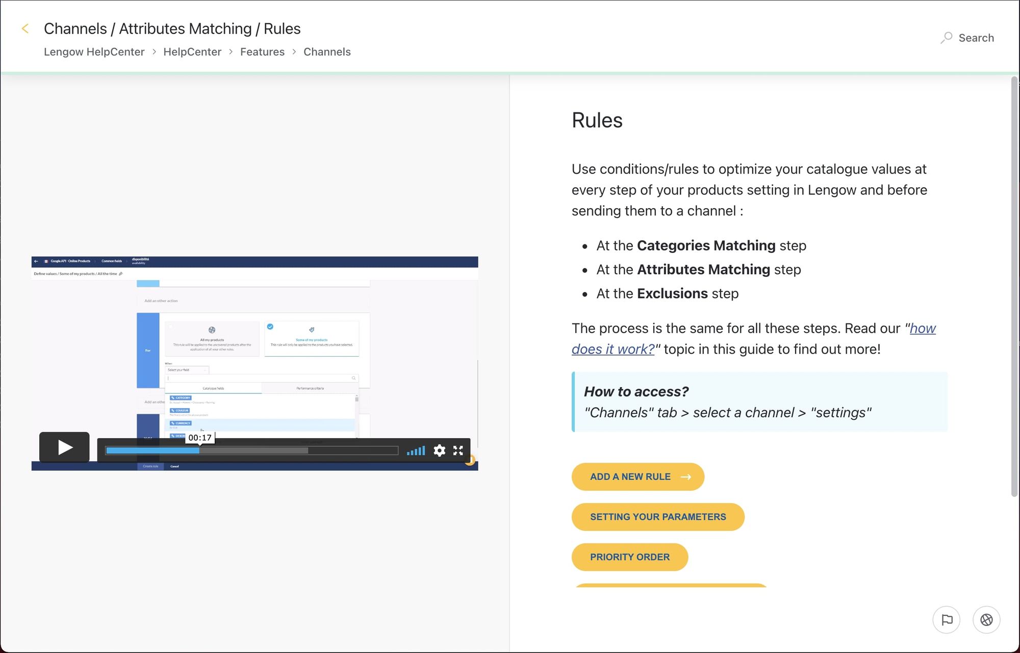
Lengow’s knowledge base does a phenomenal job using multi-media embedded in its interactive support guides to make customer resolution more effective. Depending on your SaaS business and product, you may need to use more than just text or even images to show customers how to resolve their issues. In this case, the guide is attempting to help resolve a fairly complex problem. Using a video along with step-by-step instructions is a great way to keep complicated problems resolvable for customers.
Key takeaways
- For difficult or complex problems, embedding video or other media into the support guide enables more effective self-serve support. Interactive guides make embedding video easy, using no-code knowledge base software tools such as Stonly.
6. Reelevant
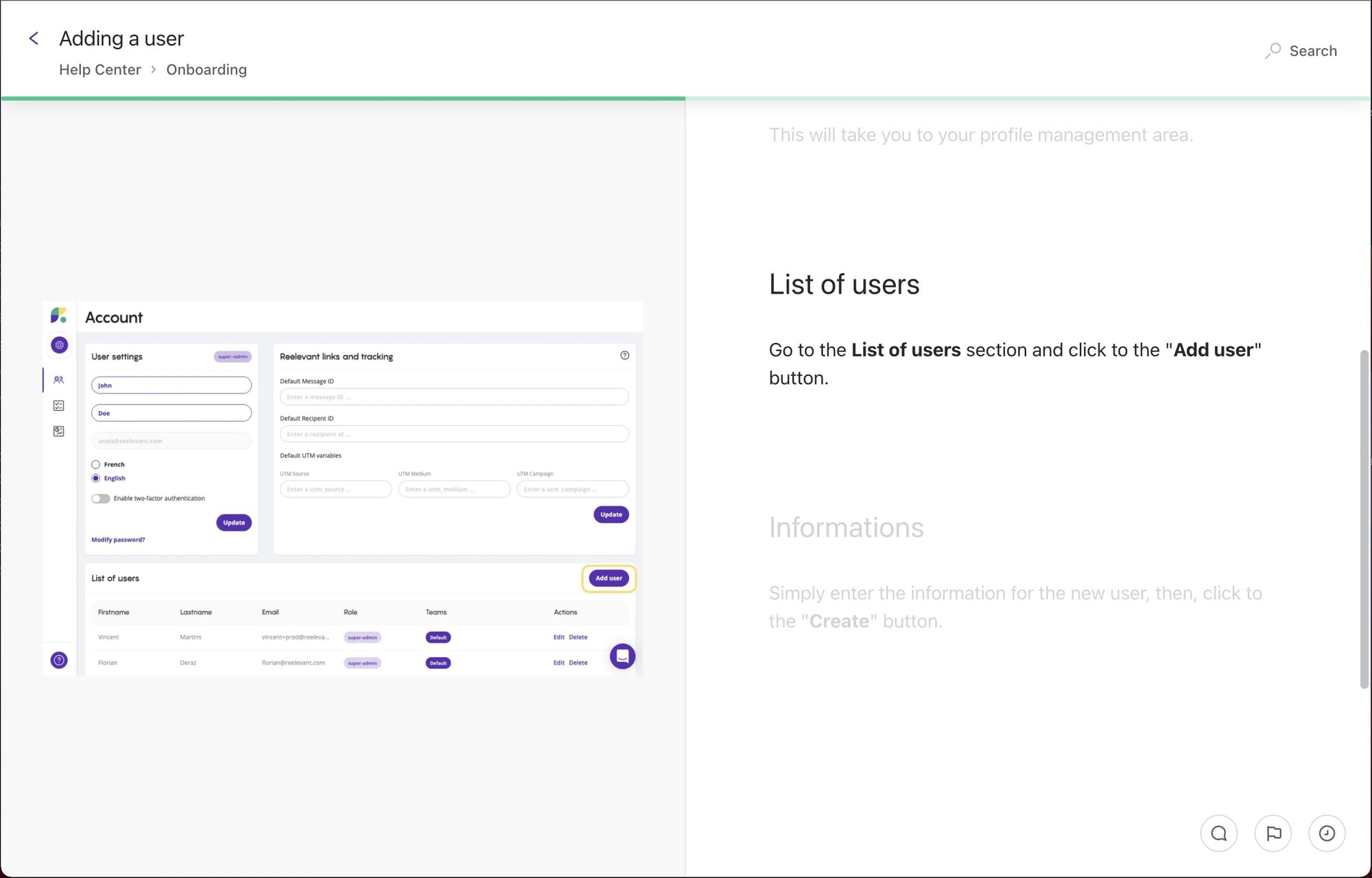
Reelevant takes a unique approach to provide its customers with self-serve support through its scrollable, interactive guides. In this example, there’s a single approach to support a customer by adding a user to the product. So this guide combines simple, intuitive instructions on the right compared with screenshots that show what the step looks like in the app on the left. Even in a more linear article format, interactive guides allow customers to simply scroll to see the instructions for the next step together with the relevant media snippet.
Key takeaways
- The support guides use a combination of super simple text-based instructions with screenshots to walk customers through the process to resolve their issues.
- For processes that have a single, linear approach, the guides use the scroll feature to move to each next step, making it simpler to navigate through the guide.
7. Slack
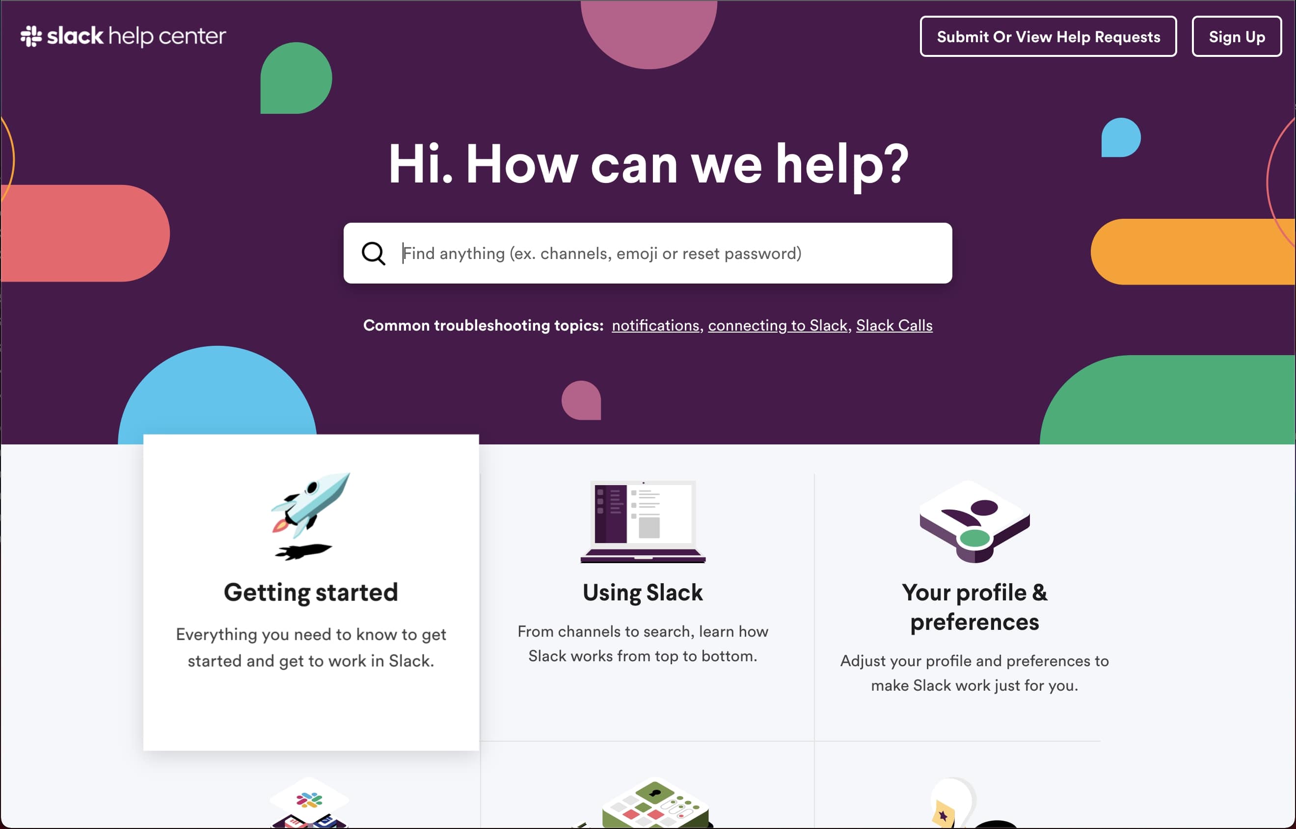
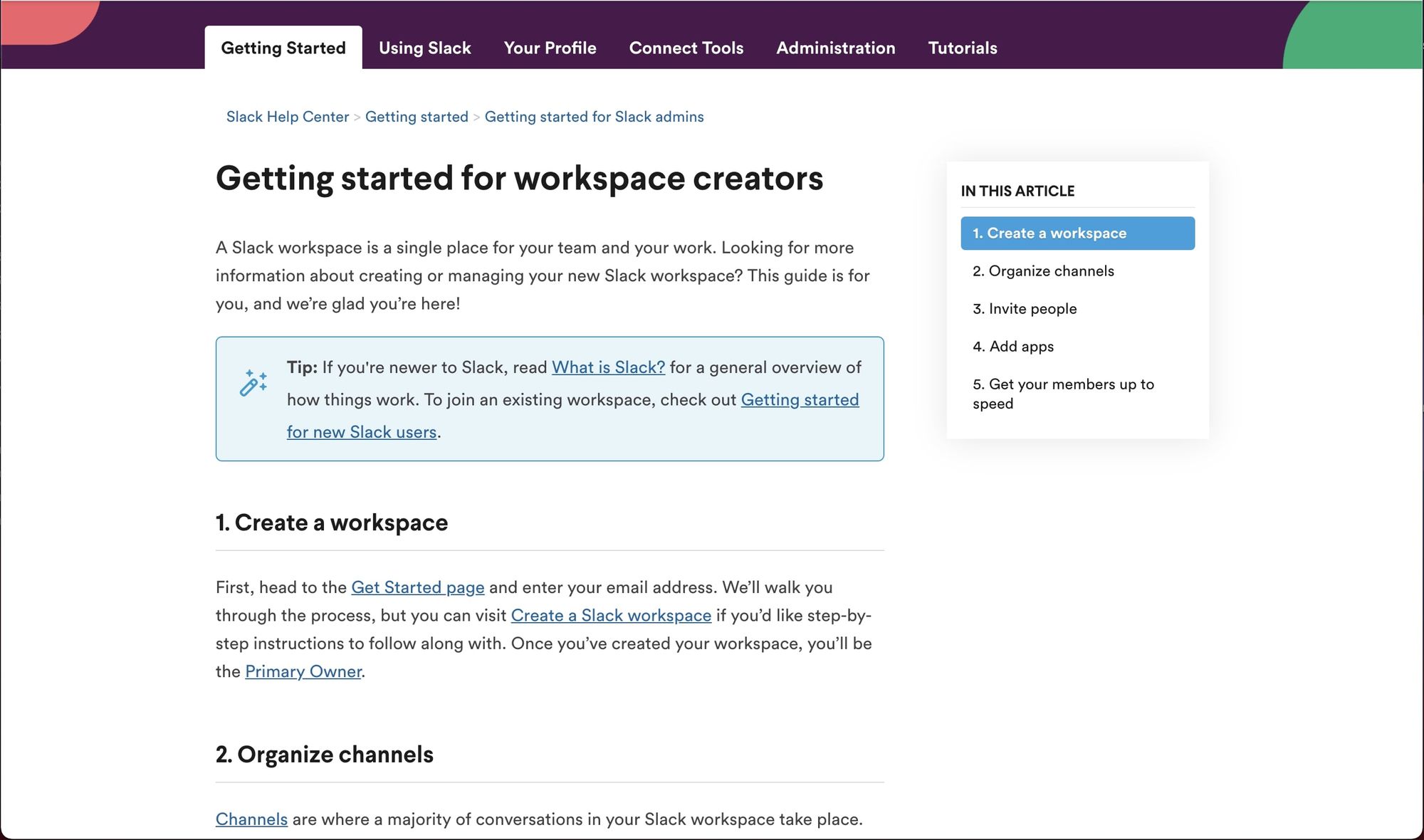
Slack’s help center is a fantastic example of using data to anticipate customers’ questions and then organizing the information in a way to resolve the most common issues up front. Slack uses multiple conventions to do this, including the example search text, and the links underneath the search bar that call out the most common troubleshooting topics. Even in its guides, Slack adds tips and other links to help users navigate to the right support articles, or answer additional troubleshooting topics.
Key takeaways
- The help center takes every opportunity to point customers in the right direction, including examples and links throughout.
- The help center elegantly captures Slack’s brand, while not sacrificing simplicity and effectiveness in helping customers troubleshoot their issues.
8. Shopify
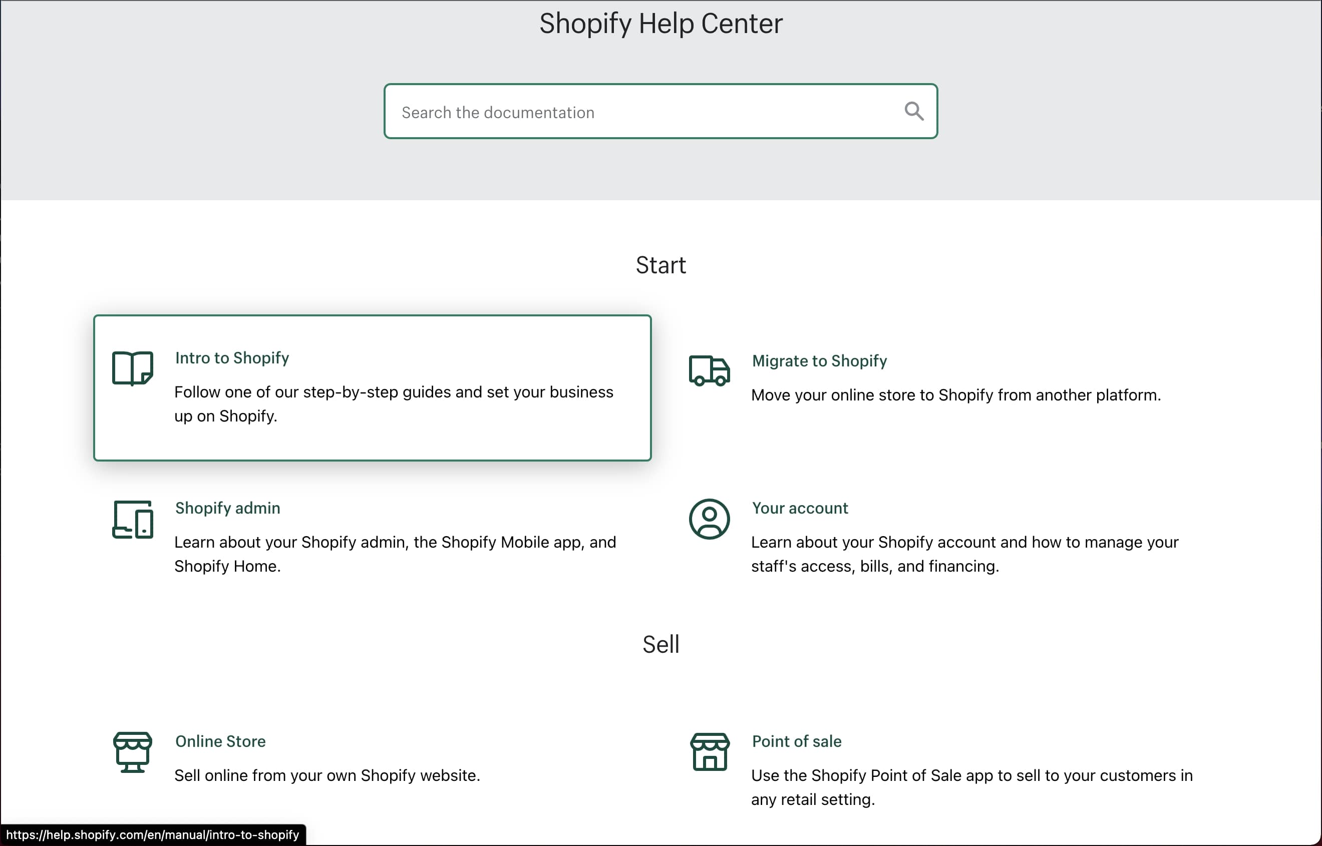
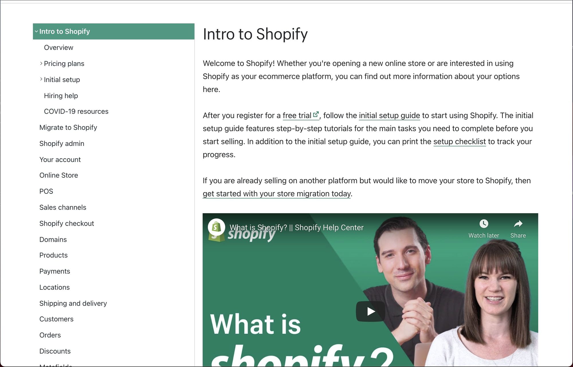
Shopify is a unique SaaS product because it takes a complex problem many small businesses face (setting up an online storefront to sell products or services) and provides a self-serve solution. The nature of the product is fairly complicated, and there are dozens of troubleshooting guides. Shopify’s help center does a great job simplifying the process to help customers find the right guide quickly. It provides helpful navigation and incorporates videos into its guides to help users through some of the more complex processes.
Key takeaways
- The information architecture is organized so it doesn’t overwhelm users, even though there are dozens of support guides in its help center.
- The troubleshooting guides are situated within an intuitive navigation structure, helping customers find what they need easier.
9. Dropbox
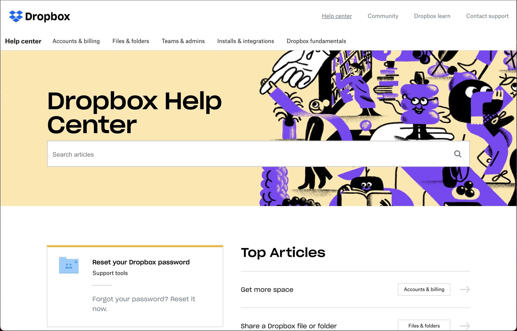
Dropbox’s help center is a great example of making the top articles appear front and center. They’ve done the work to understand the top issues and questions their customers have and make it really obvious where to start to find these answers. They also do a great job of using imagery and branding to subtly support the troubleshooting process. The background image in the screenshot above shows several meaningful illustrations that connect back to the purpose of the help center. The most prominent image is a hand leading a happy customer. Others include little beings holding stacks of books, or turning the pages of a book, signifying that this is a place where information and answers can be found.
Key takeaways
- The use of illustrations and imagery connect back to the goal of helping customers find relevant, helpful information.
- The imagery used is subtle yet aesthetically pleasing, helping frustrated customers feel a bit more at ease.
10. Miro
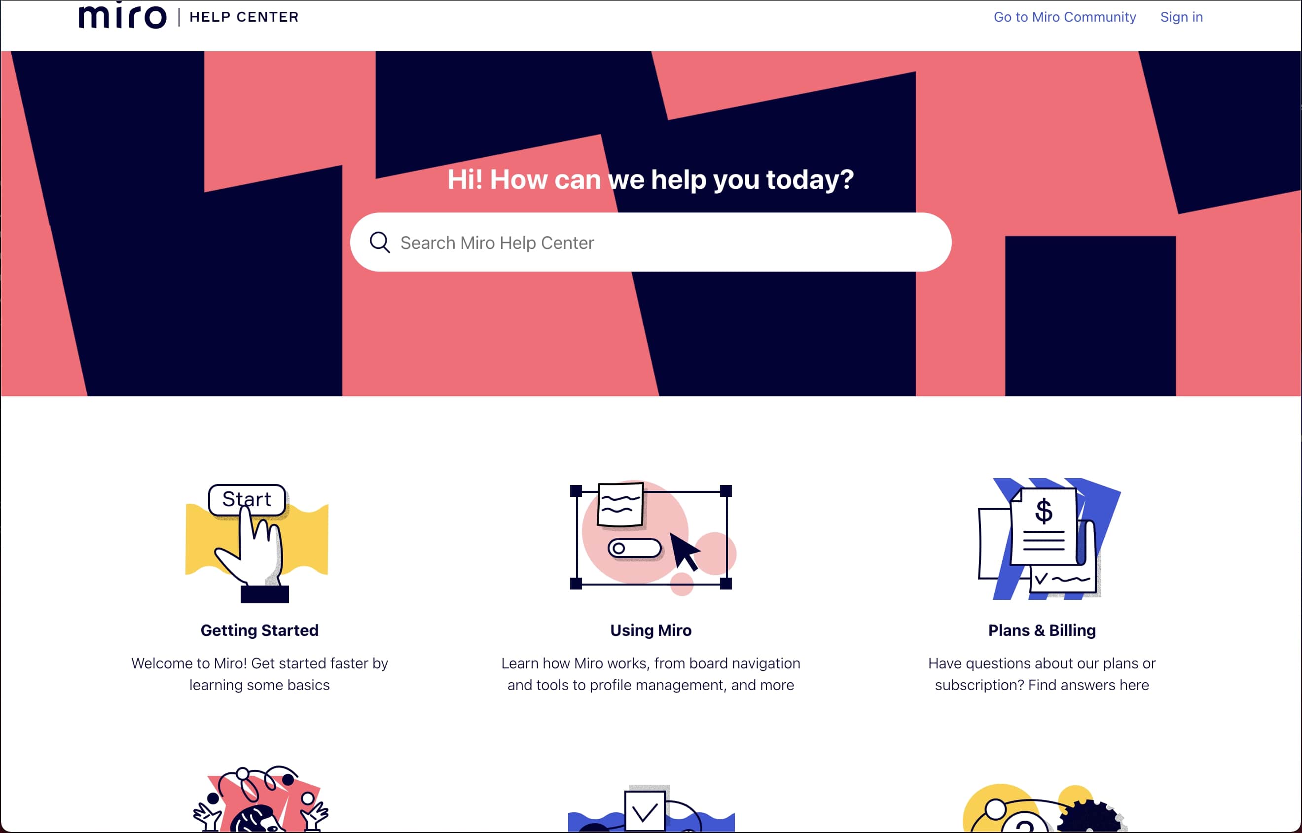
Miro’s help center is another fantastic example of being bold in asserting its brand without taking away from customers’ ability to troubleshoot their issues. This is a very difficult balance to strike. Most SaaS companies keep the branding on the knowledge base or help center very light, typically using mostly white designs to emphasize the design elements that enable support resolution. Miro took the challenge of incorporating its branding into the colors and illustrations in a way that visually supports the troubleshooting process instead of being too distracting.
Key takeaways
- The use of branding colors, iconography, and illustrations supports the goal of the knowledge base instead of adding too many distractions.
Related article: How to Build a Help Center? The Complete Step-by-Step Guide
Why SaaS companies need a knowledge base
SaaS companies, especially self-serve or product-led, need to leverage every interaction with prospects and customers to move them on the value journey toward conversion and growth. A knowledge base is a powerful tool to help customers find answers and resolve concerns quickly so they can get back to experiencing value in your product or service.
There are many benefits of knowledge bases, but here are the top benefits for SaaS companies.
1. Round-the-clock support for all customers
One of the most apparent benefits of a knowledge base for SaaS companies is its ability to provide 24/7 self-serve support. More and more SaaS companies are serving a very geographically diverse customer base spanning multiple time zones. With a well-designed knowledge base, you can provide asynchronous customer support in all time zones, instead of incurring the expense to scale up to a 24/7 support team, or forcing customers to wait until your support team clocks in to resolve their concerns.
2. Fosters a consistent customer experience
Customer experience is increasingly becoming the main differentiator upon which SaaS companies will compete, according to a recent Gartner study. Knowledge bases allow all customers to experience a consistent and reliable journey in resolving their issues. SaaS companies optimizing for an intuitive user experience within their product can now offer that same intuitive, self-serve experience on the support side by implementing a knowledge base tool like Stonly.
3. Interactive guides enable self-serve problem resolution for customers.
Interactivity puts only the relevant information in front of the customer in a step-by-step format, making the process of solving customer issues intuitive, simple, and distraction-free. This style of problem resolution is much more user-friendly than text-heavy scrollable articles. Tools like Stonly make it simple to infuse your knowledge base with this kind of interactivity.
4. Increases customer satisfaction and reduces support costs.
Since customers can find solutions faster, most issues can be resolved without ever having to reach out to support. And in the event where customers do reach out to support, the time to resolution is reduced as support agents use the knowledge base to show customers how to resolve their own concerns in the future. This is a key component of high customer satisfaction and also reduces the overall operating cost by allowing fewer agents to support more customers.
5. Place support everywhere the customers need it.
One distinct advantage of a knowledge base over a website FAQ page is that it can be placed within the product to resolve questions. Many knowledge base tools have an option to embed a widget within the product that can let users access the search functionality and find support guides without having to navigate away from the app. Keeping customers in the app is critical to keeping them on the path to success.
Ready to build a knowledge base for your SaaS company?
Now that you’ve been inspired by these examples, it’s your turn to apply these principles and create a knowledge base that helps customers have a great experience in resolving their problems and concerns.
None of the knowledge base examples above just popped into existence. Someone like you had to create them. Although it may seem overwhelming to get started, you can create a similarly elegant and effective knowledge base for your SaaS company, and we can help.
Hundreds of SaaS companies use Stonly to build knowledge bases that perform. To see how, request a demo with someone on our success team.
