
What separates the best public help centers from the rest usually comes down to three things: how the information is structured, how clearly each article is written, and how fast users can get from a question to an answer. Visual design matters too, but it's downstream of those three.
To pull out patterns worth borrowing, our team reviewed hundreds of public help centers and selected 15 of the strongest examples. We assessed each one on:
- Information architecture: category structure, naming, and how articles are grouped
- Content quality: clarity, depth, and how well each article answers the question in its title
- Discoverability: search performance, navigation, and time-to-answer
- Overall look and feel: visual design, readability, and user experience
Below, we break down what each example does well and the specific choices you can apply to your own knowledge base.
1. Canva
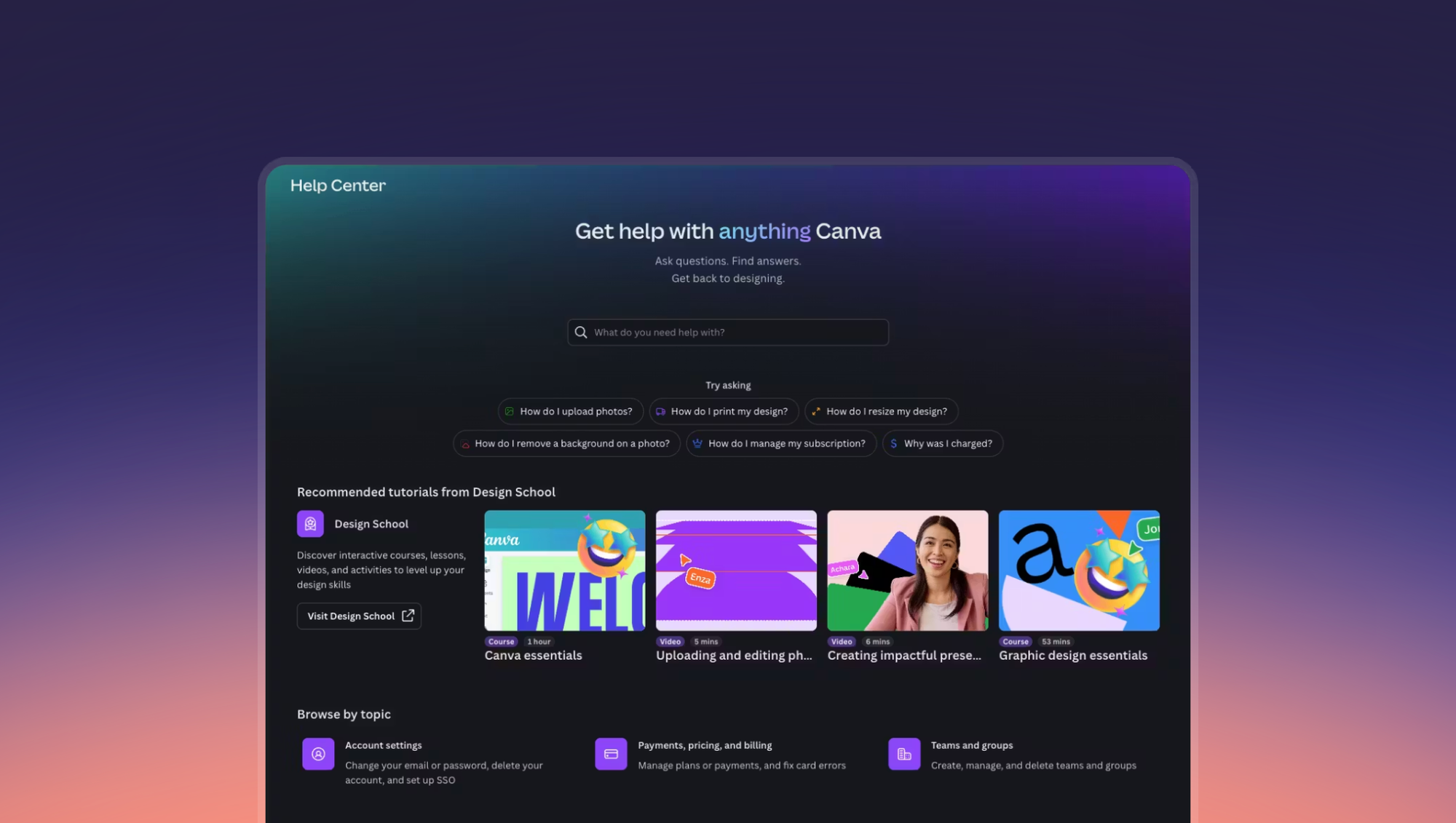
Canva's help center matches the polish of the product itself. A prominent search bar dominates the main page, backed by an AI assistant that interprets both technical and conversational queries. The layout is well-spaced, keeping a large library of content from feeling dense.
Industry: SaaS
What Makes It Great
- AI-Powered Search: Canva builds the AI assistant directly into the search flow rather than bolting it on as a separate channel. Canva treats the AI assistant as the primary way users interact with search, which means it gets used far more often than it would in a typical knowledge base.
- Task-Based Content Structure: Canva organizes content around what users want to do rather than around product features. A user looking to resize an image doesn't think in terms of Canva's toolbar. They think in terms of their goal, and the help center reflects that.
- Embedded Learning Resources: Design School tutorials blend into the help center, turning support visits into skill-building opportunities. For a product that appeals to non-designers, this approach can reduce repeat tickets by teaching users to solve similar problems independently.
Example Help Article: Generate Unique Designs Instantly with AI
2. Linear
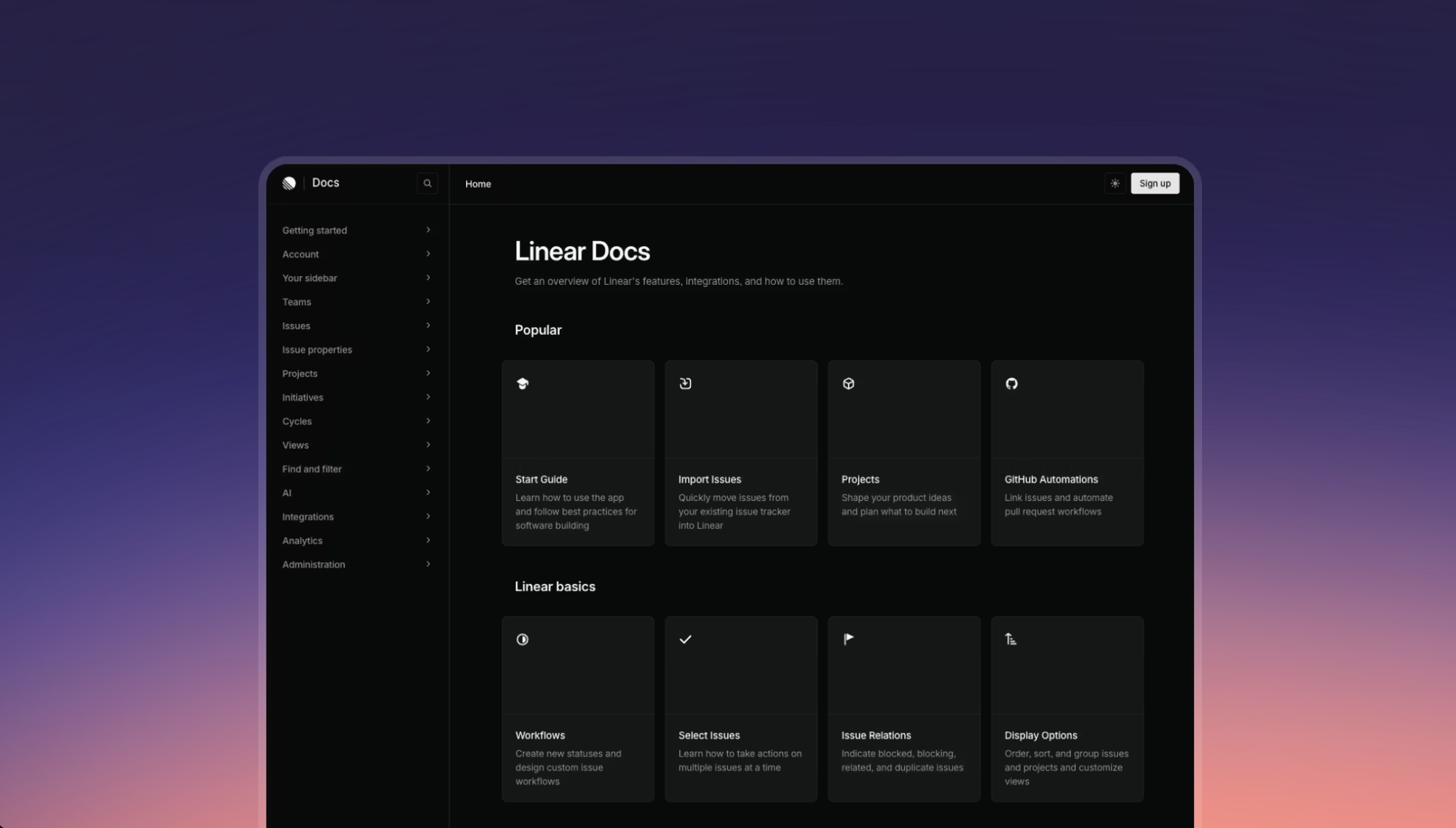
Linear's help center feels closer to product documentation than a traditional support page. A persistent sidebar acts as a full table of contents organized by different features, so you can jump to any topic without searching. Search is understated in the layout but responsive, returning tight suggestions as you type.
Industry: SaaS
What Makes It Great
- Doc-Style Sidebar Navigation: The sidebar mimics the structure of technical documentation, which lets users browse the help center alongside the product in a split screen. For a tool used by engineers and product managers, this format feels native rather than foreign.
- Long-Form Feature References: Each article goes deep by design. It reads like a full-featured guide with walkthroughs, edge cases, and a FAQ section at the bottom, which suits a power user audience that wants depth over brevity.
- Zero-Distraction Design: The Linear help center has no banners, promotions, or visual noise. The design prioritizes content above everything else, which is exactly what you'd expect from a product built around focus and speed.
Example Help Article: Create Issues
3. Revolut
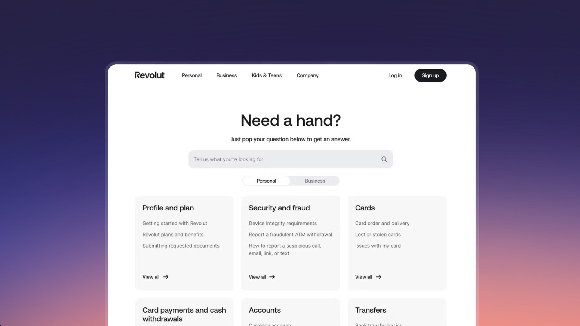
Revolut covers banking, crypto, currency exchange, and more. That breadth could easily make a help center feel chaotic, but Revolut avoids it with calculated restraint. The homepage is minimalist, using tabs to split content between personal and business customers so two dozen categories stay manageable.
Industry: Banking and Financial Services
What Makes It Great
- Tab-Based Audience Filtering: Tabs on the homepage split content for personal and business customers, serving two distinct audiences from a single URL without duplicating navigation or cluttering the page with irrelevant categories.
- Branching Content Architecture: Topics branch from broad hubs down to individual, question-level articles. This prevents any single page from becoming a wall of text and lets users drill down to the relevant information without reading content that doesn't apply to them.
- Predictive Search: Article suggestions appear the moment you start typing. In financial services, where users often have urgent questions about their money, reducing time to resolution by even a few seconds can meaningfully improve satisfaction.
Example Help Article: Card Customization
4. GoCardless
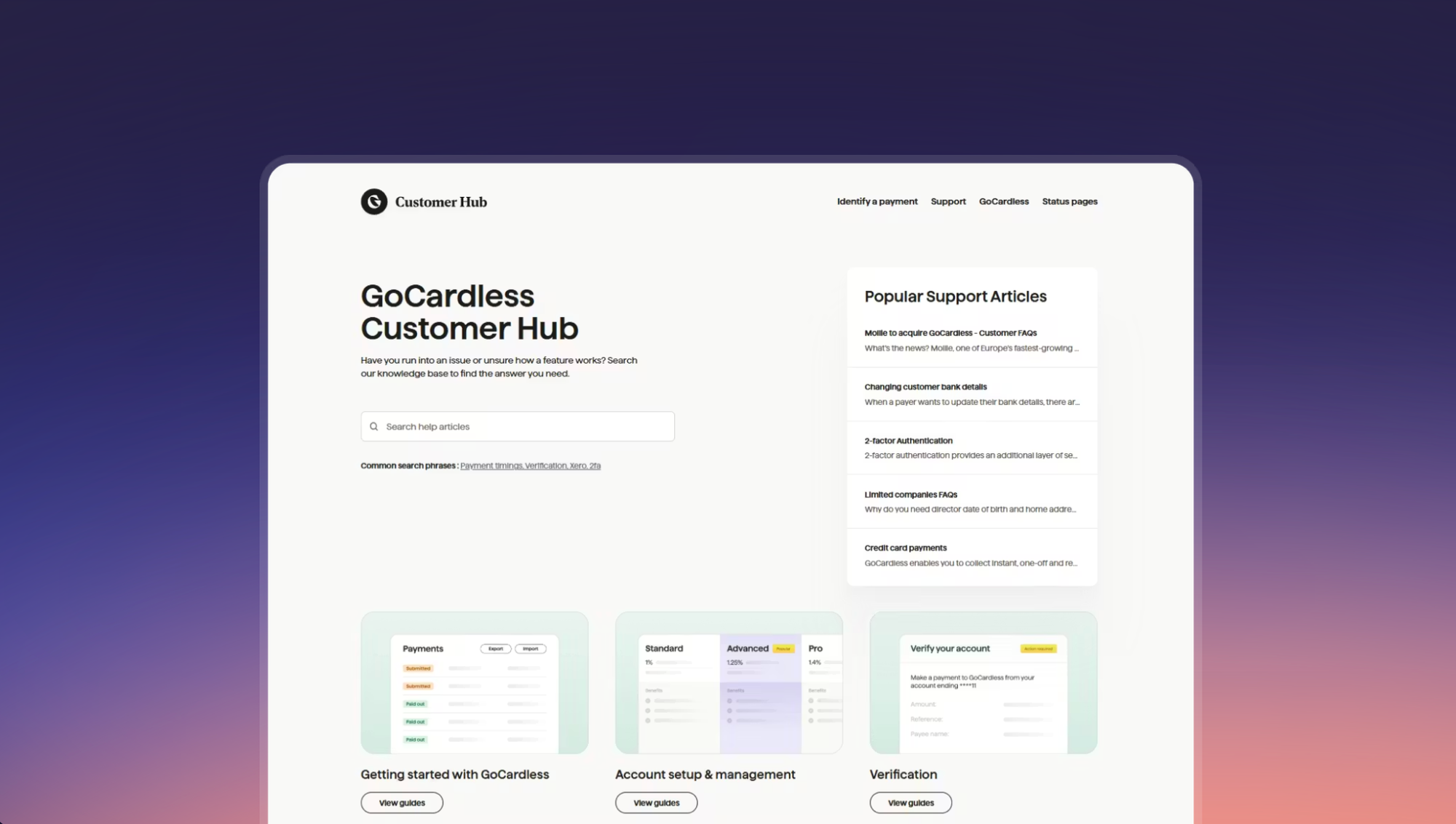
GoCardless builds payments infrastructure, and its help center reflects that same attention to precision. The help center organizes articles around the path a payment takes. Each article opens with a plain language explanation before walking through the required steps.
Industry: Banking and Financial Services
What Makes It Great
- Lifecycle-Based Information Architecture: Content follows the path a payment takes, from mandate creation to payout to failure handling. This mirrors the mental model users already have, which means less time figuring out where to look and more time finding answers.
- Bilingual Search: Search handles both regulatory keywords and casual phrasing equally well. For a product used by both compliance teams and small business owners who don't speak in financial jargon, this kind of flexibility is essential.
- Unified Developer and Support Docs: Developer docs and customer-facing support content connect rather than exist in separate silos, giving engineering and finance teams a single knowledge management resource. For a payments product, this eliminates the common frustration of bouncing between two unrelated help sites.
Example Help Article: Enable 2-Factor Authentication
5. Wayflyer
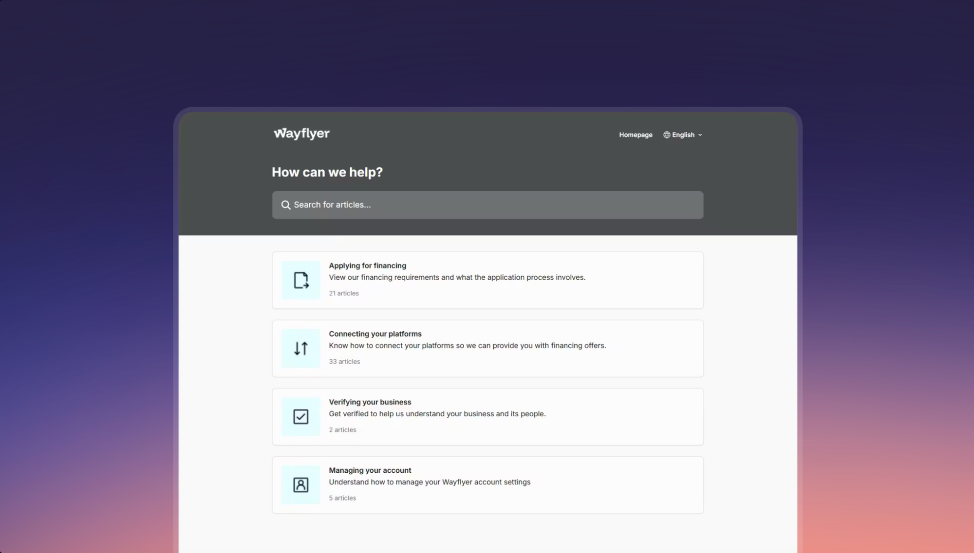
Wayflyer offers financing for growing e-commerce businesses. Its help center takes a lean approach that simplifies the typical complexity of financial services support. The homepage tracks the customer journey, and inside each top-level section, subcategories follow the same logical progression. A floating chat icon on every page gives users a fast route to a human when self-service isn't enough.
Industry: Banking and Financial Services
What Makes It Great
- Journey-Based Layout: The single-column homepage mirrors how customers move through the product, from application to account management. This is more intuitive than organizing by product feature, especially for first-time users who aren't familiar with the terminology yet.
- Content-Rich Search Previews: Search results include a snippet of the article's content beneath the title. This small addition lets users evaluate relevance before clicking, which saves time and reduces the frustration of opening articles that don't answer the question.
- Question-Framed Article Titles: Article titles are phrased as questions, which signals that direct answers are inside. This technique makes browsing faster because users can scan titles and immediately tell whether a page is relevant.
Example Help Article: How Do I Connect My Shopify Store?
6. Walmart
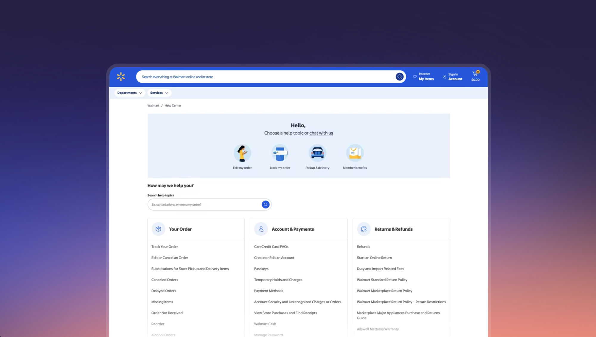
At Walmart's scale, the help center needs to resolve millions of visits with minimal friction. A large panel at the top of the homepage surfaces the most common tasks, and below it, search pulls up both keyword matches and frequently viewed articles. Individual articles are thorough and structured with subheadings for scanning and a sidebar that links to related topics.
Industry: Retail and E-commerce
What Makes It Great
- Action-First Homepage: The task panel at the top of the page resolves high-volume requests (order tracking, pickup scheduling) before users even need to search. At Walmart's scale, if even 20% of visitors get what they need from that panel, it represents millions of deflected support interactions.
- Related Content Sidebar: A sidebar on each article links to related articles, encouraging users to self-serve across multiple questions in a single session. This reduces the likelihood of a user giving up and contacting support for a follow-up question.
- Visible Live Chat on Every Page: Every page includes a clear path to live support. Rather than hiding the contact option behind three clicks (a common pattern), Walmart makes it visible, which paradoxically can reduce contact rates by giving users confidence that self-service software tools aren't a dead end.
Example Help Article: Order Not Received
7. Carvana
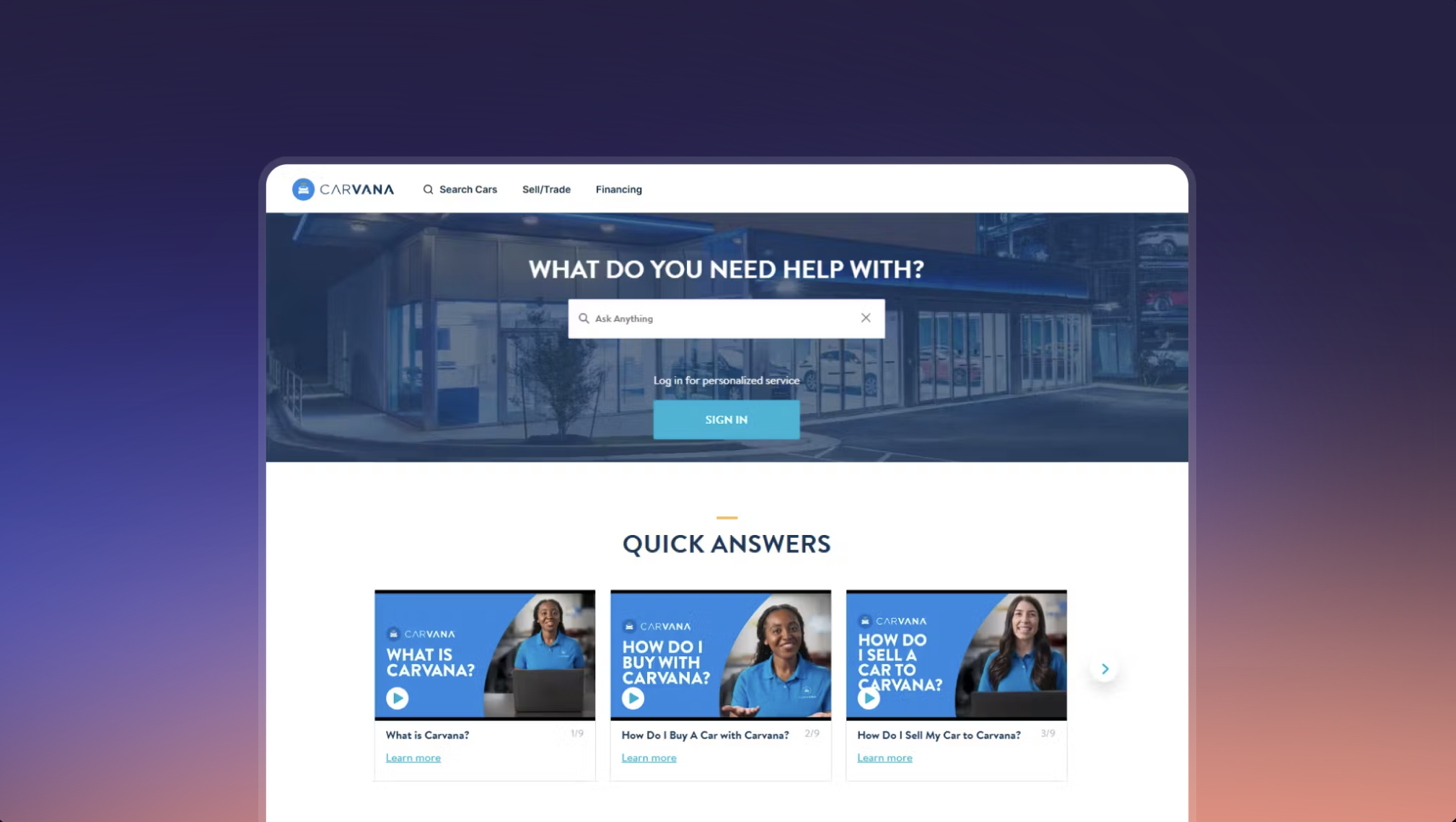
Purchasing a vehicle online involves financing, paperwork, delivery logistics, and post-sale ownership questions. Carvana organizes its help center around that arc. Top-level sections cover buying, selling, financing, delivery, and ownership, so customers can enter at whatever stage they're in.
Industry: Retail and E-commerce
What Makes It Great
- Journey-Based Navigation: The help center follows the car-buying and selling journey rather than internal product categories. Because the process is inherently sequential, users don't need to understand Carvana's internal structure to find what they need.
- Answer-First Article Structure: Articles lead with the answer, then layer in context and detail below. For high-stakes decisions like financing a vehicle, this structure lets anxious users get their answer fast while still providing depth for those who want it.
- Deep Links to Platform Actions: Many articles link directly to actions within the Carvana platform. This takes users from reading about a step to completing it, which is especially valuable for time-sensitive actions like scheduling a delivery window.
Example Help Article: Do I Need to Request Insurance for My New Car?
8. Razer
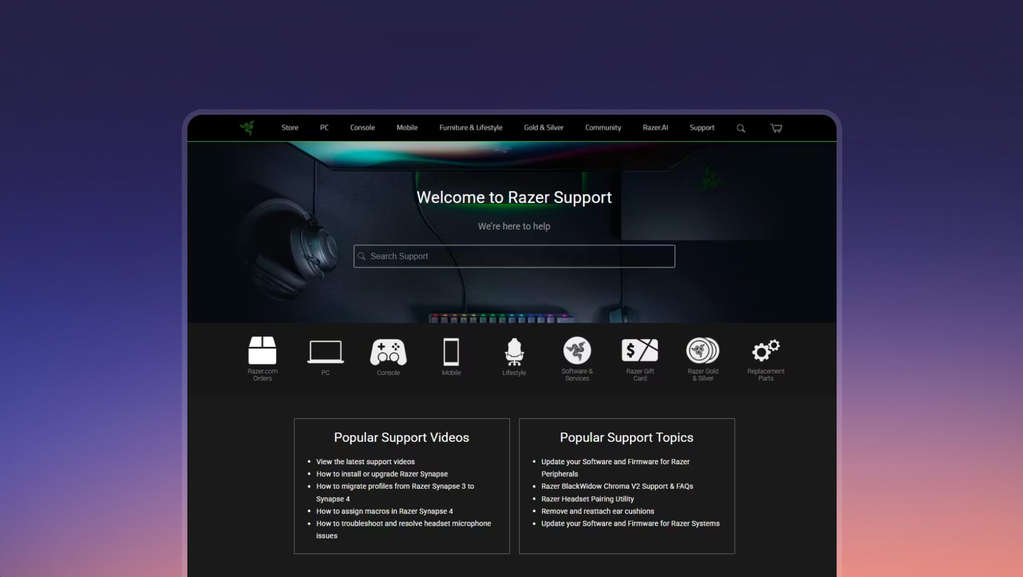
Razer's support center leads with hardware categories, which is what its gaming audience expects. The homepage surfaces product categories immediately, letting you jump straight to your laptop, mouse, or headset. The dark design leans into Razer's gaming brand while staying functional and easy to read.
Industry: Consumer Electronics
What Makes It Great
- Device-First Layout: The homepage surfaces product categories immediately, letting users find their device without navigating through generic menus.
- Model-Aware Search: Search handles model numbers and product shorthand well, which is essential for hardware support. A user searching for something like "BlackWidow V4" needs to land on the right product page, and Razer's search delivers.
- Consolidated Product Hubs: Drivers, downloads, and troubleshooting are grouped together by device. This eliminates the common frustration of having to visit separate pages for firmware, setup guides, and warranty information.
Example Help Article: Software and Firmware Updates for Razer Peripherals
9. PitPat
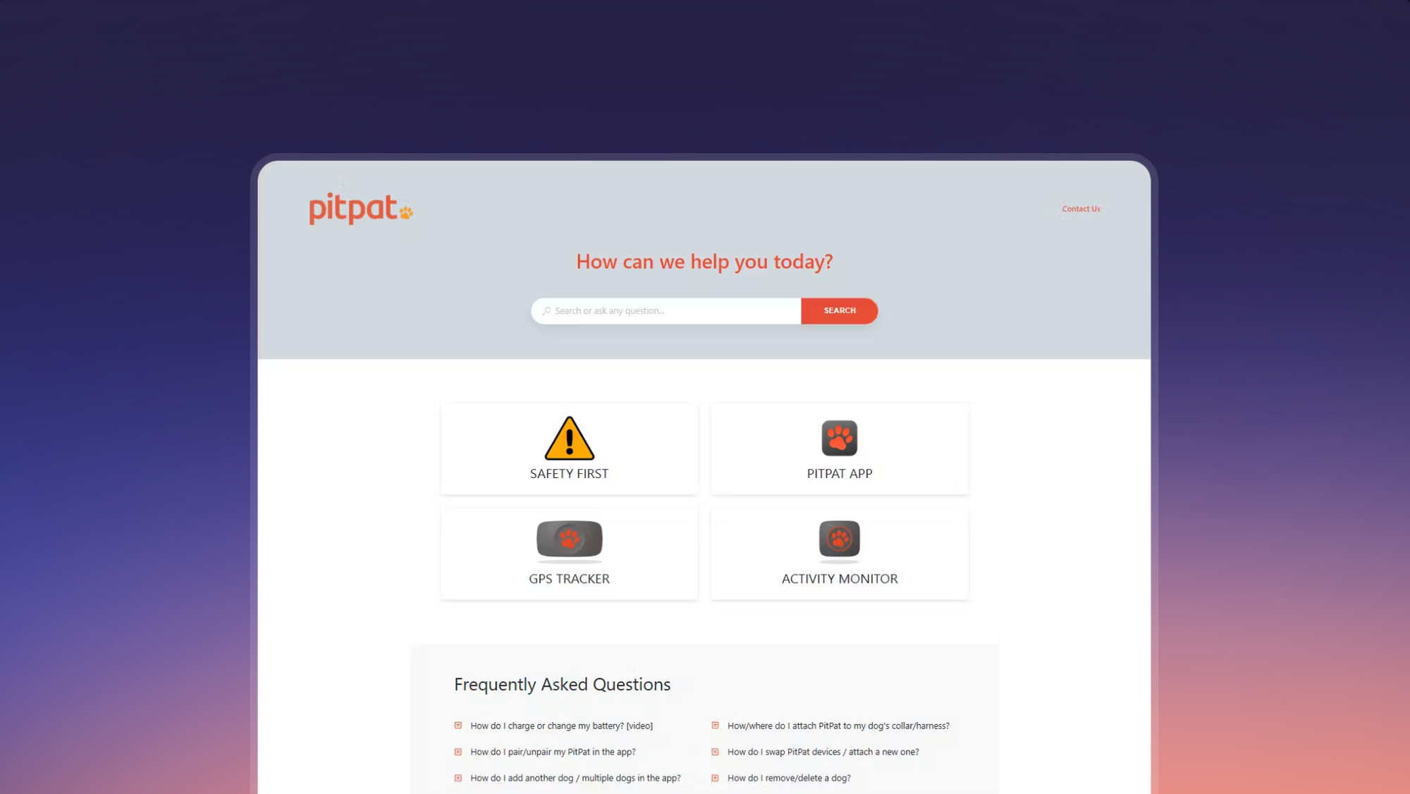
PitPat makes GPS trackers and activity monitors for dogs, and its help center punches above its weight in terms of design and usability. The homepage is compact with just four top-level categories organized by product. Results link to individual steps within guides rather than dropping you at the top of a full article, and the whole experience is wrapped in PitPat's playful brand identity.
Industry: Consumer Electronics
What Makes It Great
- Step-Level Search Results: Search links to the exact step within a guide rather than the top of the article. Traditional knowledge base search returns full articles and leaves users to scroll for the relevant section, but PitPat's approach eliminates that friction entirely.
- Sequential Content Format: Content is broken into short, numbered steps with tips, warnings, and images. For a product used by pet owners of all technical backgrounds, this format reduces the cognitive load of following instructions and makes it easy to collect user feedback at each step.
- Homepage FAQs: FAQ sections on the homepage handle quick questions without requiring deeper browsing. For a help center with a compact content library, surfacing the most common questions up front keeps users from digging unnecessarily.
Example Help Article: How Do I Pair/Unpair My PitPat in the App?
10. EA
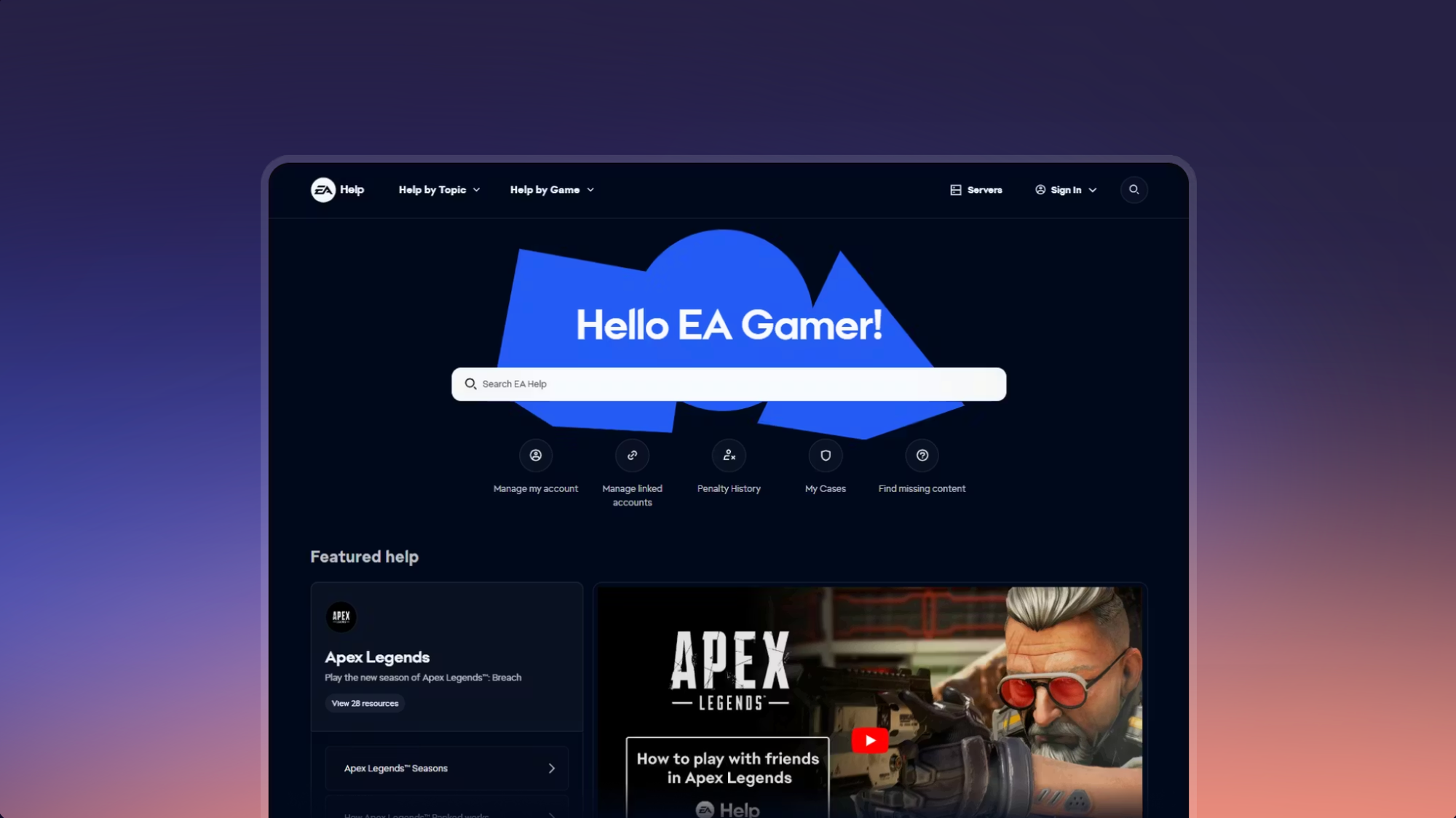
EA publishes dozens of game titles across multiple platforms, so a single FAQ page would never cut it. Instead, EA organizes the help center by game and platform. Each title has its own hub covering common issues like connectivity problems, missing content, in-game purchases, and account recovery. Articles are concise and action-oriented, leading with troubleshooting steps so players can resume playing quickly.
Industry: Media and Entertainment
What Makes It Great
- Per-Game Content Hubs: Each title gets its own hub, so players go straight to the game they need help with. This structure scales well. As EA releases new titles, the help center grows modularly without disrupting existing content.
- Platform-Aware Content: Articles account for differences between PC, console, and mobile experiences. A troubleshooting guide for FIFA on PlayStation is different from one on PC, and EA handles this distinction cleanly rather than forcing the target audience to filter on their own.
- Gamer-Friendly Search: Search interprets casual gaming language alongside formal terminology. Players searching for "lag" or "lost progress" get useful results without needing to rephrase their query in technical terms. It's a small investment in search tuning that pays off in reduced support contacts.
Example Help Article: How to Play EA Sports FC 26 Showcase
11. Reddit
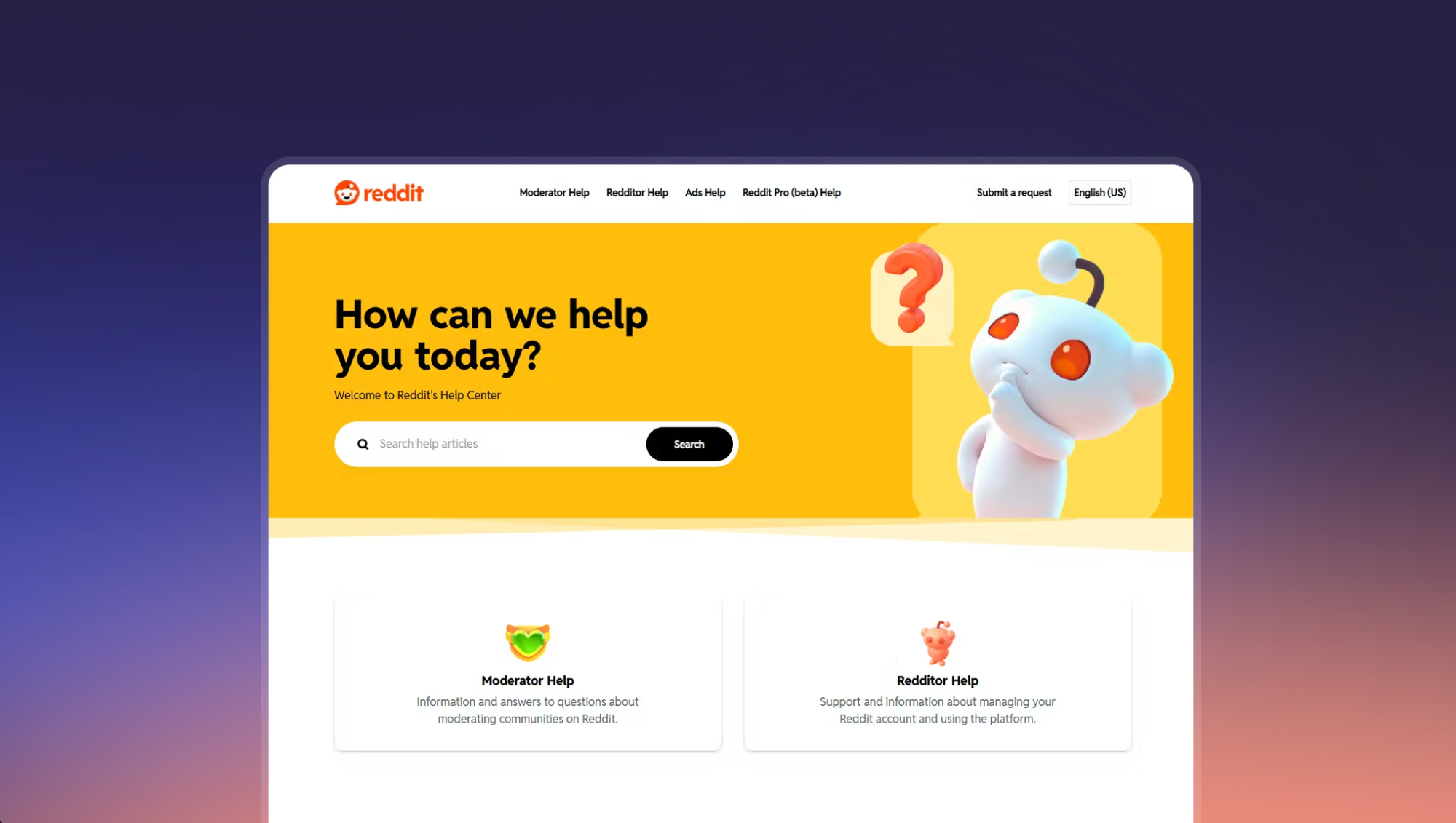
Reddit splits its help center into separate knowledge bases for different audiences: regular users, community moderators, advertisers, and Reddit Pro subscribers. The homepage acts as a portal to each, with color coding for quick visual orientation. Reddit's writing is conversational in tone, and longer walkthroughs use collapsible sections to keep the page compact.
Industry: Media and Entertainment
What Makes It Great
- Audience-Segmented Knowledge Bases: There are separate sections for users, moderators, and advertisers keep content targeted and relevant. After all, a moderator troubleshooting AutoMod rules doesn't need to wade through articles about resetting a password.
- Global Cross-Section Search: Despite the segmentation, search works across all sections simultaneously. Users who don't know which section their question falls under can still find answers without guessing.
- Integrated Community Support: Links to relevant subreddits are built into the help center flow, leveraging Reddit's biggest asset: its community. For a platform where users often know the answer better than the docs do, this is a natural extension of the support experience.
Example Help Article: What Is an AMA and Why Would I Host One?
12. Google Fiber
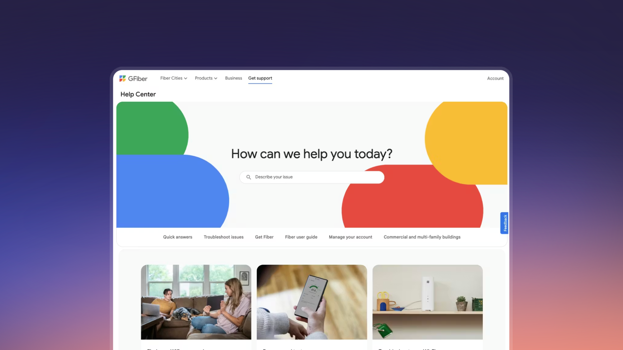
Google Fiber's help center adapts the familiar Google documentation style to the needs of broadband customers. Contact options for email, chat, and phone are visible on every page, with the ability to schedule appointments. A bottom-of-page FAQ catches simpler questions before users need to browse further.
Industry: Telecom, Utilities, and Services
What Makes It Great
- High-Traffic Tasks Promoted on the Homepage: Speed tests and Wi-Fi troubleshooting appear on the main page rather than staying buried in navigation. For a broadband provider, these popular articles likely account for the majority of help center visits. Surfacing them on the homepage keeps users from digging through navigation.
- Visible, Schedulable Contact Options: Email, chat, and phone options are accessible from every page, with appointment scheduling built in. In telecom, where issues can affect work and daily life, visible contact options reduce frustration even if the user ultimately self-serves.
- Proven Article Format: Articles use Google's reliable combination of structured steps, inline screenshots, and callout tips. It's not flashy, but it's been refined over years and billions of page views.
Example Help Article: How to Improve Your Wi-Fi Speeds
13. Xfinity
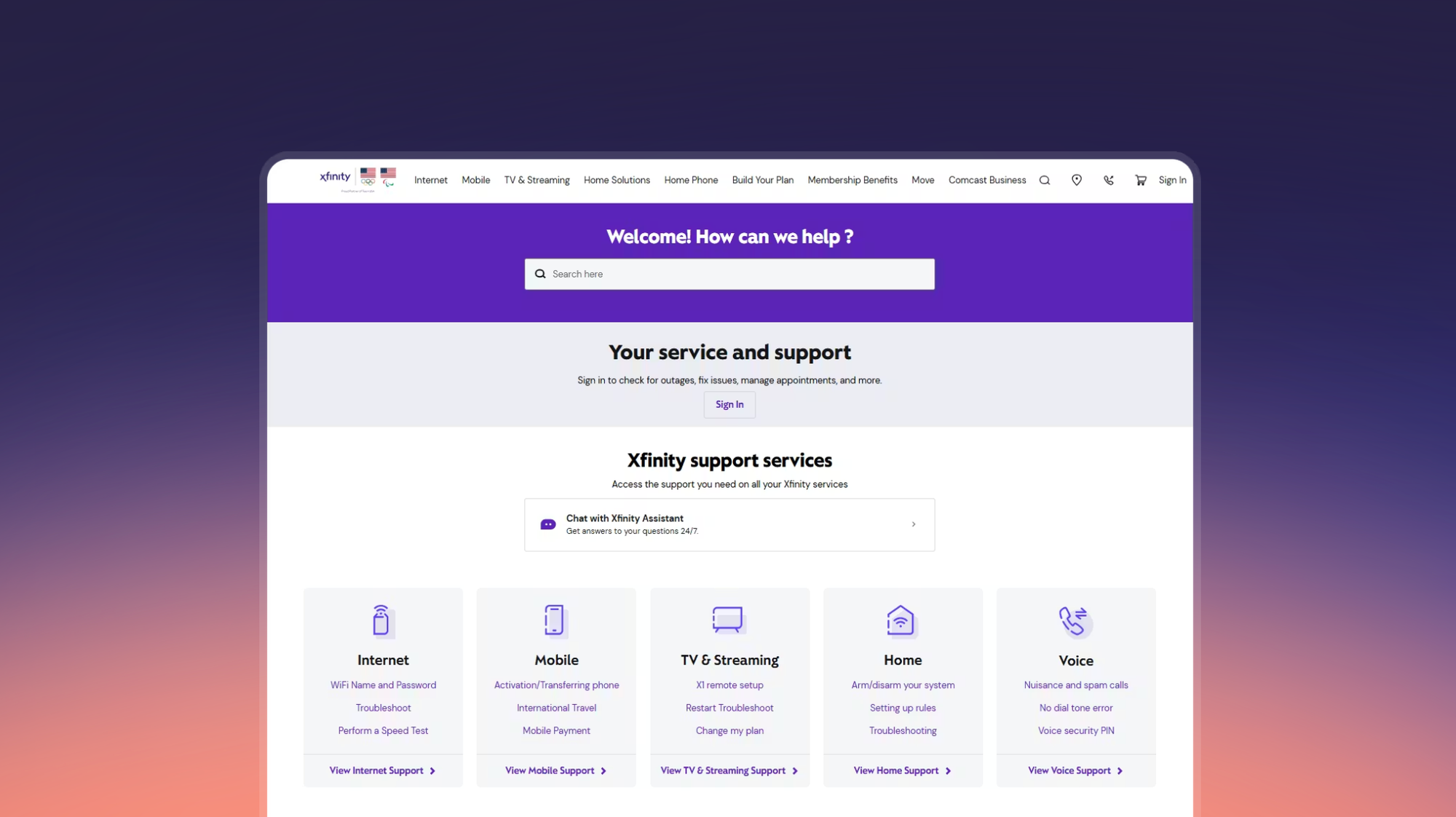
Xfinity supports tens of millions of customers across mobile, broadband, and TV. Rather than forcing everyone through a single support path, the help center opens up multiple channels. Logged-in users get account-aware support, including outage checks for their area and appointment management.
Industry: Telecom, Utilities, and Services
What Makes It Great
- Account-Aware Personalization: Logged-in users get support tailored to their account, including local outage detection and appointment scheduling. Instead of showing the same generic content to every visitor, Xfinity uses account data to surface the most relevant help.
- AI Assistant with Account Context: The AI assistant pulls in account data for signed-in users, enabling more relevant and precise answers. This goes beyond a standard chatbot that only searches articles. It can answer questions about the user's account and service, rather than only about the product in general.
- AI-Generated Search Summaries: A short AI summary appears above traditional search results, giving users a quick answer without requiring them to click through to a full article. For straightforward questions, this can resolve the issue in seconds. For complex ones, the full articles are right below.
Example Help Article: How Do I Activate My Mobile Phone or Tablet with Xfinity Mobile?
14. Khan Academy
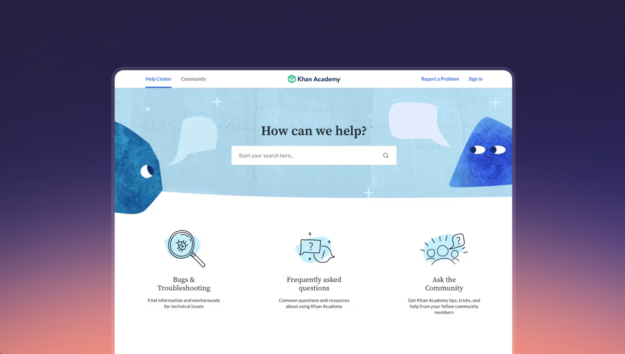
Khan Academy organizes its help center around its three core audiences: learners, teachers, and parents. Each group gets its own content section with articles tailored to their perspective. Community forums are featured prominently, and search displays both knowledge base results and community discussions in a side-by-side layout.
Industry: Academia and Institutions
What Makes It Great
- Audience-First Structure: The help center organizes content by who you are (learner, teacher, parent) rather than by product feature. On a platform where the same feature (like assigning a quiz) looks completely different depending on your role, this eliminates irrelevant content from the start.
- Side-by-Side Search Results: Search displays knowledge base articles and community discussions in a two-column view, surfacing both official answers and peer experiences without forcing users to run two separate searches.
- Annotated Visual Instructions: Khan Academy annotates screenshots and GIFs to walk users through each step. For a platform used by students as young as elementary school, this visual approach bridges gaps in reading comprehension and technical fluency.
Example Help Article: How Do I Get Started Using Khan Academy as a Teacher?
15. Ford
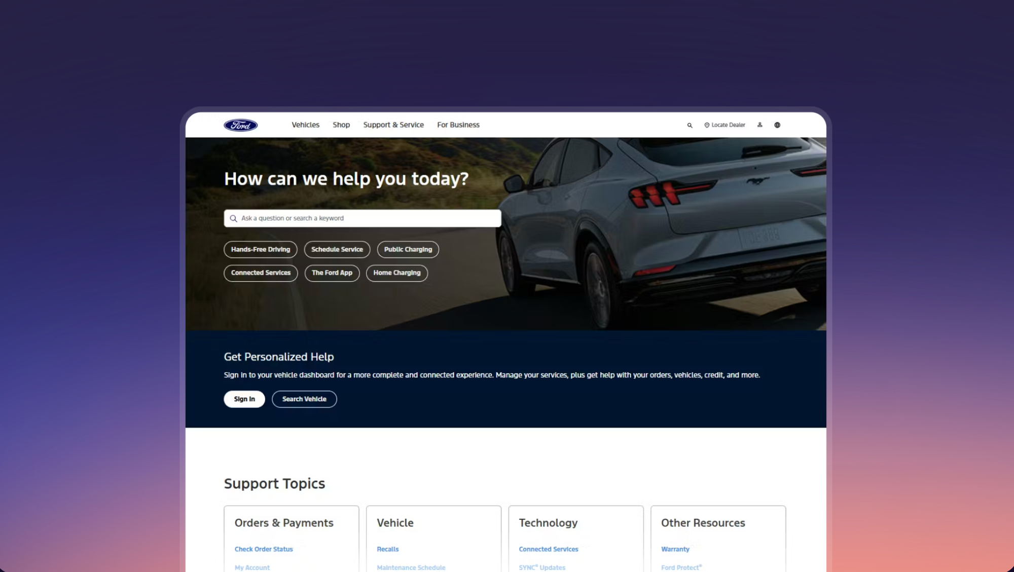
The automotive industry has traditionally leaned on digitized owner's manuals for customer support. Ford takes a different approach with a purpose-built help center that covers vehicles, connected services, and ownership topics in a browsable format.
Industry: Industry and Manufacturing
What Makes It Great
- Semantic Search: Search surfaces the right content even when users don't use the correct product terminology. A customer searching for "car won't connect to phone" will find the Bluetooth pairing guide without needing to know the feature's official name.
- Quick-Nav Shortcuts: Buttons beneath the search bar link to the most popular support topics (charging stations, service scheduling, the Ford app). These shortcuts act as a visual menu for the highest-traffic tasks and reduce dependency on search for common questions.
- Vehicle Dashboard Integration: Signed-in users can access their vehicle dashboard directly from the help center for personalized support. This connects generic help content to account-level assistance, which is rare in the automotive industry.
Example Help Article: Maintenance Schedule
How Stonly Can Help You Create a More Effective Knowledge Base
The examples above share a few common threads: clear structure, fast discoverability, and content that adapts to different audiences and contexts. Building external knowledge bases with those qualities requires the right platform.
Stonly gives customer support teams the tools to put these patterns into practice:
- Interactive guides and standard articles so you can break complex processes into step-by-step flows that adapt to each user's situation
- AI-powered search and an AI chatbot trained on your knowledge base content for faster, more accurate answers
- A no-code widget and triggers that surface the right content inside any web or mobile app, so users get help where they need it
- Deep integrations with Zendesk, Salesforce, and Freshdesk that put knowledge directly in your agents' workflow
- Content and search analytics that show you how your knowledge base is performing and where to improve
Stonly is a knowledge platform built for better, faster customer service. To help more customers self-serve and give your agents the knowledge they need in the moment, see how Stonly works.
Frequently Asked Questions About Knowledge Bases
How should I structure my knowledge base for different audiences?
Start by identifying your core user groups and what each one needs from your help center. Revolut, Reddit, and Khan Academy all take this approach by splitting content by audience type so users only see what's relevant to them. You can segment with tabs, separate sections, or role-based navigation depending on how different the needs are. The key is making sure a user can self-select into the right content path within a few seconds of landing on the page. If your audiences share most of the same content, tabs or filters work well. If their needs barely overlap, separate sections or even separate knowledge bases may be a better fit.
What are the types of knowledge base?
There are two main types of knowledge bases: an internal knowledge base or a customer knowledge base.
- An internal knowledge base is created solely for use within an organization. Internal knowledge bases act as help centers for employees, providing the information they need to carry out their tasks.
- A customer knowledge base provides information that customers need to navigate a product and resolve common issues. It helps users self-serve, reducing the need to contact support and cutting down the workload for support staff.
How do I create a knowledge base?
There are six important steps when creating a knowledge base:
- Put together a team
- Choose a knowledge base platform
- Create a rough outline
- List out common customer problems
- Compile solutions to the problems
- Create your first knowledge base article
Related post: How to Build a Customer Service Knowledge Base: A Detailed Guide
How often should knowledge base content be updated?
At a minimum, review your knowledge base content every time you ship a product update, change a policy, or adjust pricing. Beyond those triggered updates, schedule a quarterly audit to catch articles that have gone stale, close gaps where new support tickets suggest missing content, and retire pages that no longer get traffic. Search and content analytics can help you prioritize. Articles with high traffic but low resolution rates are usually the first ones worth revisiting. AI knowledge management tools can be helpful with this workflow.