An excellent customer experience is one that properly supports completely new users of your product without getting in the way of people who are very familiar with your product.
You need to provide a solution that will step in to support that new user at the first sign of trouble but will stay out of an experienced user’s way unless they need help. That’s where a self-service portal comes into play.
Here’s a look at what makes an excellent self-service portal, as well as nine self-service portal examples.
Feeling inclined by these self-service portal examples?
Stonly helps you build an intuitive, easy-to-use self-service portal with no code and hassle.
Schedule a demo
What is a self-service portal?
A self-service portal provides users with the information they need to use a product effectively without contacting customer support.
An effective self-service portal includes interactive and highly engaging guides that address top support topics and a comprehensive knowledge base covering the major issues that customers encounter.
A good self-service portal improves customer satisfaction. Customers want fast, easy answers to their questions–without needing to contact support. A well-built portal gives them the instant answers they need to continue with the task they set out to complete with your product. It also benefits your customer service team by allowing them to focus on issues that truly need intervention.
What makes a good self-service portal?
Here are some of the key characteristics that will help your self-service portal provide help without getting in the way:
The proper level of support for the user
The portal provides proactive, detailed instructions for new users and more experienced users alike.
Experienced users want to just use your product, but when they do have a question, want to be able to quickly find the answer. A comprehensive customer service knowledge base fits the bill here and is a key aspect of a self-service portal.
Support where the user is
Regardless of a user’s experience using your product, when they run into trouble using it, their frustration level is going to increase. The last thing you want to do at this point is to make them hunt for help.
People should be able to get to your self-service portal when they need help. Place interactive guides in your app, or make it easy to get to those guides from the places where people are likely to have questions.
Help that doesn’t require help to understand it
A good self-service portal provides guidance in a form that is easy to understand and includes instruction in a form meaningful to your users. Provide clear, easy-to-follow, multimedia steps; proven more effective at troubleshooting and learning.
Provides insights to reduce the need for help
A really good self-service portal identifies common areas of confusion so that you can improve your product and reduce the need for help because your product is just that intuitive.
9 Best self-service portal examples for inspiration
Here are nine examples of self-service portals to give you some ideas of things you may want to do with your self-service portal.
Along with each example, we’ve included our key takeaways to consider when building your own self-service portal.
YouSign
YouSign offers esignature services to small and medium-sized businesses.
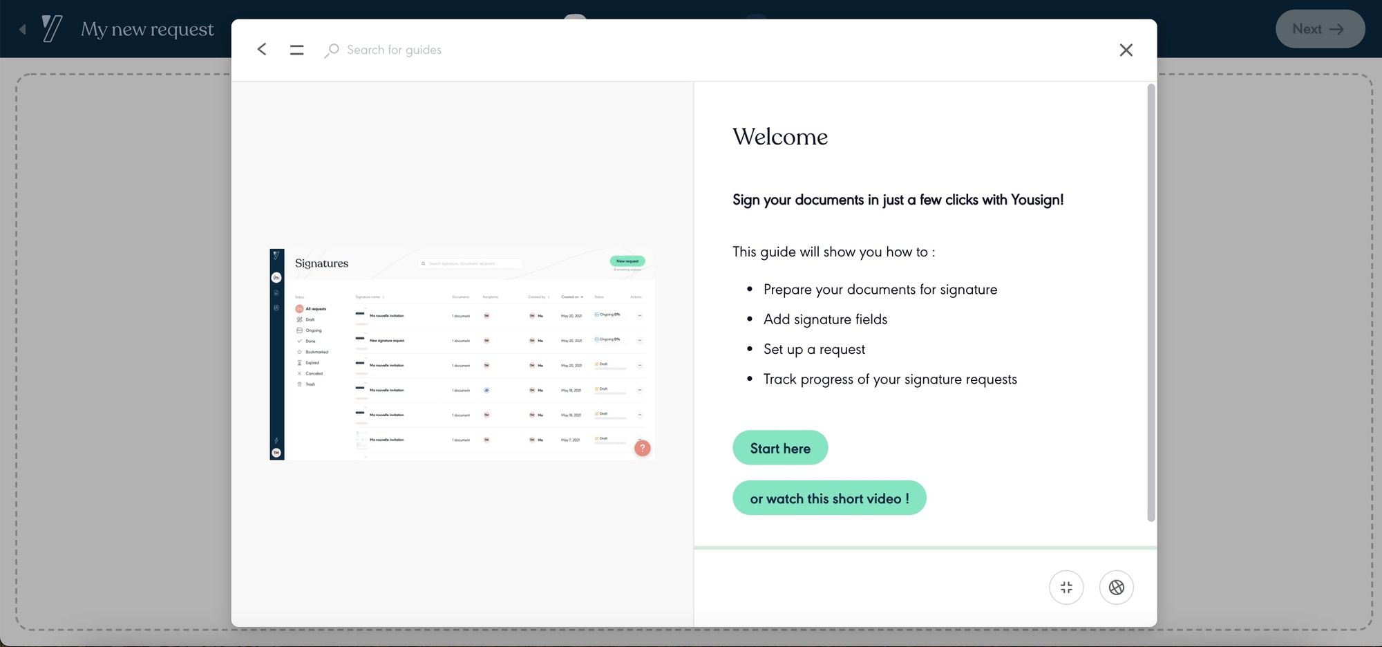
YouSign provides access to their help center throughout their app so that users can find answers to their questions without leaving the task they’re working on. There’s also a link to the help center available in the left-hand navigation.
Their self-serve portal features interactive guides that use animated gifs to demonstrate the steps to follow to accomplish specific tasks, such as this guide for creating a new signature request. Some of the guides also include video, which provides the user a choice of how they absorb the information they need.
To help people find the guides that are specifically related to them, YouSign organized their portal based on user roles with a separate Admin Guide and Owner Guide.
Key Takeaways
- Make your self-service portal easy to get to regardless of where you’re at in the app.
- Organize your help content based on user roles.
Malt
Malt provides a freelancing marketplace connecting freelancers with companies looking for help on their next project.
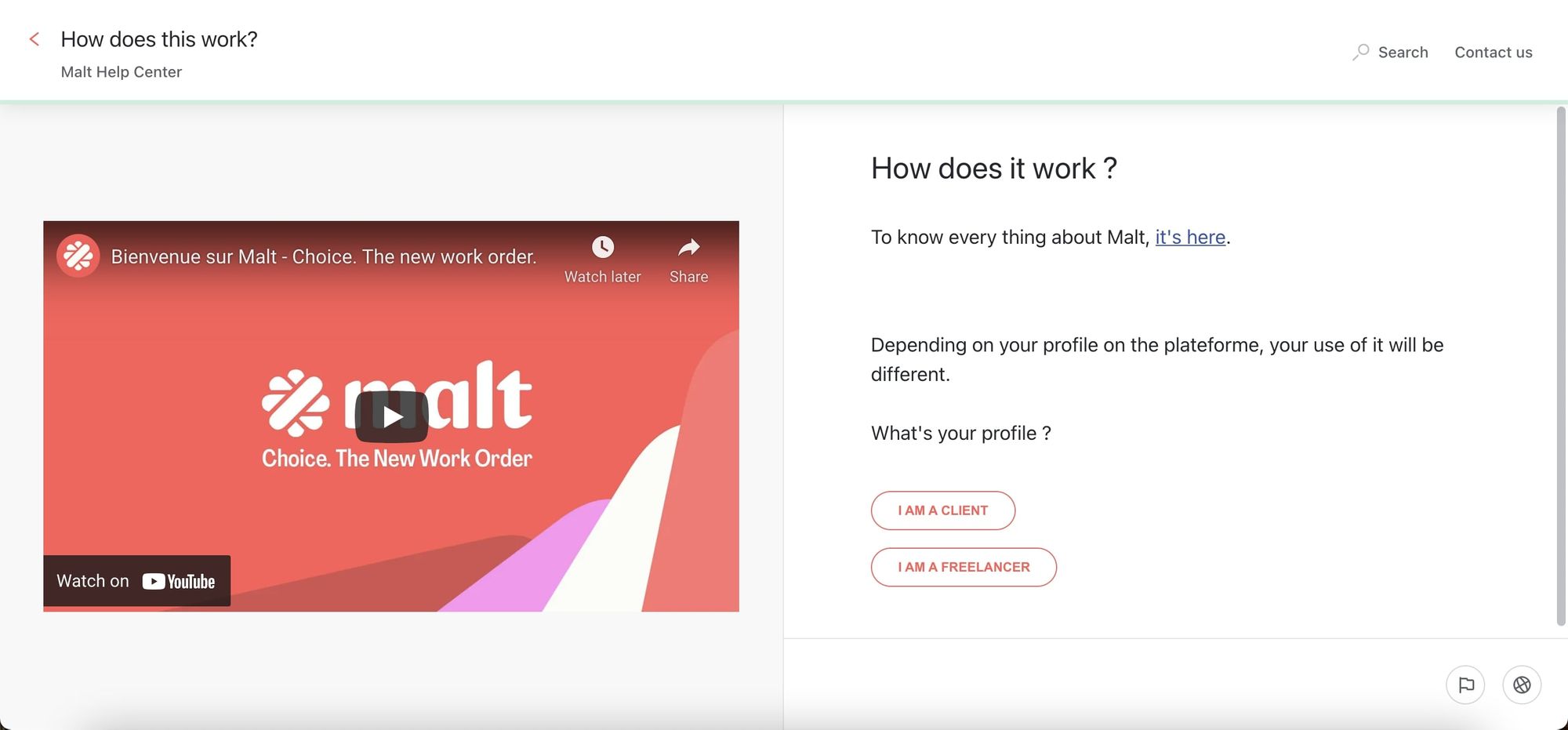
The Malt help center is available from a link in the footer on every page. There are also several “Learn More” links in certain areas of the app that take you to more information in the help center.
Inside the help center, topics are organized based on their customers’ two main roles, so if you’re a freelancer or a client, it’s clear where to go for more information. In these targeted areas, there are several guides answering specific questions for the specific role.
There are certain sections of the site (such as missions for freelancers) that have tutorials for those who are new to that feature. These tutorials allow you to exit out of them if you don’t need to see the info, and you can replay them if you realize you need information that you didn’t get the first time you visited this part of the app.
The other key thing to note is that since Malt operates in multiple countries in the EU, the help center is set up to seamlessly change language based on where the customer is located.
Key Takeaways
- Embed links to your help content in your app so it’s there if users need it.
- Pay attention to where your users are so you’re speaking to them in their language.
Dashlane
Dashlane is a password manager app that automatically fills and stores passwords, personal data, and payment details across all platforms.
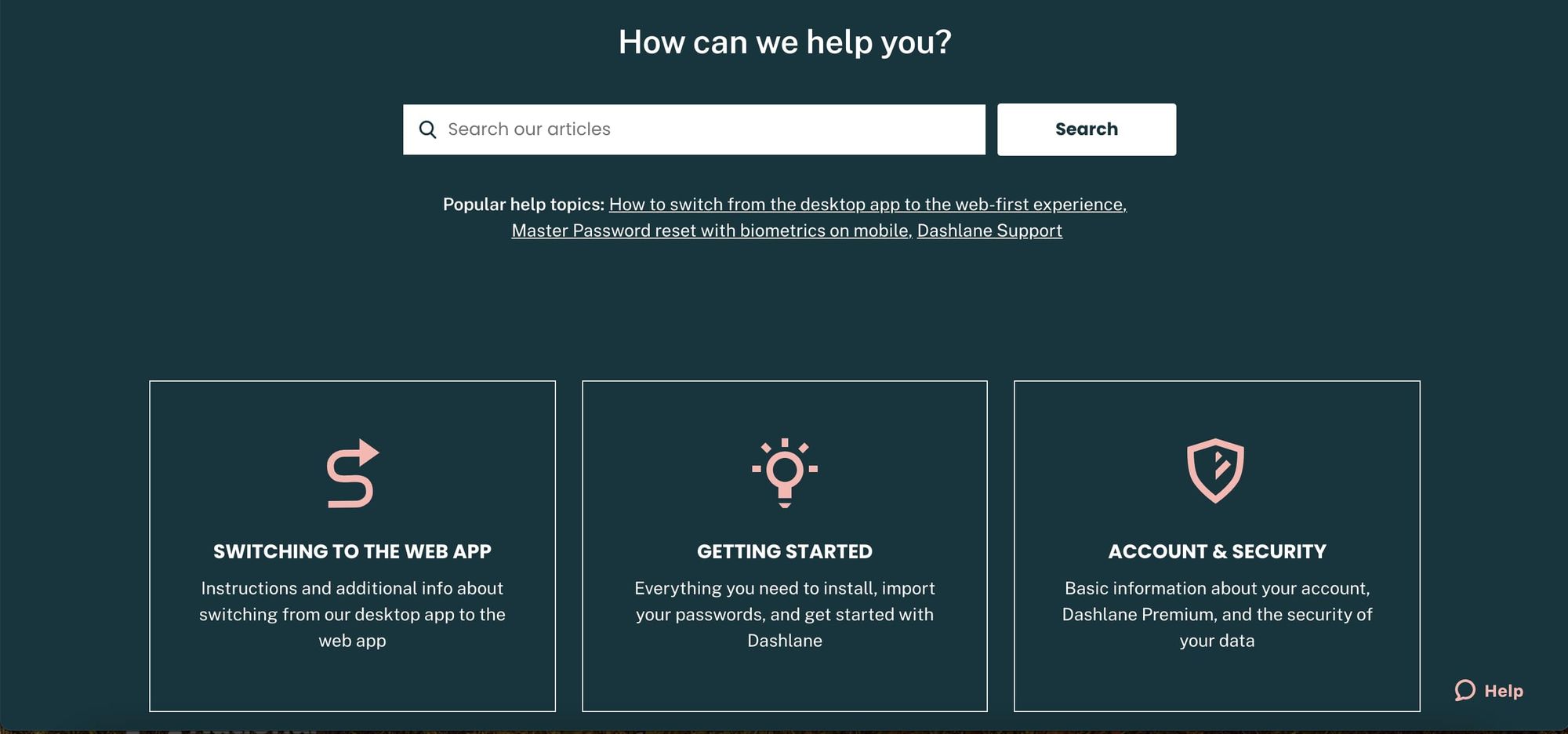
The Dashlane support area features multi-language, step-by-step guides for the highest ticket volume issues. These guides incorporate graphics and videos where appropriate.
If users don’t find the answers they’re looking for in those guides, they have a clear path for contacting customer support.
To get a little more insight into how Dashlane incorporated their self-service portal with their overall customer support strategy, see this case study.
Key Takeaways
- Make your self-service portal an integral part of your overall customer support strategy.
- Answer the most asked questions so your users only have to contact support for unique situations.
Slack
Slack is a messaging app that connects people in businesses or groups who work together.
Related Post: How to Build a Help Center? The Complete Step-by-Step Guide
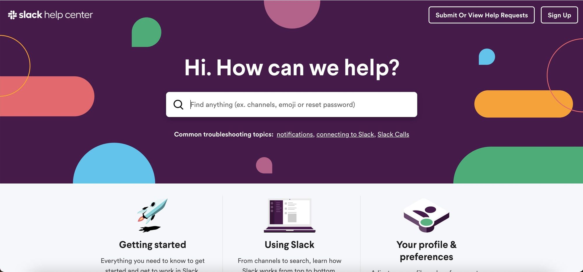
The front page of the Slack portal has six main groupings of information: Three of which are shown here. As you go down a level those groups appear as tabs at the top of the page.
Guides include a mixture of text and images. The site also has tutorials that incorporate text, animated gifs, and videos explaining key concepts.
This portal is also available inside the Slack app providing access to the same articles that you can get from the Slack help center on the website.
Key Takeaways
- Establish an organizational scheme for your help content and maintain that throughout your self-service portal.
- Use a variety of modes to communicate help information to account for different learning styles.
Telus
Telus is a communications company that provides wireless, data, IP, voice, television, entertainment, video and security, healthcare, and agriculture in Canada.
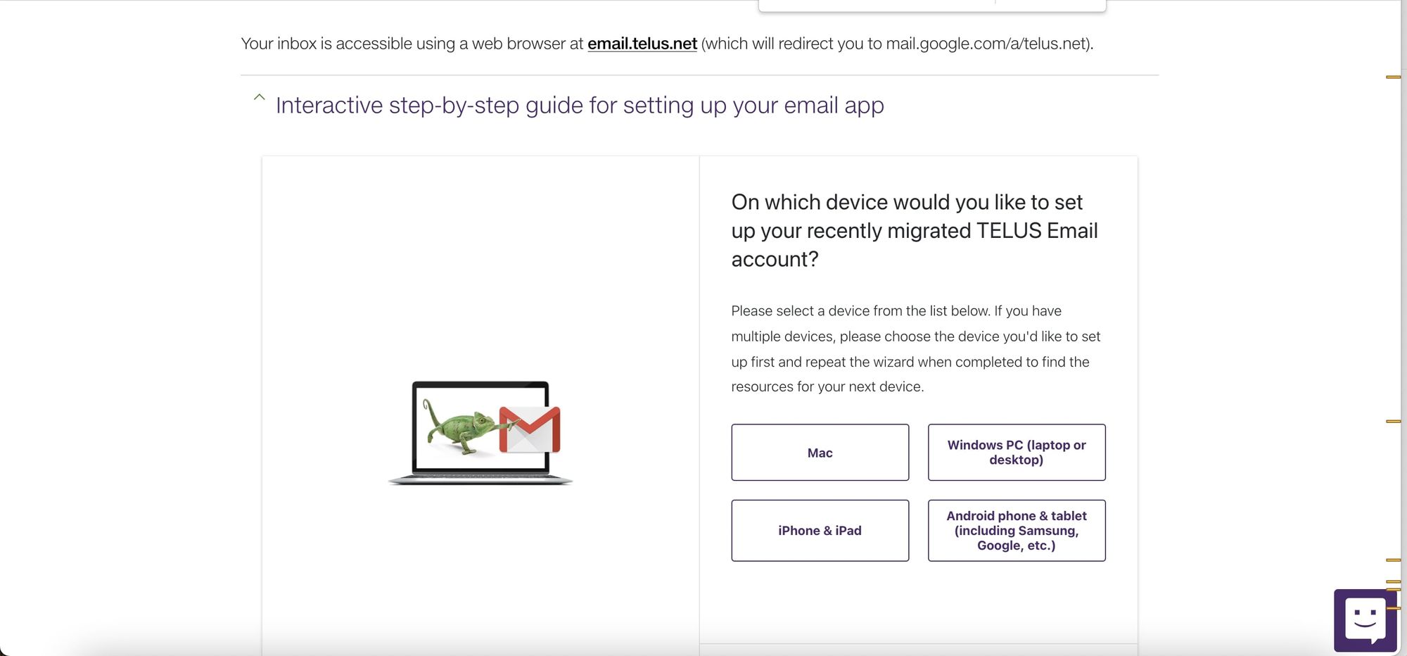
The support portal for Telus uses interactive guides with a wizard format to provide the specific instructions a user needs based on their situation. For example this guide for setting up email identifies the users device and email program and then provides the appropriate interactive content.
Telus’ support home page provides a few ways for users to find the information they need including search, organizing content by product, and providing links to key self-service tasks. The portal also clearly notes which actions are explicitly self-service.
Key Takeaways
- Structure your help content so it’s specific to your user's situation.
- Clearly note when users can perform the action for themselves or if they need to contact support.
DoorDash
DoorDash is a food delivery marketplace that connects people looking to enjoy a good meal, restaurants that want to provide a good meal, and people that want to deliver that good meal.
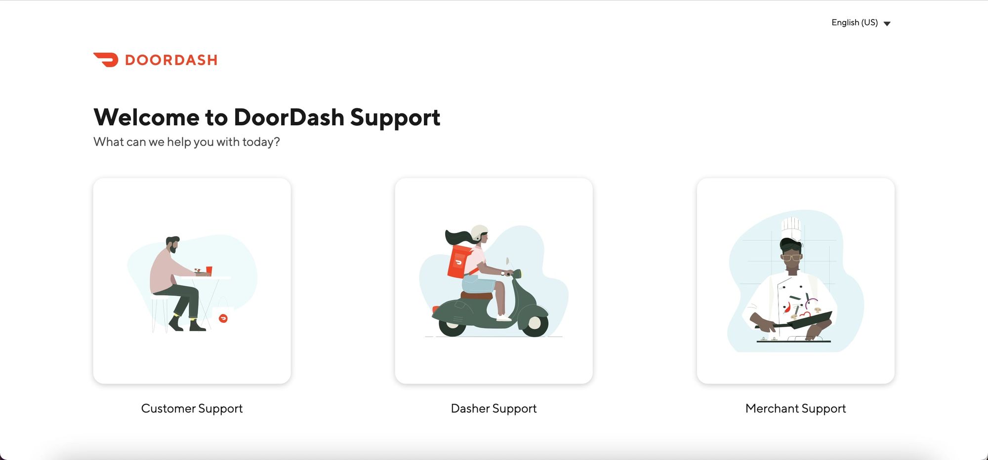
DoorDash provides separate self-support portals for the three key roles:
- Customer (people who want a good meal)
- Dasher (people who want to deliver a good meal)
- Merchant (people and companies who want to provide a good meal).
Each area allows users to deal directly with their specific issues. For example, in the Customer area, customers can get help with their current or past orders which logs them into their account. They can also go to the Help Center which is a collection of articles focused on topics relevant to that particular role.
The individual articles do a good job of providing specific instructions depending on the device you’re using (desktop or mobile).
Articles have animated gifs that demonstrate the key steps in the process, for example, this post on how to cancel the DashPass subscription.
Key Takeaways
- Provide separate self-service portals targeted to specific types of users.
- Write device-specific content to help users in their context.
Autopay
Vehicle identification, revenue optimization, analytics, and parking management, all in one easy-to-use solution.
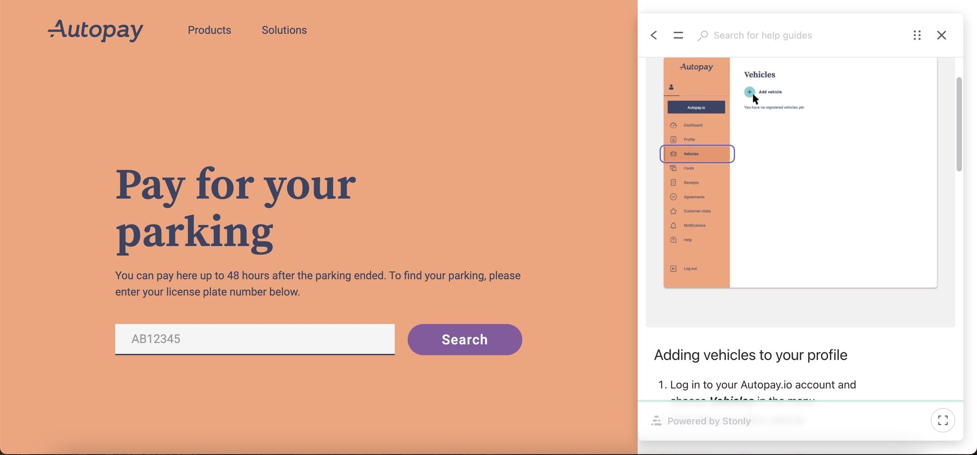
People can access the Autopay help center from a link in the header, or they can open the Knowledge Base to sit alongside the actual application by clicking on the question mark that appears in the lower right-hand corner of every page in the app.
The help articles are organized based on the main menu items in the app. The articles include interactive guides that show step-by-step instructions to accomplish key tasks.
Key Takeaways
- Make it easy to get to help content wherever your user is in your app.
- Organize your help content in the same way that your app is organized to make it easier for users to find the help they need.
Devialet
Devialet is an acoustical engineering company that produces and sells earbuds, speakers, amplifiers, and related accessories.
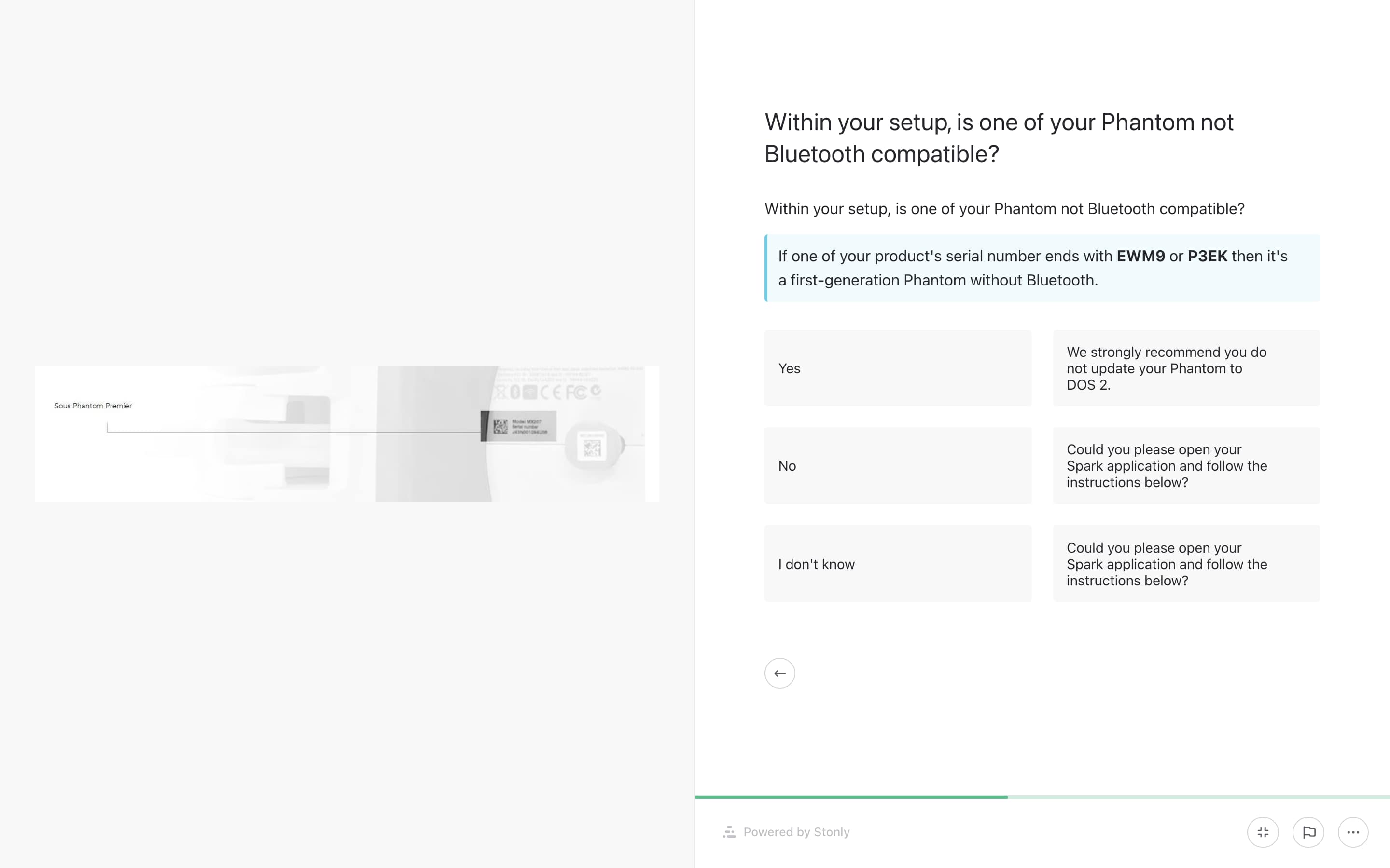
The Devialet help center has a combination of static articles addressing commonly asked questions and interactive guides that provide instructions based on specific circumstances. This is a good example of how you can provide useful instructions for products other than software.
Devialet uses interactive guides to provide specific instructions depending on the product or use case. Such as this guide for clearing different products.
Key Takeaways
- Create help content for all your products and services, even if they aren’t software.
- Target your help content to specific use cases.
Back Market
Back Market is a marketplace for refurbished electronics.
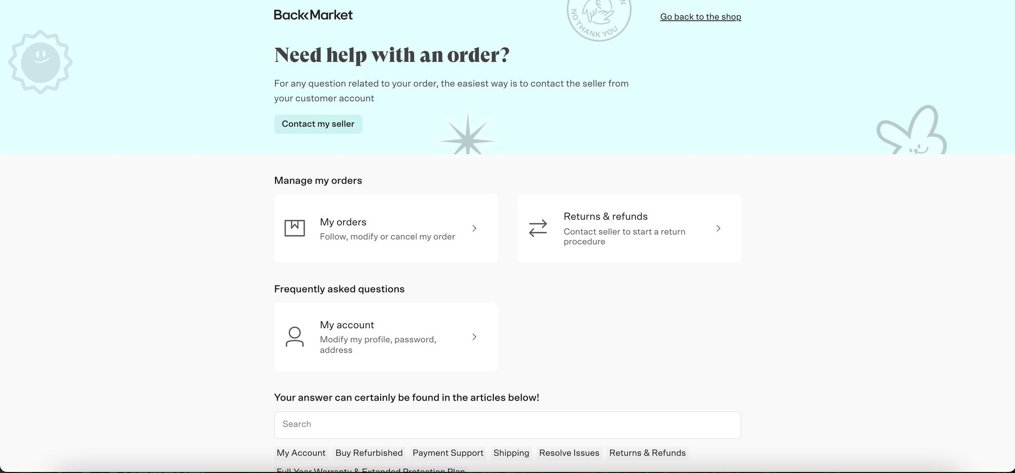
The initial page of the BackMarket self-service portal provides links to the account management pages so that you can go to your orders, returns, and refunds, or your account information.
You can also search for specific help articles. Some articles are heavily text-based, while others have interactive instructions with graphics such as this post on how to remove an iCloud account from your apple device.
Key Takeaways
- Include links to self-service functionality so your portal is more than help content.
- Use the form of content best suited for the help topic. Text is sufficient for some topics while other topics require more interactive content.
Related Post: 8 Document360 Alternatives to Level Up Your Self-Service
Want to build your own self-service portal?
A good self-service portal helps your users answer their questions quicker and saves your customer support staff time so that they can focus on those cases that do require staff intervention.
If these examples have inspired you to build your own self-service portal, keep the following points in mind.
Write interactive content that helps your users clearly understand how to solve their problems. Stonly’s interactive guides help you create powerful content that provides clients the answers they need.
Make your content easy to find Stonly’s widget allows you to position support where people can find it when they have a question.
Keep your content up to date. Stonly’s editorial tools and modular design help you keep your knowledge base current as your product evolves.
Feeling inclined by these self-service portal examples?
Stonly helps you build an intuitive, easy-to-use self-service portal with no code and hassle
Start a FREE Trial

