90% of customers will use self-serve support when it's available. And when done well, there's no better way to improve customer satisfaction while saving time and cost.
Most support leaders know there are big self-serve opportunities, but get exhausted just thinking about it. That’s because the conventional wisdom about “improving self-serve” is completely wrong.
Conventional wisdom states that, in order to drive more self-serve, you need to:
- increase coverage so your help center will answer every possible question
- overhaul your entire knowledge base to make it more customer friendly
- program a chatbot (that your customers will hate)
We’re going to show you a better system - a targeted approach aimed at decreasing support costs and improving CSAT fast. So fast, you’ll start to see results in less than a week - and you won’t have to overhaul anything.
In this playbook, we’re going to show you:
- The right way to identify and prioritize key issues
- What you need to do to create incredibly effective content for them
- How to provide that content exactly when and where it’s needed
We’ve helped hundreds of companies implement this system. Want to see how? Schedule a call with our team here.
Identify and prioritize key issues
Most companies take a broad, coverage-focused approach to self-serve. They prioritize keeping everything up to date and making global improvements.
Coverage is important, but over-focusing on it leads to help centers that cover everything decently, and nothing exceptionally.
To make a big impact fast, you need to focus on providing incredible self-serve support on key issues. In order to do that, you’ll need to identify and prioritize.
So where should you start? With one of your highest impact issues.
You want to identify an issue that:
- Causes a lot of support tickets
- Could reasonably be solved by customers with good self-serve support
- Is meaningful, and stands in the way of success.
Think about the topics that drive a ton of tickets - topics you know people could solve on their own, if only they’d use your knowledge base - topics causing your your support reps to answer the same questions, over and over, day after day.
Got one? Great!
If not, here are a few examples from other companies:
- Dashlane (a password manager) - forgot master password
- Calendly (a meeting scheduler) - trouble with availability
- Warby Parker (online prescription glasses retailer) - returns and exchanges
- Verizon Wireless (telecommunications company) - questions about phone bills
- Zoom (video communications technology) - trouble with video quality
- Blue Apron (meal kit delivery service) - missing ingredients
Related Post: How to Build a Help Center? The Complete Step-by-Step Guide
Create incredibly effective content for them
Now that you’ve identified your target issue, you need to make content that will move people from high-touch support to self-serve success without hurting their experience. This is where our approach differs from the status quo–from trying to cover everything, to covering the important things incredibly well.
In the past, the only format for self-serve support has been linear, long form articles. But when someone is having an issue, the last thing they want to do is read an article. They want, and need, guidance.
When it comes to support, customers follow the path of least resistance; they look for the easiest answer. If self-serve starts to feel hard, and contacting support feels easier, that’s exactly what they’ll do.
For each of your key issues, you need to make a great piece of content that:
- Drives utilization, because it’s inviting and makes the solution feel less daunting
- Decreases abandonment, because it’s engaging and interactive
- Gets more people to a resolution, because it provides more users with the right solution for them
Here’s how you make content that will move the needle:
Offer a step-by-step solution
The number one reason people bounce from your help content to your live support team is that self-serve feels like too much work. It feels too hard.
The easiest way to fix this? Break your content down into digestible, easy-to-follow steps.
By breaking your help content into steps, you do two things: first, you make the solution feel simple. Your customers only see the next thing they need to do, not all of the steps at once. Second, you get your customers engaged. As they’re clicking from step to step, they are actively participating in the process and feeling the progress they’ve made.
Account for different situations and circumstances
Often, two customers can have the exact same issue but require different solutions based on their circumstances. We’ve seen situations where:
- Mobile users need to follow different steps than desktop
- Paying customers need to follow different steps than free users
- Admins need to follow different steps than team members
Let your customers make choices in your help content so that they can get the exact information that’s relevant to them and their situation. An interactive tool like Stonly makes this easy.
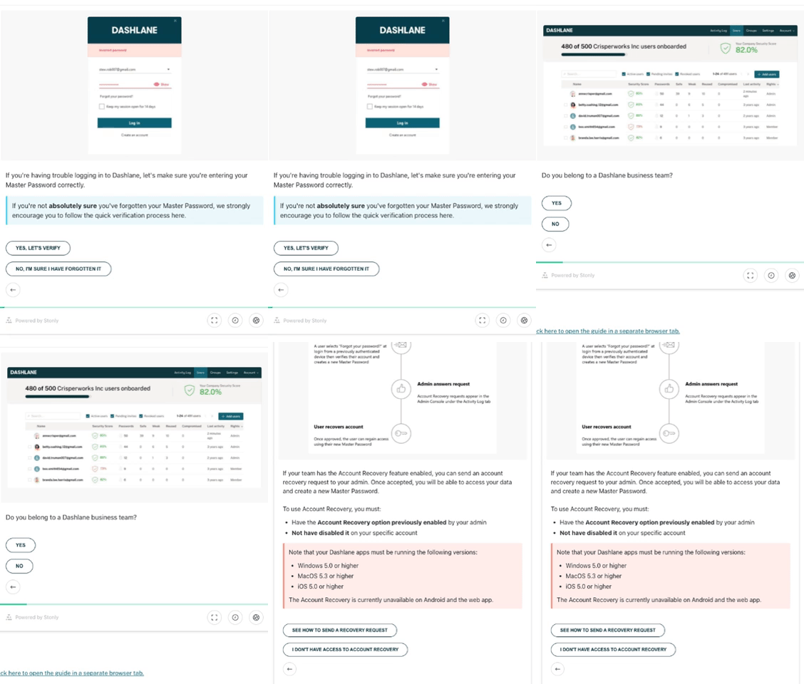
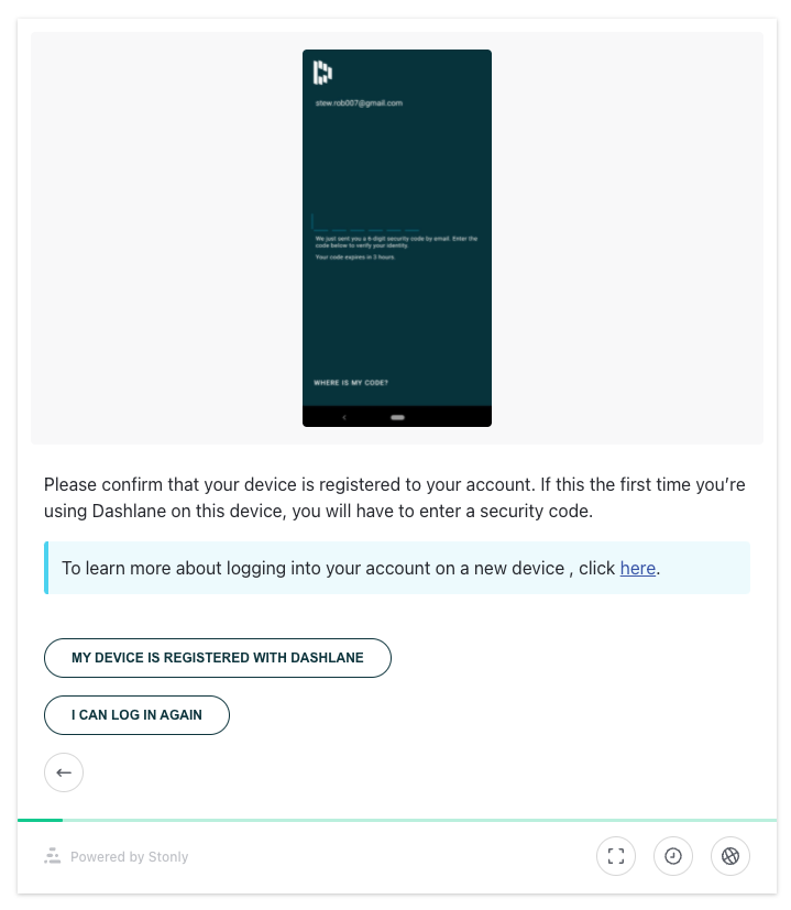
For example, Dashlane built a guide to help when customers forget their password. They ask a set of qualifying questions, then lead each reader down the right path for them.

By removing all of the information that does not apply, you make the issue much more self-servable and give each customer exactly what they need to be successful.
Don't skip the details
Static help content forces you to make a lot of tradeoffs. For example, to keep a piece from feeling long and overwhelming, you may leave out details and limit the images and visuals you include. This may make the piece look less intimidating, but it also makes it much harder to follow for your customers, who spend a lot less time thinking about your product than you do.
Include all of the information your customers need. Show screenshots of every step, and explain exactly what they need to do in detail. Assume they’re not experts at using your product, and over-simplify the solution.

People with a better understanding of your product will move through your guide faster, while those who require more guidance will still get all of the information they need, too.
Related Post: 8 Document360 Alternatives to Level Up Your Self-Service
Deliver that content exactly when and where it's needed
Remember, people are looking for the easiest, fastest answer to their issue. Self-serve is already the fastest path. To make it the easiest, you need to make sure that it is 100% accessible and obvious, right when and where your customers need it. By providing both reactive (right in the places where a customer will look for help) and proactive (providing help before customers seek it) help, you’ll dramatically improve your self-serve rate on the topic.
Just like people have different circumstances, they encounter support needs in different places. You want to be there when the time is right, and where they need the help.
Companies that make the biggest impact provide each piece of content in several places. Every issue is different, so choose the combination of these that makes sense for your customers.
Add tooltips right where the issue occurs
Sometimes you know the exact locations in your site where a user will experience a particular issue. Be proactive: add a tooltip that opens your content in a small window in that exact location.

Launch targeted support on the page
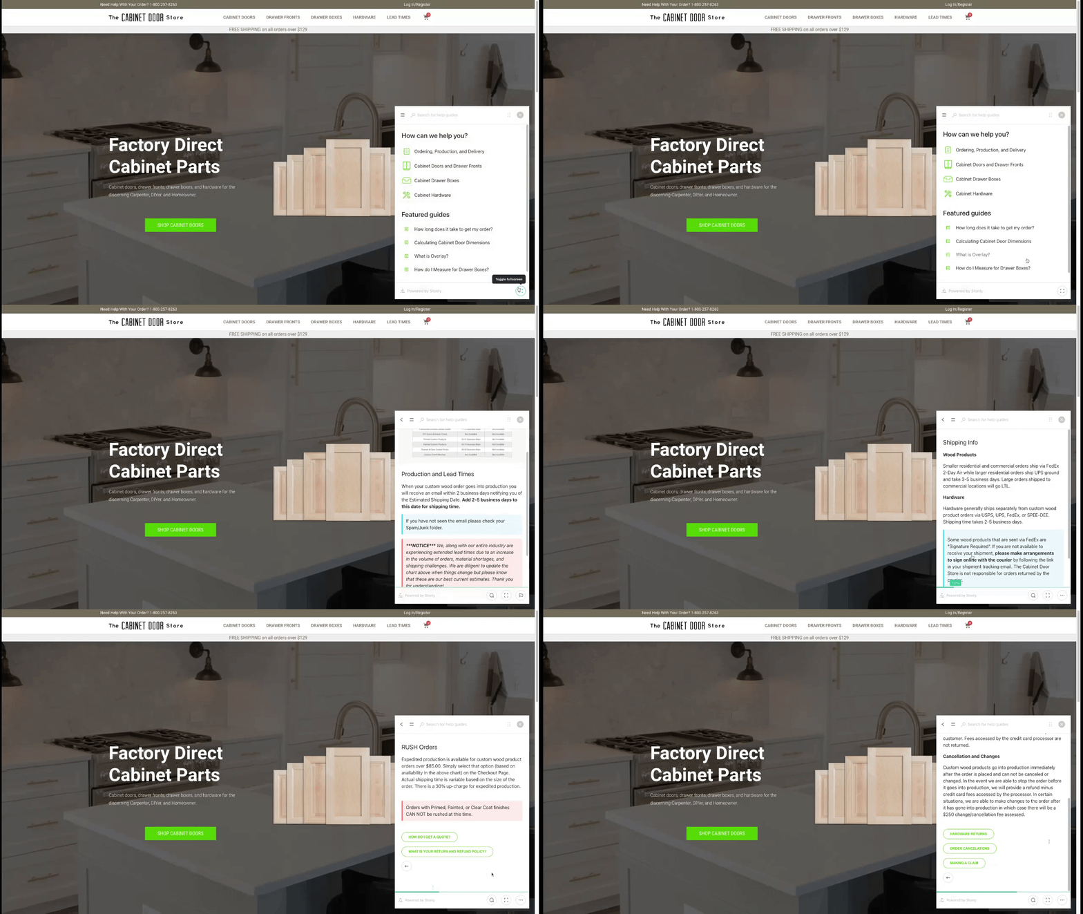
ou may already have a help widget on your site, but it probably either opens a chat or your whole knowledge base. Instead, use a widget that opens directly to the content you know someone is looking for at that particular moment. If this is a page where users may have other questions, then you can set up a guide that offers this answer first.
Incorporate into your contact form
You don’t want to make it hard to contact support, but you do want to offer the self-serve option first and make it the easiest option to access. Build a contact form that includes easy access to your key guides before you offer the form itself.

Include it in your help center powerfully
Some customers will head straight to your knowledge base when they have an issue.
Make your knowledge base content interactive for your top issues. If you’re using Stonly for your knowledge base, this is the default. If not, you can embed interactive guides right into your current articles. You don’t even need to change what’s already in the article, just add the guide to the top of it so customers who get to your help center still get your powerful, step-by-step guide.
You also need to make sure that, when someone does get to your knowledge base, they can always easily find answers for your top issues. There are two ways to do this:
- Add important guides as featured articles. Your top 5 problems should be the featured guides in your help center so people can get to the answer in fewer clicks.
- Make sure they show up in search. Ensure high priority articles show up when people search for common issues, regardless of the phrases and terms they use. Remember, customers often don’t use your verbiage the way you do.
By targeting the right issues, making content that’s built to drive self-serve resolutions, and putting that content in front of people when and where they have trouble, you’ll improve satisfaction and deflect tickets - guaranteed.
We’ve seen this work over and over again, with companies of all different sizes in a wide variety of industries.
If you want to decrease ticket volume fast, we can help. Start your free trial of Stonly's customer self service software today, or schedule a call with our success team and we’ll make sure you accomplish your self-serve goals.
Related post: What is a self-service portal?

