Successfully creating a great onboarding experience for each user can be challenging. Even with excellent market research, companies fall into the trap of using a one-size-fits-all user onboarding strategy that fails to meet users' needs and sends them churning from the product.
But how can companies create onboarding experiences tailored for each customer without spending hours and dedicated human support resources walking each user through the software?
Automated in-app user onboarding tools can personalize your new users’ onboarding experience with self-serve features. This article will explore what makes effective user onboarding and examine nine examples that will show you how to improve your user experience (UX) and retain users.
Need a great user onboarding solution to boost your user retention rate?
Stonly helps you create onboarding experiences tailored to your customer's needs.
Get a Free Trial.
What makes a good user onboarding experience?
A good user onboarding experience guides users toward using your product to achieve specific goals. Here’s how:
Personalize each experience
Segment your users so you can personalize their onboarding. This is one of the many crucial SaaS onboarding best practices that drives customer success. Personalizing your user experience for each use case shows your user persona you understand their needs and can fulfill them.
Companies who use the one-size-fits-all onboarding strategy may lose users early in the adoption process because they don't provide enough immediate reassurance that their product will address the user’s needs.
To segment your users, ask qualifying questions during the sign-up stage. Then, place them into unique use cases so you can guide them on how to use your product to solve their problem throughout the onboarding process.
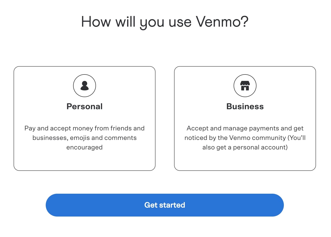
For example, when creating your account, Venmo asks new users, “How will you use Venmo?” so they can choose whether to create a personal or business account. They’re then able to onboard the user for that specific use case. This allows them to better understand customers and retain them by providing the actual solution they need.
Use “"Aha!" moments” that showcase a user’s wins
Highlight the moment your users reach a milestone. Immediately highlighting your product's valueto your users will reassure them that they’ve made the right choice in adopting your product and increase the likelihood they’ll keep using it.
Wishpond, a marketing automation tool, allows users to design landing pages, pop-ups, and other marketing-related websites. Their “"Aha!" moment” occurs when users click the “publish” button, which immediately launches a live marketing campaign.
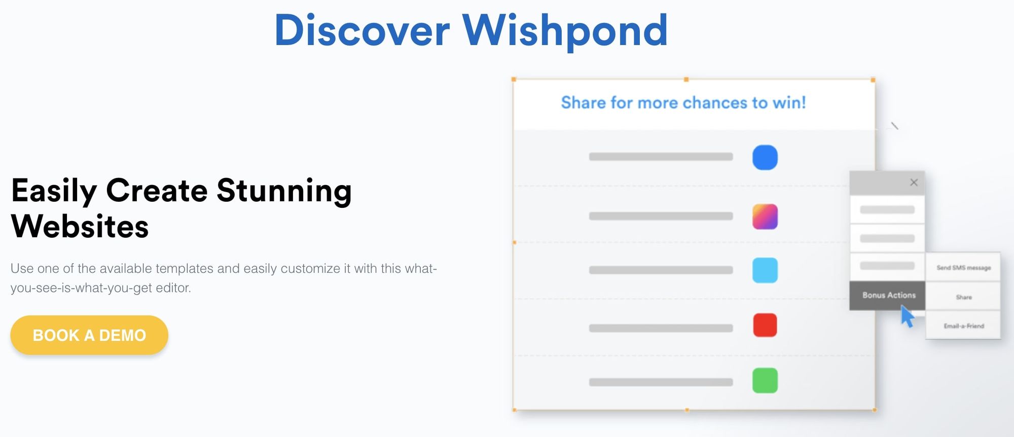
Wishpond’s users can see the immediate value of using this B2B SaaS tool to capture leads quickly and automatically.
Use tooltips and hotspots to continuously onboard
Make onboarding an ongoing process that guides your users long after they’ve first signed up for your software. Incorporate tooltips and hotspots to help you guide your users to use features that can improve their onboarding process while getting the most out of your software.
Stonly uses hotspots to highlight features their users can implement to get the most out of the onboarding tool. They strategically place noticeable dots near the buttons that will grab their users’ attention.
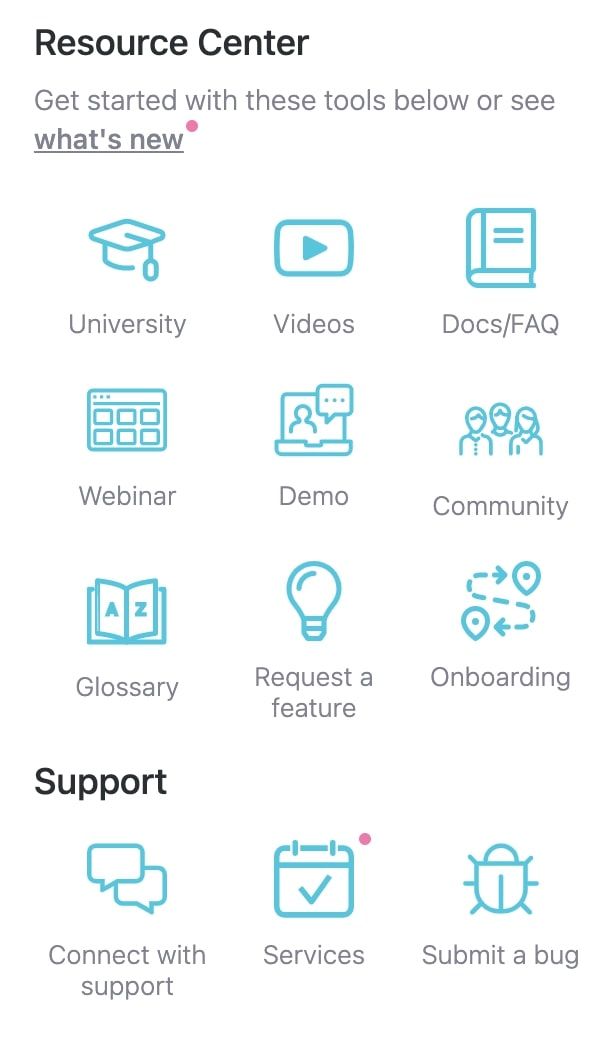
A good example of this principle in action is with the product management platform, ClickUp, which uses hotspots to help guide users through its resource center.
Collecting feedback
Your users want to be heard. Collecting their feedback through an NPS survey tool or a contact form will give you valuable information to upgrade your product’s UX design for a great user experience. Collecting feedback should be high on your SaaS onboarding checklist.
This allows you to find out what you’re doing right and what needs improvement. You’ll then get to showcase new features and provide updates that show your user you value their input.
For example, you can collect your UX design and content data with a feedback widget.

Here, you can see how Calendly use a feedback widget so users can express their level of satisfaction with a particular resource. Importantly, this is extremely fast and simple for users.
9 user onboarding examples to enhance your onboarding experience
Example 1: Netflix
Netflix’s onboarding experience is made easy for users through simply worded instructions and an easy-to-follow personalization process. Once users successfully create an account, Nextflix asks them to select a few examples of the kind of content they like to watch. This step is crucial to helping software developers step out of the one-size-fits-all user onboarding process they tend to fall into.
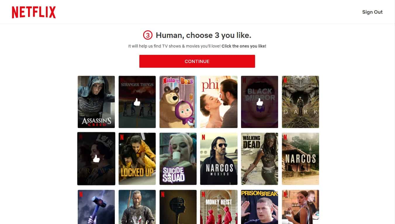
By creating a personalized account, Netflix has shown its value to the user—they now have a subscription to a product tailored to their needs and will be more likely to be presented with recommendations for the type of content they want to watch.
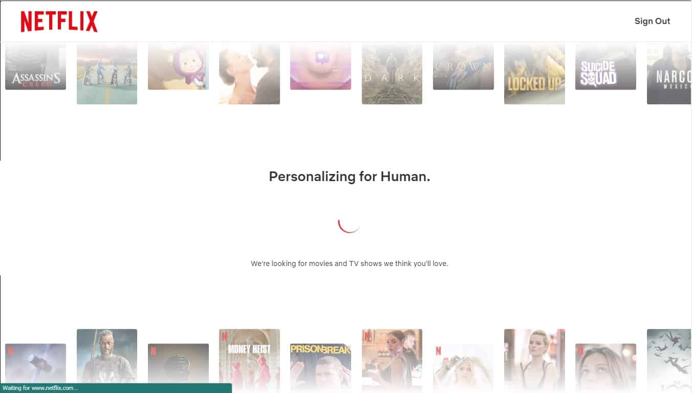
But the onboarding process doesn’t stop with the initial data they gather during onboarding. Over time, Netflix continues learning from the viewing decisions its users make to further personalize recommendations for shows.
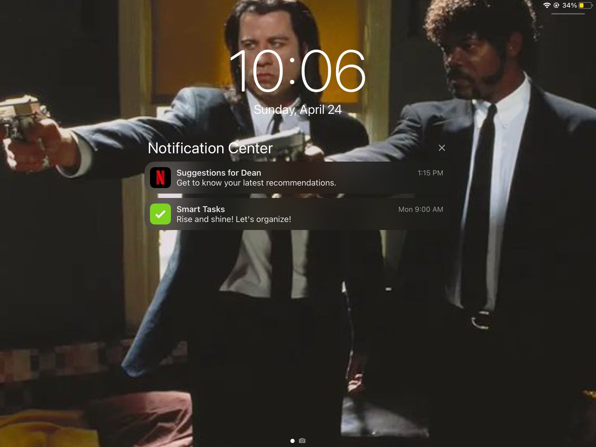
They encourage users to keep coming back to the platform with push notifications promoting some of these recommendations, which increases the likelihood that users will keep using the product and seeing the value.
What makes Netflix onboarding great
What makes Netflix’s onboarding great is how they personalize the user experience from the start. You don’t have to wonder if they care about the content you enjoy because they allow you to tell them exactly what you want. They ask you to choose action movies or romcoms when they ask you to choose 3 types of movies you like. That way, you’ll receive action movies or romcom suggestions on your home screen.
They use straightforward language, so their software feels more like a human is communicating with them than an AI who just wants them to keep the subscription active. Also, their setup and user interface are very user-friendly and easy to navigate.
Key takeaways
- Netflix makes signing up and personalization very easy and employs multiple techniques to collect data on their users to improve their UX for their customers.
- The streaming app methodically retains its customers with features that feel personalized to each user, leading to a higher retention rate.
Example 2: Slack
Slack’s user onboarding experience shows users how to use the communication tool by asking them to use the app's features to become familiar with the platform—namely, using the chat feature. Upon creating the account, users start sending messages to the Slackbot (Slack’s onboarding AI), which walks new users through an interactive tour of Slack's most important features. It also helps users set up their accounts and their first channel.
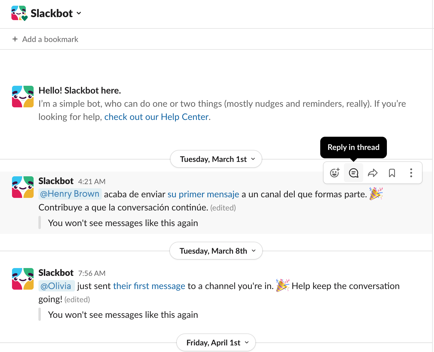
This makes it easier for users to learn how to use the product quickly and confidently.
Whenever there are updates to Slack features, the Slackbot functions as a tooltip informing users of these updates and reminding them to use the app's features. They also provide value to their users by highlighting features they’ve yet to use to showcase the platform’s capabilities and how users can improve their communication as a result.
What makes Slack onboarding great
Slack’s onboarding is great because they teach users how to use the tool by immediately making them use the tool. Slackbot, their chat AI, makes the user feel like they’re not alone through the step-by-step onboarding process as it sends frequent messages about features, tips, and more. This is an elegant way of holding the user’s hand during their early experience with the product without requiring a dedicated customer success resource.
Key takeaways
- Slack’s onboarding allows users to fully experience their platform and teaches them how to use it.
- Slack highlights features that may be useful to the user, so they’re more inclined to use them and gain more value from the product.
Example 3: Duolingo
Duolingo is a fun and exciting way to learn a new language, and its onboarding process is the same. They help keep users on track to learn their chosen language and encourage them with gamification to keep up their learning streak.
New users are asked to choose a language learning goal after receiving a friendly welcome from Duolingo's mascot, an encouraging owl named Duo. The platform asks, "Why are you learning a language?" which gives users a goal to work toward to boost motivation and retention. Knowing why someone signed up also allows Duolingo to personalize the app experience.
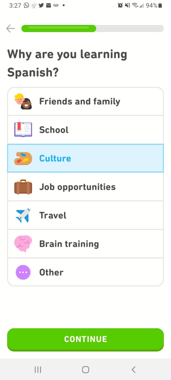
Duolingo also enables you to stick to your goals by reminding you to come back to it for a quick revision after you have completed a lesson. Since most users are new and might forget what they learned in their first sessions, Duolingo acknowledges their successes and gamify progress with colorful badges and satisfying sound effects.
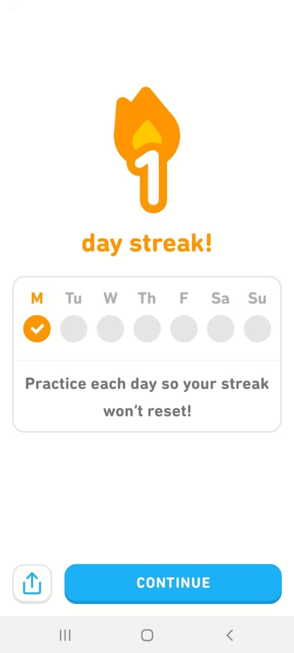
Using gamification is a key factor in the success of Duolingo. Achievers are motivated by points, badges, and statuses. Thus, Duolingo uses level points, XP points, leaderboard positions, and leaderboards to appeal to them. The progress you make is visible to other site members, allowing achievers to brag about their accomplishments.
What makes Duolingo onboarding great
Duolingo’s gamified continuous onboarding feature is what makes its onboarding great. The language learning app keeps its users on track by constantly highlighting when they’ve hit a new learning target while encouraging them to move to the next level. Coupled with the personalized user experience, their "Aha!" moments give users a sense of accomplishment that incentivizes them to keep using the app.
Key takeaways
- Duolingo’s stellar UI/UX and integration of gamification make a process that could feel like a chore fun and helps users to form a habit.
- Duolingo uses multiple techniques to make learning a new language personal. Their understanding that different users are at various stages of learning makes the onboarding process meaningful and supportive for users.
Feeling inspired by these user onboarding examples?
Stonly helps you create onboarding experiences tailored to your customer's needs.
Get a Free Trial.
Example 4: Canva
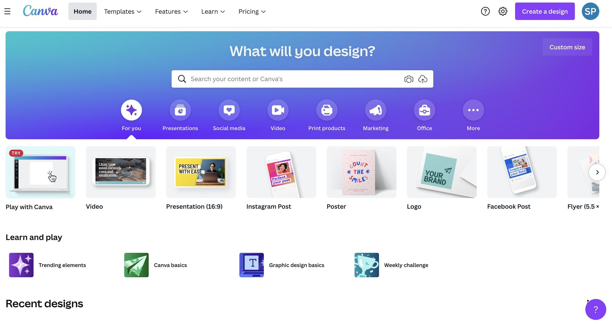
Canva allows users to create a personalized version of the application that best suits their needs. During the onboarding process, Canva asks their new users how they plan to use the platform, then takes them through a tutorial based on their selection.
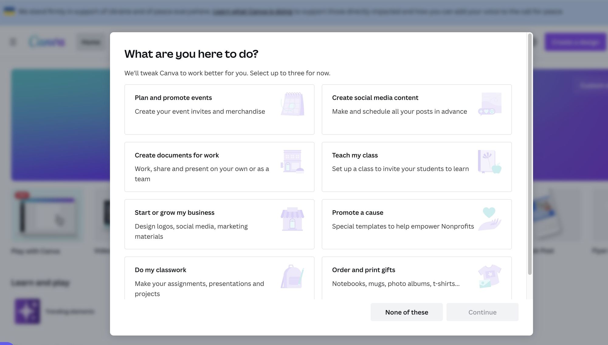
This strategy of immediate personalization reassures users that they won’t be stuck with features and functions they don’t need, and they’ll get the most out of their subscription (or freemium account). This also allows Canva to provide custom usage recommendations.
The tutorial is provided in an interactive format that guides users as they create their first design.
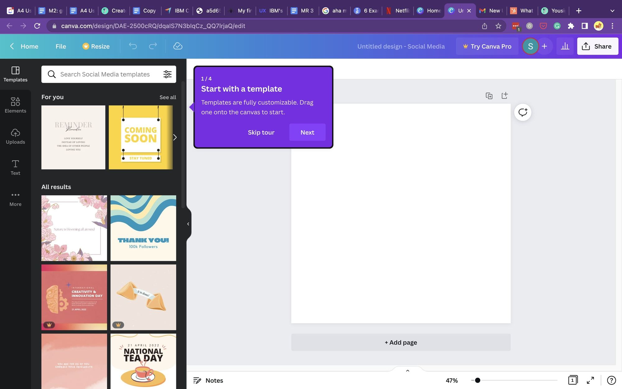
As the design platform updates its features, they use push notifications and emails to inform users of the change through easy-to-follow instructions. Their notifications focus on showing users how they’ve improved their software by comparing the user’s older designs to the capabilities of the new features.
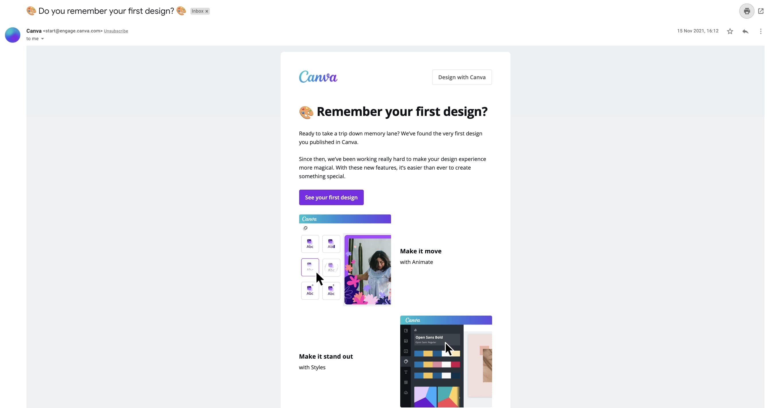
This reassures users that not only are they paying for a valuable product, the product now enables them to produce higher-quality work.
What makes Canva onboarding great
Canva’s method of avoiding the one-size-fits-all user experience is what makes their onboarding experience great. Their design platform ensures that the setup is tailored to the user’s needs. This reassures users that they’ve chosen a product they can count on to produce the work they need without unnecessary features.
For example, social media managers can access Facebook, Instagram, and other social media post templates and tools. In contrast, small businesses will have access to logo templates and brochures.
Key takeaways
- Canva guides users through an onboarding process that focuses on user needs rather than product features. This enables Canva to provide personalized usage recommendations.
Example 5: IBM Cognos Analytics
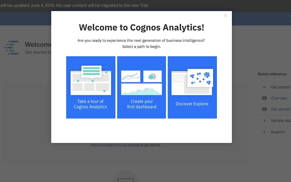
IBM’s Cognos Analytics expertly simplifies what could easily be an overwhelming and complex onboarding process with immediate personalization.
Their initial product tour begins with a “choose your adventure” selection using concise but clear language, so users know what to do to tailor Cognos to their needs. This immediately provides value to a user that could be hesitant to use the tool because they’re intimidated by the complex nature of the product.
As the user becomes more familiar with the business intelligence tool and is using it to build queries, Cognos strategically uses hot spots to guide users on using features to improve their user experience. The application includes an unobtrusive “?” pill that users can click to access help when needed.
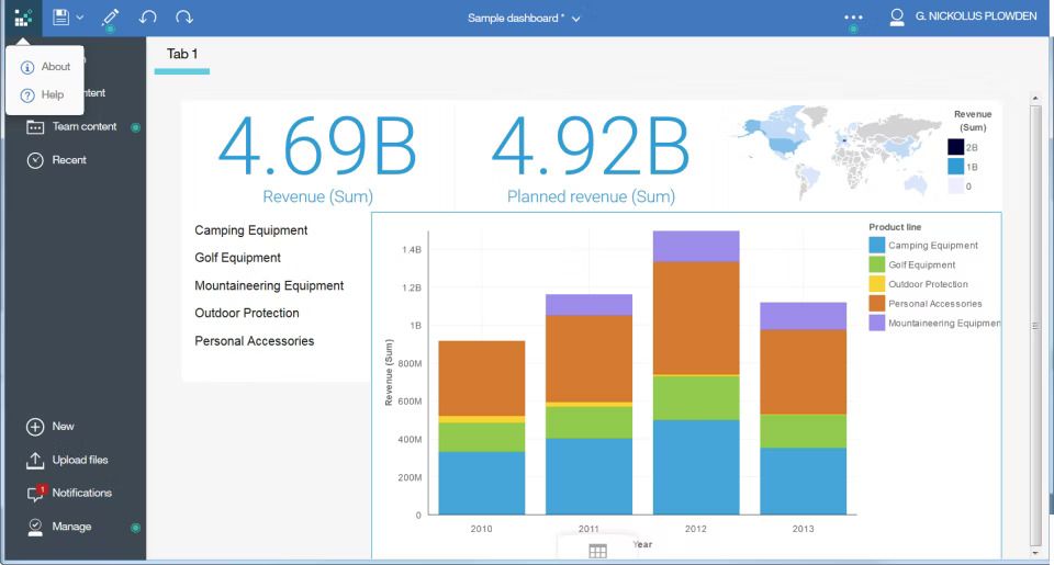
By making the self-serve process simple, users are more likely to find answers to their questions quickly and easily and continue using the tool.
What makes Cognos Analytics onboarding great
Cognos Analytics' onboarding process is great because it preempts the user’s hesitancy to set up their product by simplifying the onboarding instructions and the language used to do so. By making business analytics seem less complex with simple language, users are more willing to keep using the tool.
Additionally, their immediate personalization modal gives users confirmation that the product will actually suit their needs. So an eCommerce company will have access to KPIs that allow them to analyze sales and growth. In contrast, a SaaS company would have access to data that tells them more about their daily active users.
Key takeaways
- Cognos Analytics simplifies what could be an extremely complicated app onboarding into very personalized steps using clear language.
- They use multiple techniques to guide users through the application, ensuring that the experience is continually improved upon by letting them find answers quickly.
Example 6: Toggl
Toggl’s onboarding process starts with an interactive guide that shows new users how to use the application’s core functionalities. However, Toggl gives users complete control of when and how they complete their onboarding.
Users are told what they’ll learn and how many steps it’ll take and are given a choice to pause the product tour when they see fit.
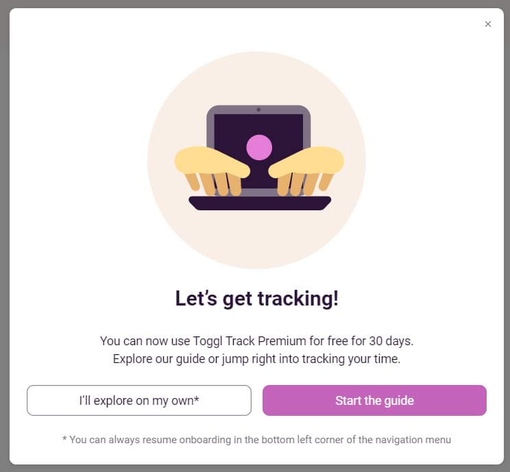
This is ideal for users who prefer to figure things out by themselves while still giving them the choice of learning how to use your app with your guidance. This approach allows Toggl to effectively onboard users of different kinds.
As the users start using the platform more, Toggl’s "Aha!" moment modal helps them acknowledge when they’ve reached milestones while using the platform.
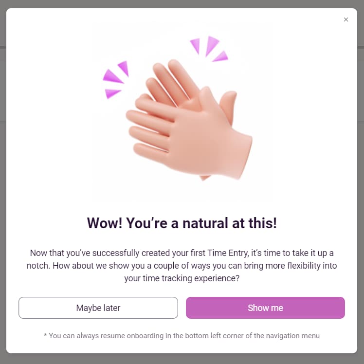
This drives home the platform's value to the user’s work life. Toggl then prompts users to continue using the app through carefully worded push notifications that remind them how to use the app and when to track their hours.
What makes Toggl onboarding great
Toggl’s onboarding offers great user onboarding experiences because it is designed with the different types of users in mind. Instead of insisting that users take their product tour and follow the workflow, Toggl gives their users control over when they actually use the onboarding guide. They also subtly continue to onboard users using insightful push notifications.
Key takeaways
- Toggl’s onboarding is straightforward with no surprises. They allow users to control when and how they do their onboarding.
- Toggl uses milestones and push notifications to drive their user engagement and, ultimately, their retention.
Example 7: Glew.io
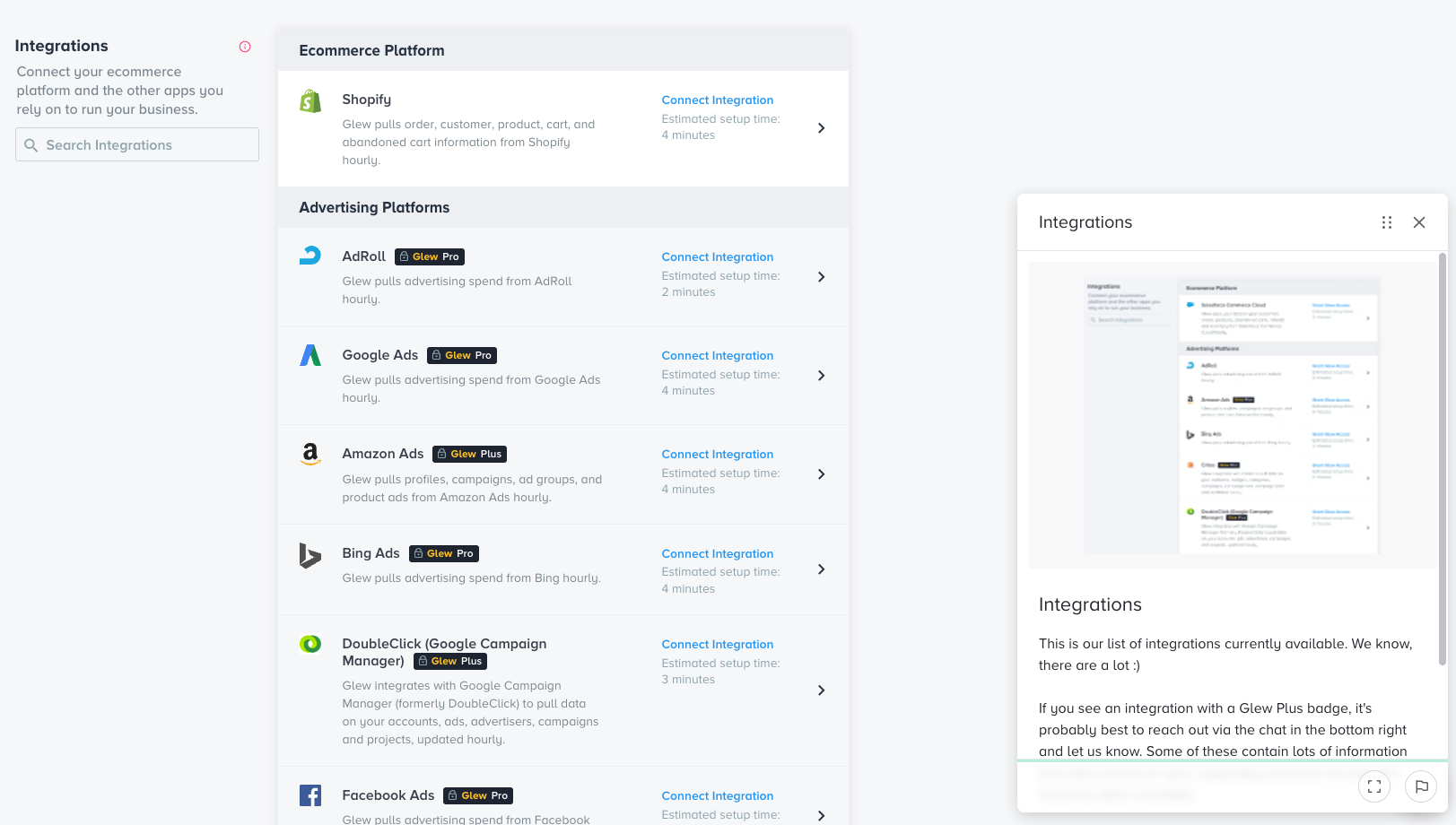
Like Cognos Analytics, Glew.io simplifies the user experience in the onboarding process, so their powerful business intelligence tool is less intimidating to set up for their e-commerce users. Their product tour starts with an interactive guide that prompts users to move to the next step while explaining the purpose of each step in simple language. To remove new users’ hesitancy to complete the onboarding process, they provide a “Learn More '' button throughout the entire process that better explains the tools used and functionality.
Glew.io takes the onboarding process a step further by providing video tutorials so users fully understand how and why to use the product. As users become more familiar with the product, Glew.io encourages them to find answers to common questions with an expertly placed “?” pill and a chatbox so they can speak with tech support when they need to.
Glew’s strategy makes users feel like they aren’t alone while tackling a complex task—business analytics. This provides the reassurance users need to confirm they chose the right product.
What makes Glew.io onboarding great
Glew.io’s onboarding process is great because it makes a seemingly complex tool easy to set up with clear instructions in simple language that even the least tech-savvy person can understand. So, suppose a user wants to request reports on their revenue for a specific group of customers. In that case, there is a video tutorial that shows them how to with easy-to-understand language.
Glew also offers to have a member of their onboarding team help their customers set up their accounts if they need to and provides the self-help “?” pill that leads users to their in-app knowledge base.
Key takeaways
- Glew.io simplifies a very complicated onboarding experience by providing an interactive guide. They aim to remove user hesitancy by providing buttons and tooltips throughout the user journey.
- Glew.io uses video tutorials, “?” pills, and a chatbox to quickly familiarize users with the product and offer guidance when they have questions.
Example 8: Yousign
Like Toggl, Yousign offers users the choice to take their interactive product tour or skip the onboarding guide altogether. After the user completes their account creation and setup, Yousign alerts users when they’ve reached a milestone for an early "Aha!" moment.
Giving the user control of their onboarding process allows you to smoothly onboard across a spectrum of users, from the kind who prefer to do it themselves to those who want a guiding hand through it all.
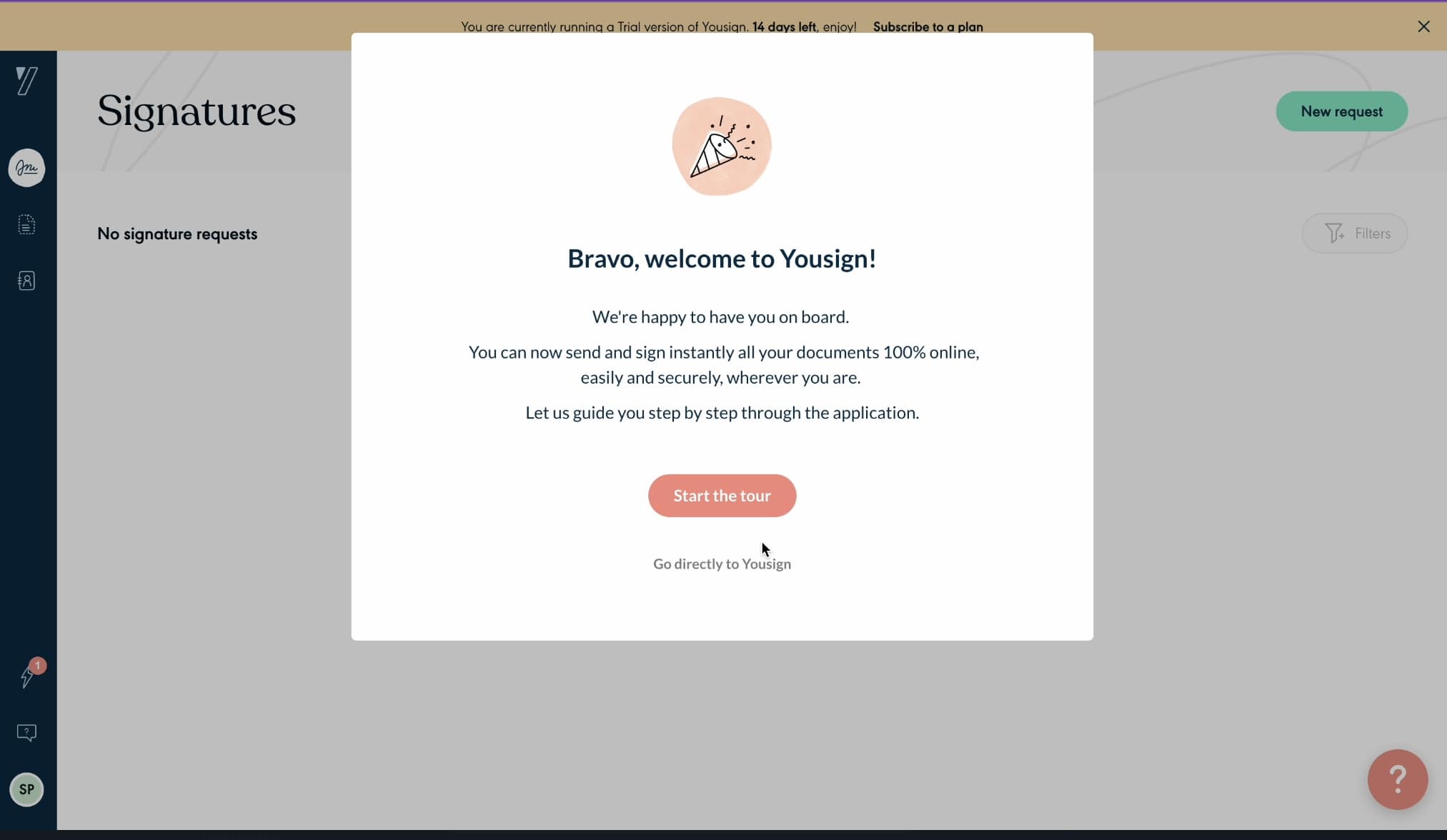
Yousign’s self-serve approach to onboarding with their in-app guide gives users the product walkthrough they need without relying on tech support for an easy setup.
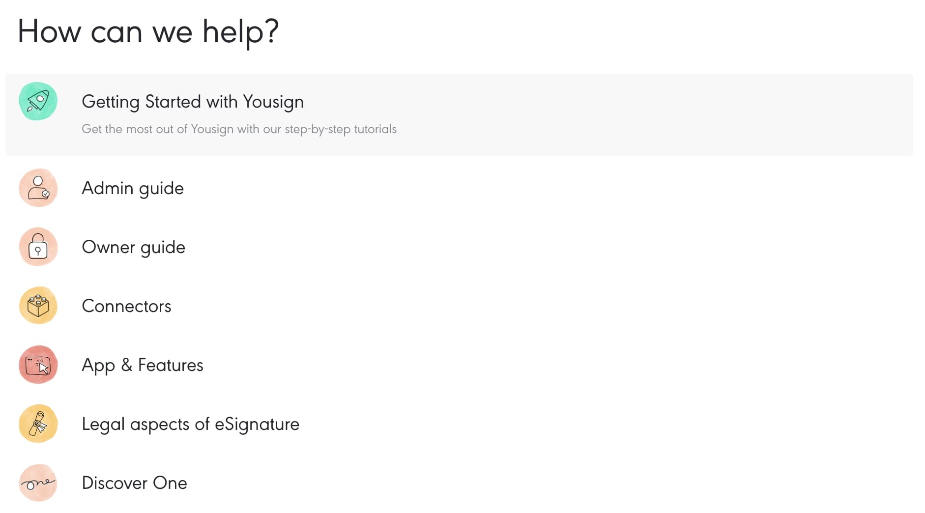
The e-signature platform reminds users that help is readily available when they need it with the non-obtrusive “?” pill. There they can find answers to frequently asked questions.
What makes Yousign onboarding great
Users will find Yousign’s onboarding experience great because the platform doesn’t force them to use the onboarding guide but allows them to choose whether or not they want to use it. So, users who prefer to jump right into signing documents without a step-by-step guide can do so.
They, however, ensure these users aren’t left without answers if they need them as they use an in-app knowledge base as a comprehensive onboarding guide. Suppose you need to learn how to add an attachment to a document. In that case, you can easily find an interactive guide in their knowledge base. Users are also subtly reminded that they have access to the help they need with the ever-present “?” pill.
Key takeaways
- Yousign allows users to choose whether they want to jump right into using the software without the interactive product tour or if they’d like to go through the onboarding workflow.
- Yousign’s self-serve approach allows the more tech-savvy users to jump in without the fuss. The smart placements of “?” pills enable users to determine what they’re doing right or wrong with their in-app knowledge base.
Example 9: Stonly
Stonly’s onboarding process seamlessly walks new users through the application’s setup with an interactive tour guide. As a B2B SaaS onboarding tool that provides self-serve onboarding, they lead by example with this principle for their setup. To personalize the user experience, Stonly provides different use cases for users to choose from when setting up their accounts.
The user onboarding process for an onboarding tool could be daunting, but Stonly carefully leads users through their setup with simple language, clear instructions, and onboarding that allows them to learn by using the platform. Stonly expertly employs an in-app knowledge base, so customers can quickly find the answers to any questions they may have.
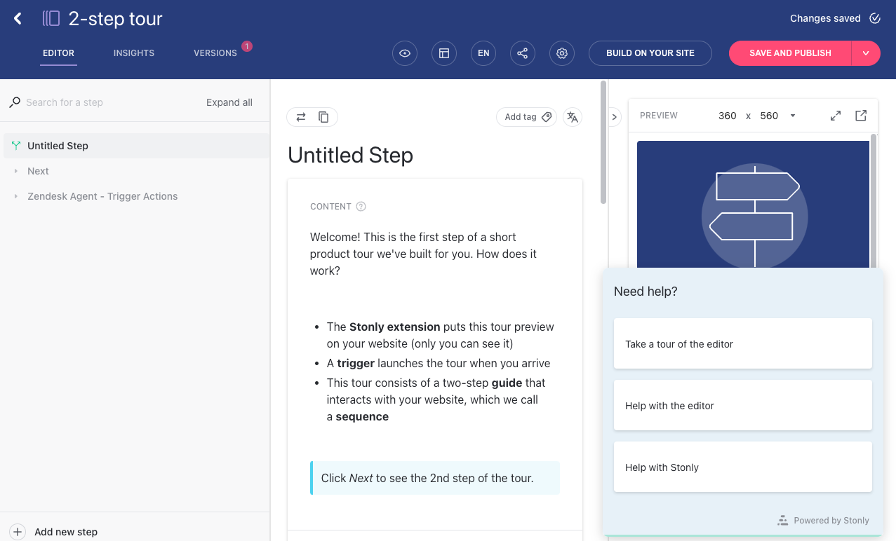
Their tooltips and hotspots highlight features that can help users better achieve their onboarding goals and get the most out of the tool. As the users navigate the onboarding tours, they’re rewarded with "Aha!" moments that show them the value Stonly has to offer them. And to make sure they’re providing excellent service, Stonly collects feedback from their users with their NPS survey widget and uses this data to improve their product.
What makes Stonly onboarding great
Stonly’s onboarding process is great because it empowers users to quickly learn how to use the tool with their interactive product walkthrough, in-app knowledge base, and helpful widgets that guide users through the entire process.
With its self-serve onboarding modal, Stonly provides users with all the information they need at the click of a button, so users don’t need to call tech support during their first bout of uncertainty.
Key takeaways
- Stonly employs a personalized approach to interactive onboarding, making what may be a daunting task simple.
- Stonly uses an in-app knowledge base to assist users in swiftly finding answers to their questions about the software.
Feeling inspired by these user onboarding examples?
Stonly helps you create onboarding experiences tailored to your customer's needs.
Get a Free Trial.
Personalize your user onboarding experience with in-app solutions
Your first-time users want to understand the value your product provides immediately. Personalizing your onboarding process from the start encourages users to continue using your product as this shows them how your product will meet their needs. But this can be time-consuming. Using an in-app self-serve onboarding tool automates this process and drives user retention.
To create a great user onboarding experience, you need to make sure that you understand each user and their needs. Ask qualifying questions at the activation stage. This allows you to segment each use case to create an onboarding solution that keeps them on that path.
Applications like Netflix, Duolingo, Canva, Cognos Analytics, and Stonly are great examples of immediately creating a personalized experience for user onboarding.
Providing immediate value through "Aha!" moments will reassure your users that they made the right choice when they selected your product. Duolingo, Toggl, Slack, Yousign, and other examples discussed above all drive their users back to the app with positive reinforcement.
Feeling inspired by these user onboarding examples?
Stonly helps empower more people to discover and get their unique value from your product.
Get a Free Trial.
Frequently asked questions about user onboarding examples
What is the goal of user onboarding?
The main goal of user onboarding is to empower your users to use your software to do what your software enables them to. Additionally, user onboarding aims to drive user retention by providing your users with valuable insights into getting the most out of your product.
How do I onboard a new user?
To onboard a new user, ensure that you identify your user type by asking qualifying questions, then provide them with a step-by-step guide on setting up your product. Throughout this process, ensure you highlight your product's value by celebrating each milestone your user achieves. Then, collect feedback to learn how to improve your product.
What is user onboarding flow?
A user onboarding flow is an onboarding strategy used to introduce your existing customers and new users to a new product or feature. This could include guiding a new user through an interactive guide that requires them to use the new feature.

![9 User Onboarding Examples to Learn From [2024]](/blog/content/images/2022/05/Stonly---A4-User-onboarding-examples-01.jpg)