Your potential customers have questions, and you’ve got answers. But what’s going to hook them to engage with your answers and choose to purchase from you instead of your competitors? An amazing and interactive FAQ page, that’s what.
Selling anything online in the information age is becoming easier and easier. Self-serve free trials, same-day shipping, and automated payment tools literally make online shopping as easy as tapping a few buttons. Attention is no longer a commodity. It’s a currency. When your potential customers have questions, you have precious little time to answer their questions before they leave.
We’ve curated some of the best FAQ eCommerce page examples, along with some tips to give you the inspiration to create an FAQ page that converts visitors into customers.
What is an FAQ page?
You may already know the ins and outs of what an FAQ page is and does. If so, feel free to skip ahead straight to the examples. FAQ stands for frequently asked questions, and the FAQ page is a carefully curated list of questions that potential customers have when evaluating a product service and direct answers to these questions.
Depending on the nature of your company’s products and services, the method to answer your potential customers’ questions may vary a bit.
Website FAQ page
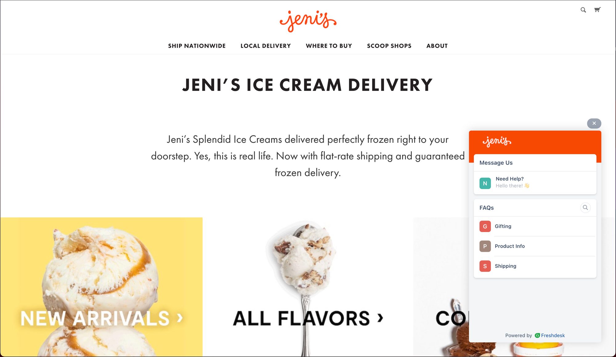
The most basic way for an eCommerce company to answer customers’ questions is through an FAQ page on their website. Typically, these pages are found in the bottom footer section of the website through an “FAQ” button.
Website help center/knowledge base
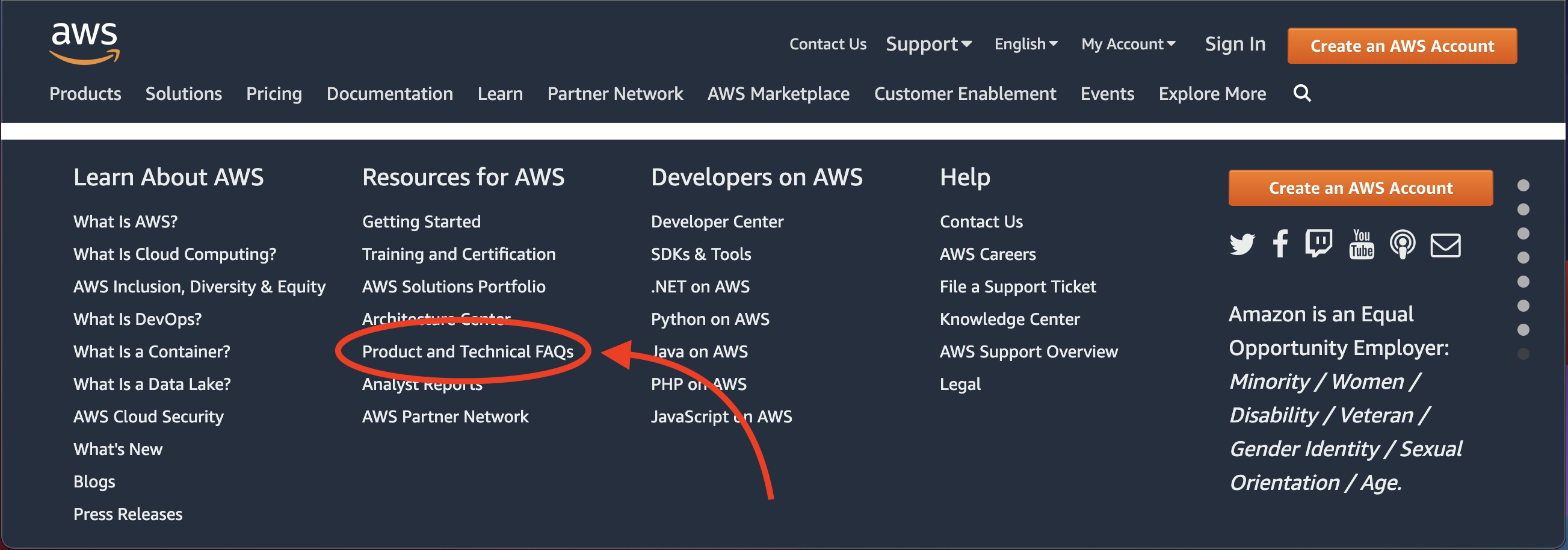
Many popular websites, especially those with more complex product or service catalogs, implement a knowledge base to answer customers’ questions. While an FAQ page focuses on providing simple and direct answers to common questions, a knowledge base goes further by providing articles and guides to answer questions and provide support in more depth.
Typically, the knowledge base is found on the top-level primary navigation bar and also in the website footer menu through “Help” or “Help Center” buttons.
Website knowledge base widget
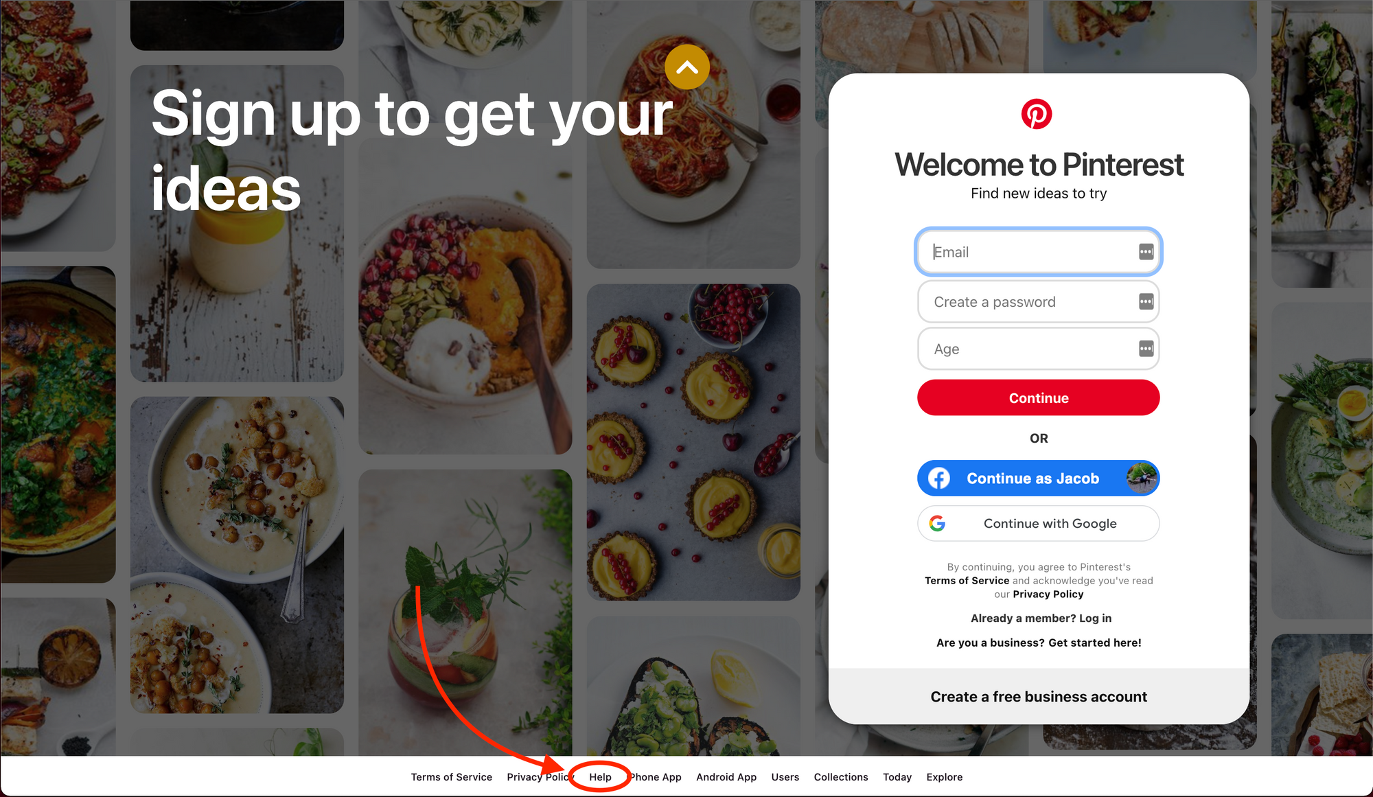
Companies that focus on providing a strong customer experience as their strategy often utilize widgets to answer customers’ questions. Similar to a help center or knowledge base page, a knowledge base widget can provide answers to questions in the form of articles and guides within the widget.
The primary benefit of this is allowing the customers to find answers without leaving the page they were on when they had the question. This allows them to get answers and continue on their buying journey quicker. Typically, the widget is found on the corner of the screen on all or most pages of the website with a “?” or “help” call to action.
Feeling inspired by these eCommerce FAQ page examples? Use Stonly to build similar FAQ pages for your eCommerce platform. Start a FREE Trial.
Benefits of an FAQ page for eCommerce?
The primary job of any eCommerce webpage is to convert potential customers into paying customers. This is why virtually any well-designed website’s homepage includes the primary conversion button front and center. If a potential customer isn’t ready to purchase immediately from the homepage, then the job of the rest of the site is to systematically resolve her concerns so that she will buy.
If customers aren’t ready to immediately buy, they likely have questions that need to be answered first. If the customers don’t find answers quickly on your site, they will likely ask Google and may end up making a purchase with your competitors instead of you if their answer ranked higher on the Google search. So answering the customers’ questions while you have their attention using an FAQ page or knowledge base will provide multiple benefits such as increased conversions, lowered acquisition costs, and improved brand reputation.
Increased conversions
The FAQ page is an opportunity to let the website visitor know that you’ve already anticipated their burning questions and can guide them to a quality resolution. The better experience customers have in answering their questions on your site, the more likely they are to convert and purchase with you.
Lowered acquisition costs
Another huge benefit of a well-designed FAQ page is lowering customer acquisition costs by reducing the number of customers reaching out to sales or support for answers to their questions. Self-serve is becoming a virtual requirement for most online transactions. By providing a solid self-serve experience to answer common questions, you get the benefit of happier customers that you can support with a less expensive, more nimble support team.
Improved brand reputation
Customer experience (CX) is becoming the number one differentiator among companies. A recent CX study by Oracle found that 60% of marketers are worried that they are at a competitive disadvantage because their customer experience isn’t good enough. Using tools to provide customers with the answers they need when they need them is an example of providing a competitive customer experience. FAQ and knowledge base widgets from tools such as Stonly can help your eCommerce page provide direct and informative answers, building your brand’s reputation.
What’s a good example of an FAQ page for eCommerce?
A good FAQ page for eCommerce not only answers potential customers’ most common questions but does so in a way that encourages the customer to buy from the site. The best way to encourage a customer to buy is to help them find answers while they are still on your site that are complete, informative, and easy to understand. Avoid gimmicks such as obnoxious pop-ups, and focus on directness and simplicity.
A well-designed, effective FAQ page implements the following principles:
The FAQs are easy to find
Whether you are using an FAQ page on your website, tapping into a help center or knowledge base, or utilizing a knowledge base widget, make sure customers can easily find their answers.
The FAQs focus on the 5-7 most important questions
Depending on the complexity of your products and services, you may need to provide significantly more than five to seven answers to resolve all of your customers’ concerns. While this may be true, resist the temptation to list them all directly on the page. Highlight the top five to seven questions, and then provide a search tool or other category lists for the remaining questions.
The questions are worded from the perspective of your customer
It’s easy to forget that the questions and answers need to be worded in a way that resonates with your customers. You are the expert of your product and service, so there will be the temptation to showcase your expertise in how you talk about the product. But this type of language may actually alienate your customers and make them feel like they aren’t experienced or knowledgeable enough to purchase your product.
The answers are short, informative, direct, and complete
Again, even though you may be the expert of your product or service, you don’t need to word vomit all of your expertise on unsuspecting customers. Be concise and direct in your answers, providing just enough information to answer questions to customers’ satisfaction and not any more than that.
The answers showcase your brand’s personality
As long as you have followed the other principles above, then you can focus on infusing your answers with your brand’s personality. How you interact with customers will leave an emotional impression on how they view your company and your products and services. For example, if your products and services are targeted toward Gen Z and you aren’t using any emojis in your answer, you may be missing an opportunity to build your brand with your target market.
8 best FAQ eCommerce page examples for inspiration
Now it’s time for the main event. We’ve curated a list of eight examples of FAQ pages that will inspire you with their simplicity and superior customer experience. We’ll also point out each example's particular strengths to arm you with ideas and insights.
1. The Cabinet Door Store
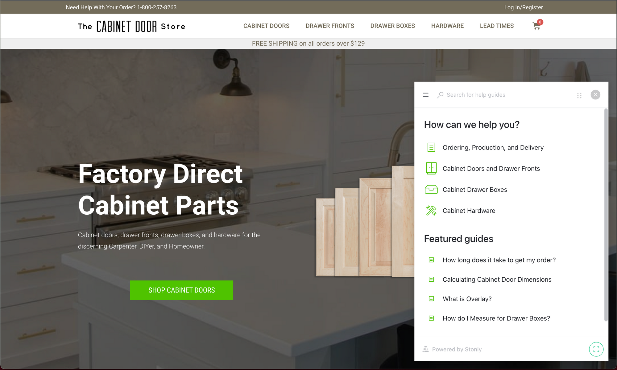
The Cabinet Door Store is another example of using a knowledge base widget to provide customers with answers to common questions anywhere on their website.
This is an example of a product that’s a bit more complex than others, because of the different sizes and styles of cabinet doors they sell. Instead of listing all of the questions customers will have, they provide high-level categories in the top section and then provide the four most common questions and answers in the bottom section. This allows the customer to find answers to the most common questions immediately, while also giving them the structure to find answers to less common questions.
The other strength of this FAQ implementation is the way they use step-by-step guides within Stonly’s widget to make complex answers as simple and intuitive as possible. For example, for the question “How do I measure for Drawer Boxes,” they provide a guide with multiple simple steps. This helps the user get the answer step-by-step without becoming overwhelmed.
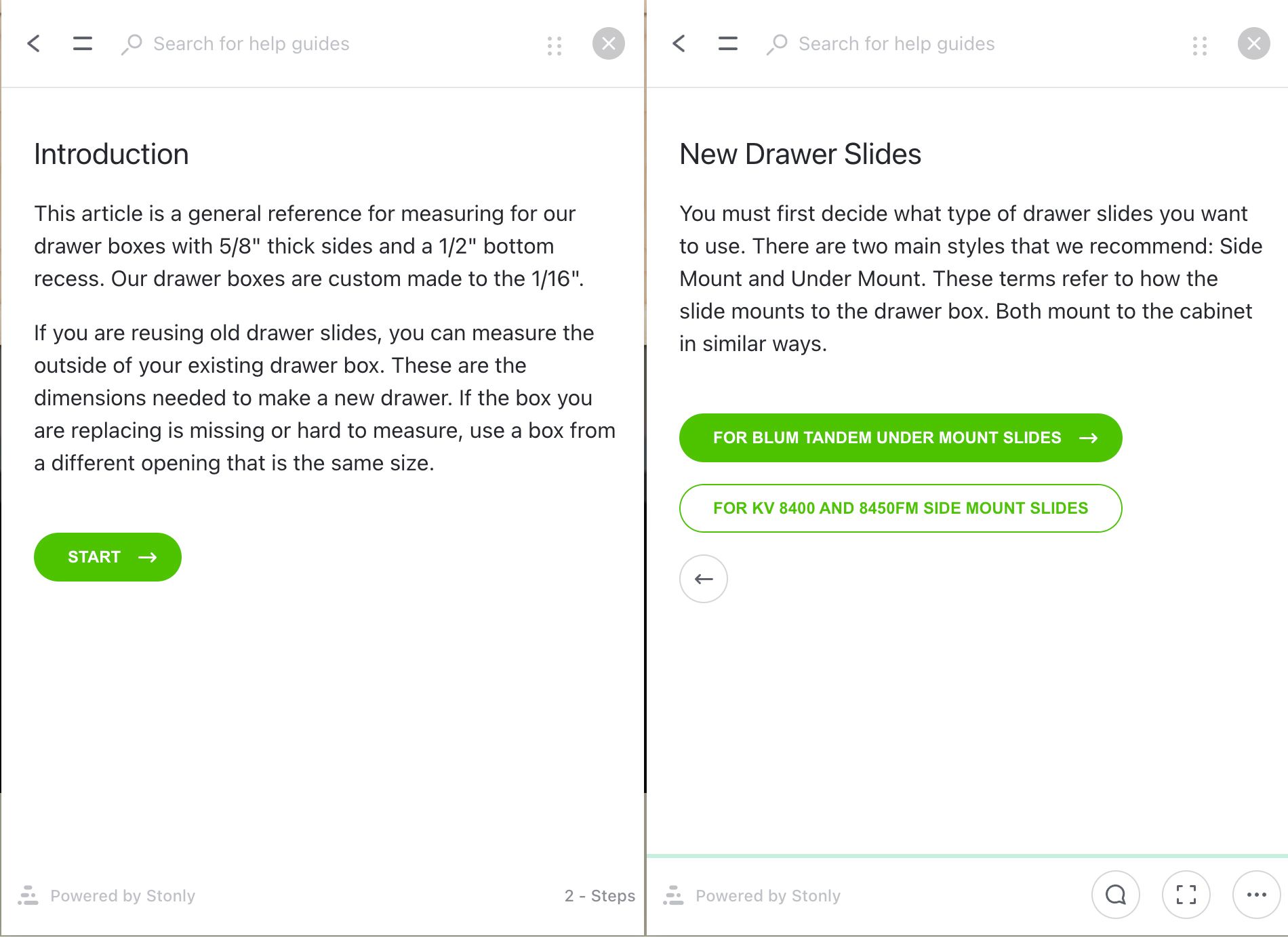
The widget is also used to quickly launch relevant answers from the FAQs when users click on a tooltip. For instance, when looking at options for customization of a cabinet door, clicking the green tooltip icon next to the question “Prepped for glass?” pulls up a guide explaining what this question means so the customer can understand the product choice they’re about to make. This happens without taking the user away from their transaction or pulling them into another tab in their browser.
2. PhoneSoap
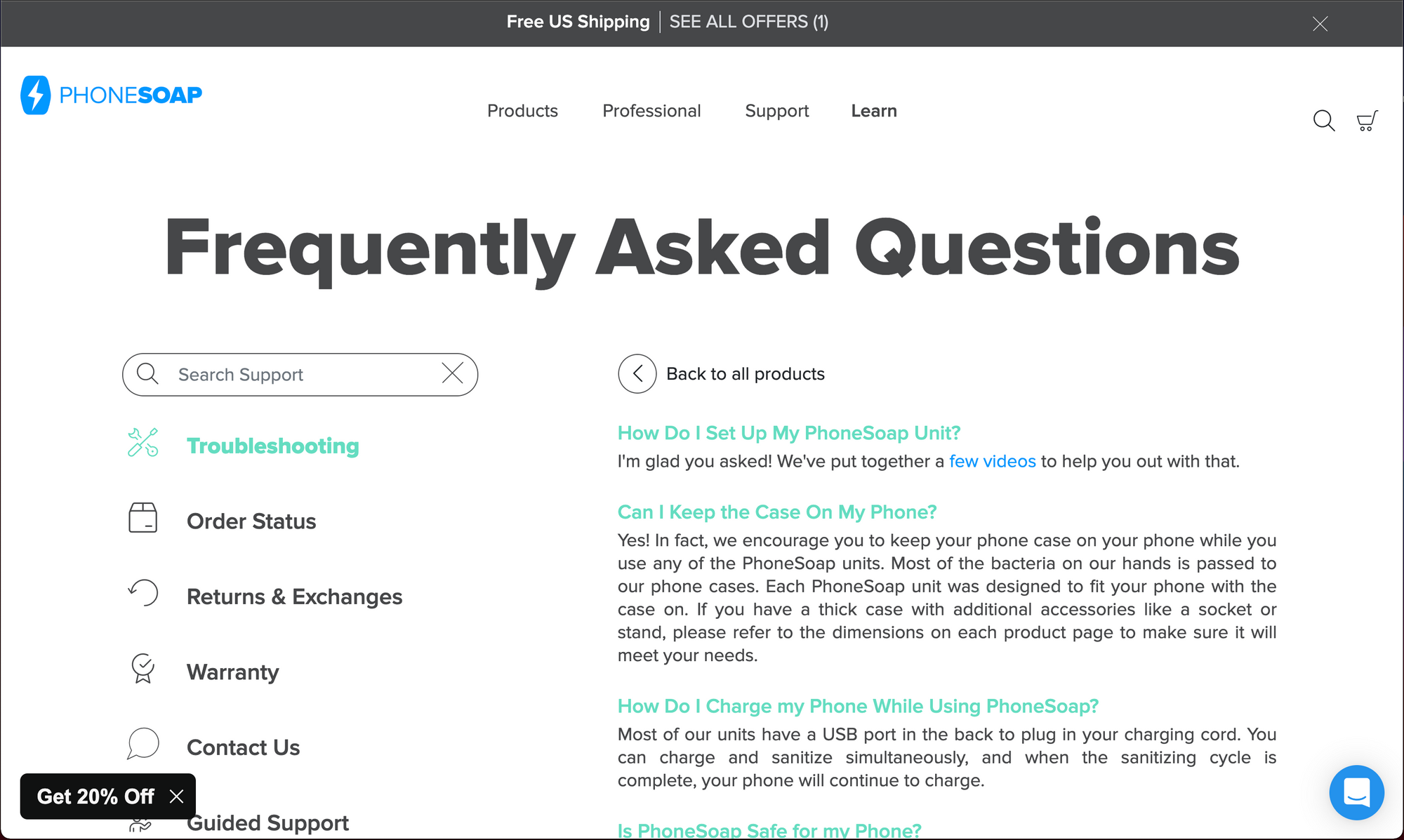
PhoneSoap does a phenomenal job making its most important questions front and center on its FAQ page. First off, the simple design and bold header make it incredibly clear to customers that they are at the right place to find the answers they are looking for. Next, the fact that the top questions have the answers visible without additional clicks makes the experience for customers that much better.
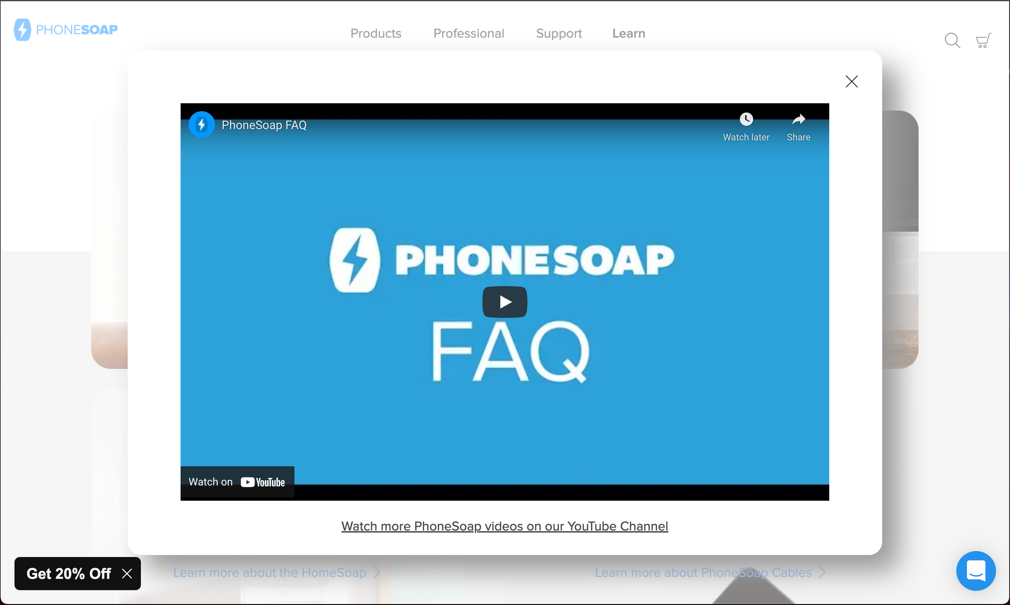
One particularly helpful and effective tactic that PhoneSoap employs is including an FAQ video on the page. This is a great way to capture the attention of those that prefer video explanations to text.
3. CIRCA
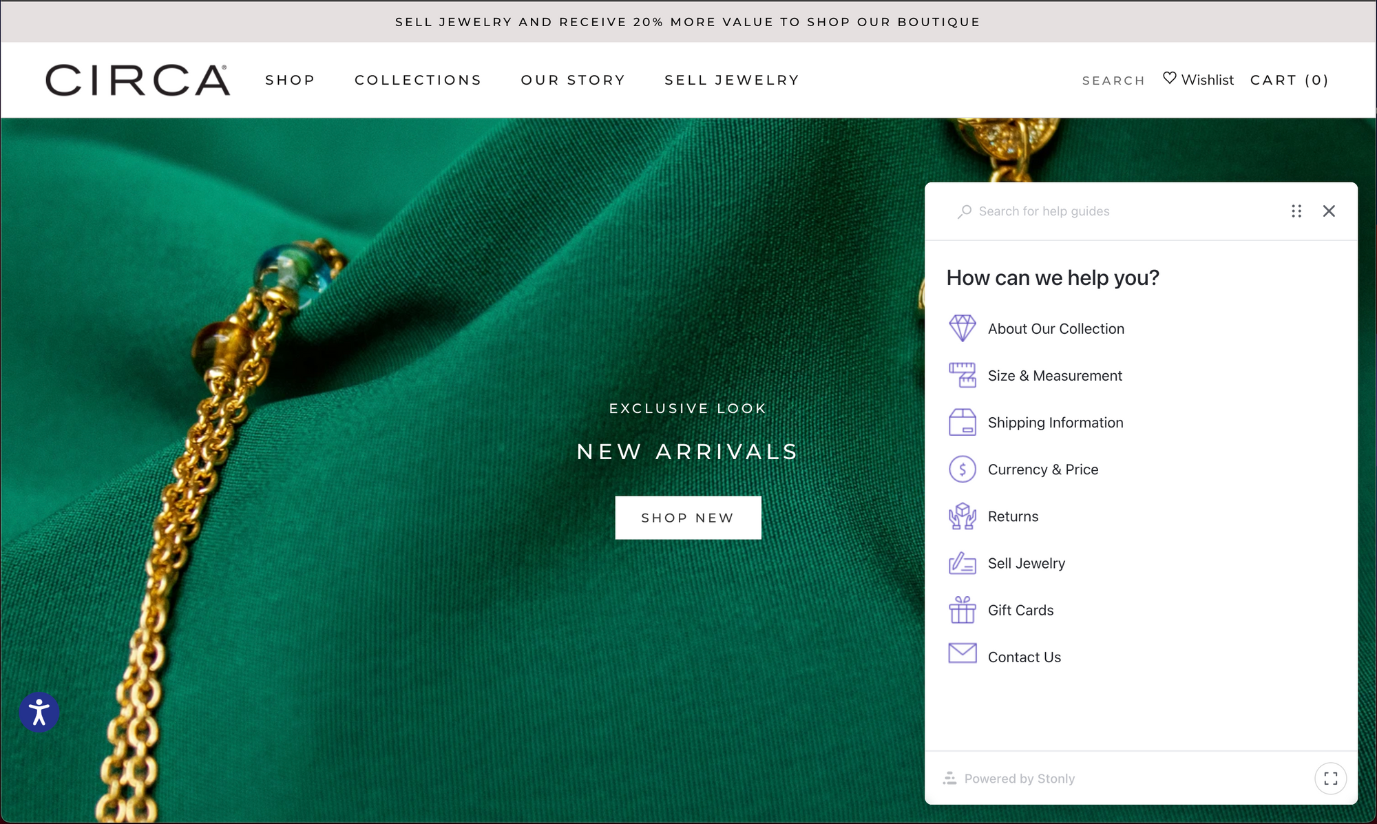
CIRCA does a great job providing answers to customers’ questions anywhere on their website. This website employs a knowledge base widget from Stonly that shows up as a simple “?” icon in the bottom right of every screen. This gives the customers a way to get answers right when they need them, and not have to navigate away to another page.

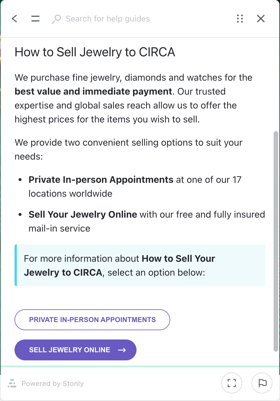
Another great strength of CIRCA's FAQ widget is providing interactivity in addition to text in the answers. Not only are the answers to questions clear and direct, but they anticipate additional questions the customer may have, and provide prompts within the knowledge base guide to answer additional questions.
4. TrainingMask
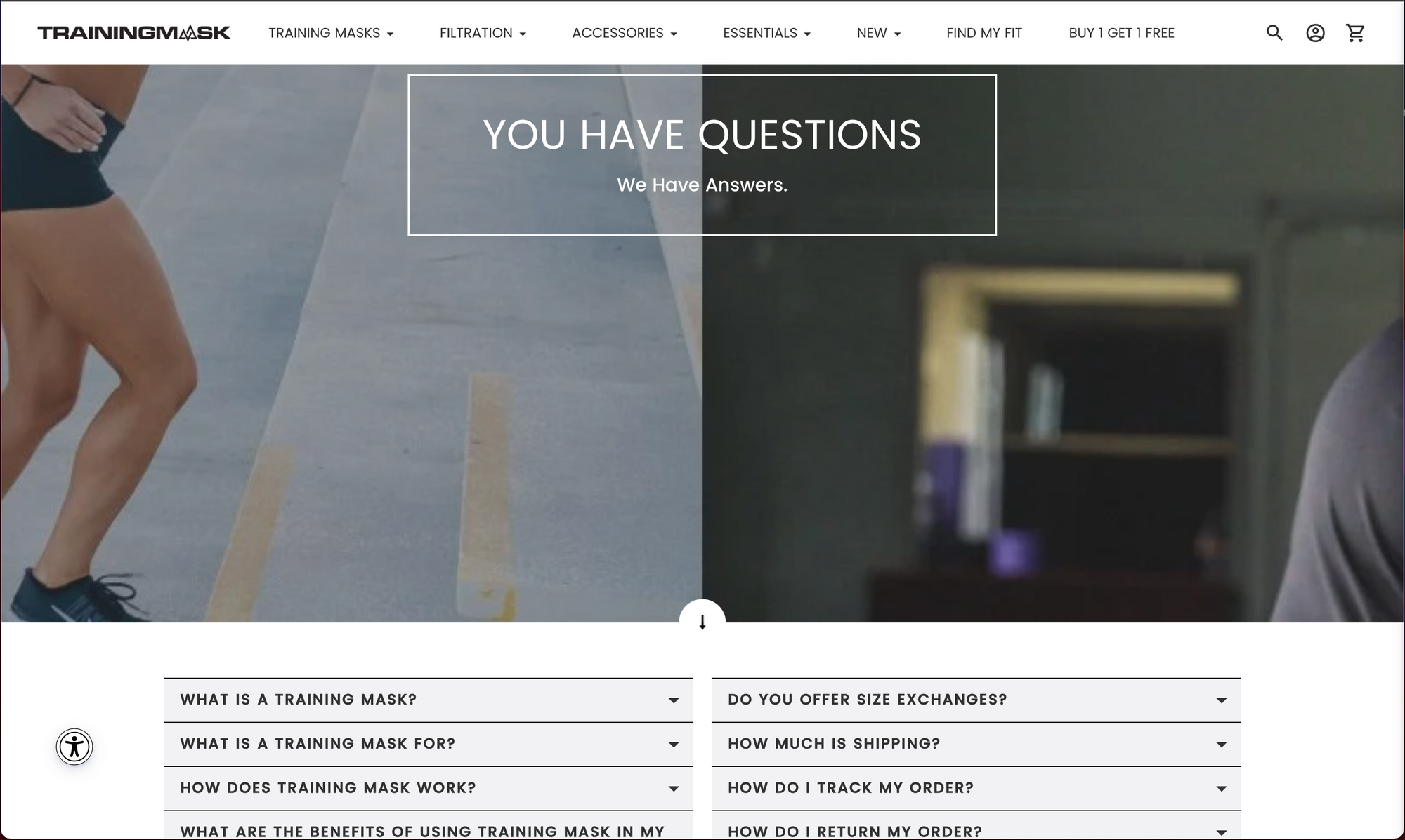
TrainingMask’s FAQ page on their website does a great job infusing their brand personality into their design. The top header speaks directly to the customer, giving them assurance that they will find the answers they are looking for on the page. Each answer is worded from the perspective of the customer, and the answers are direct and short. They also do a great job infusing subtle buttons to offer customers discounts on their products, so that when they find their answers, they are ready to continue on toward a purchase.
Feeling inspired by these eCommerce FAQ page examples? Use Stonly to build similar FAQ pages for your eCommerce platform. Start a FREE Trial.
5. Airbnb Hosting Resource Center
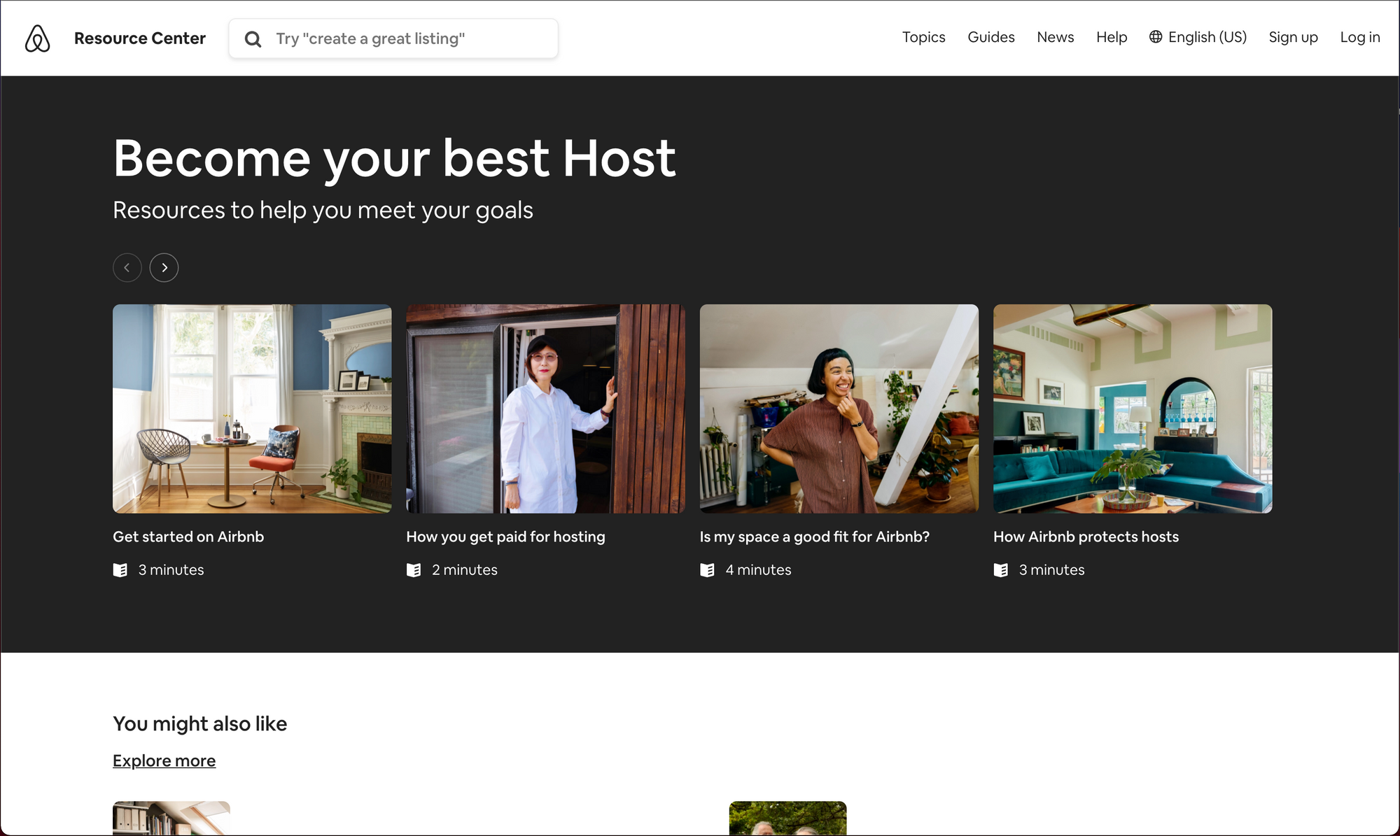
The Airbnb Hosting Resource Center is an example of a knowledge base that includes FAQs in the form of helpful guides to make a more complex service seem simple. If you are considering using Airbnb’s services to invite strangers to stay in your home, you are likely going to have a lot of questions. This is an important decision. Airbnb anticipates the top questions and concerns that potential hosts might have, and uses incredible visual design to direct them to the guides that will answer their questions. Another fantastic tool they’ve implemented is showing the time it will take to go through their guide. This helps manage customer expectations and gives them assurance that it will only take a few minutes to get the answers they need.
6. Walmart+
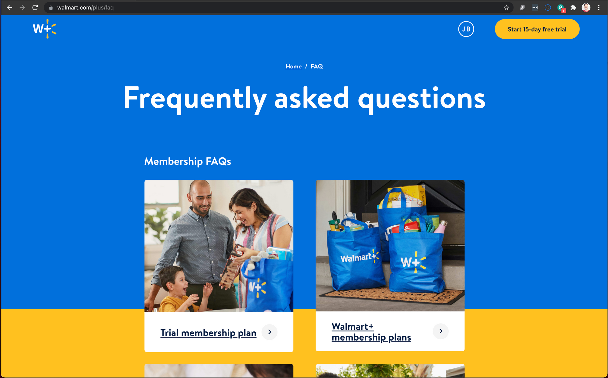
Walmart+ is a fantastic example of answering customers’ questions simply and directly in a way that strengthens trust in its brand. Walmart understands that the value proposition of its Walmart+ membership is giving people more time to spend with their families by spending less time shopping in their stores. The wording and imagery infused into its FAQ page constantly reinforces this message.
7. Shopify
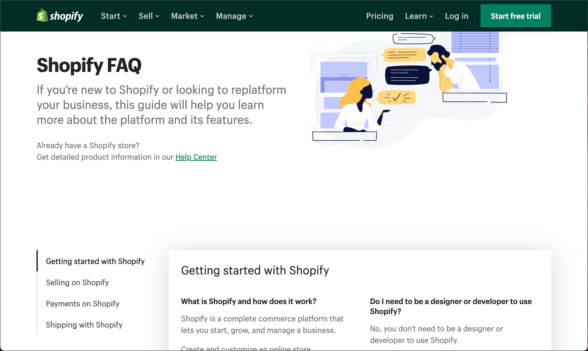
Shopify takes a unique approach to how it organizes the information on its FAQ page. Instead of presenting all of the questions in a list and providing answers to each question, it presents the high-level questions as categories and includes links in the answer to other related questions and answers. The benefit of this type of organization is allowing customers to answer any additional questions they have about words or terms they may not be familiar with instead of having to search or look these up independently.
8. Elementor
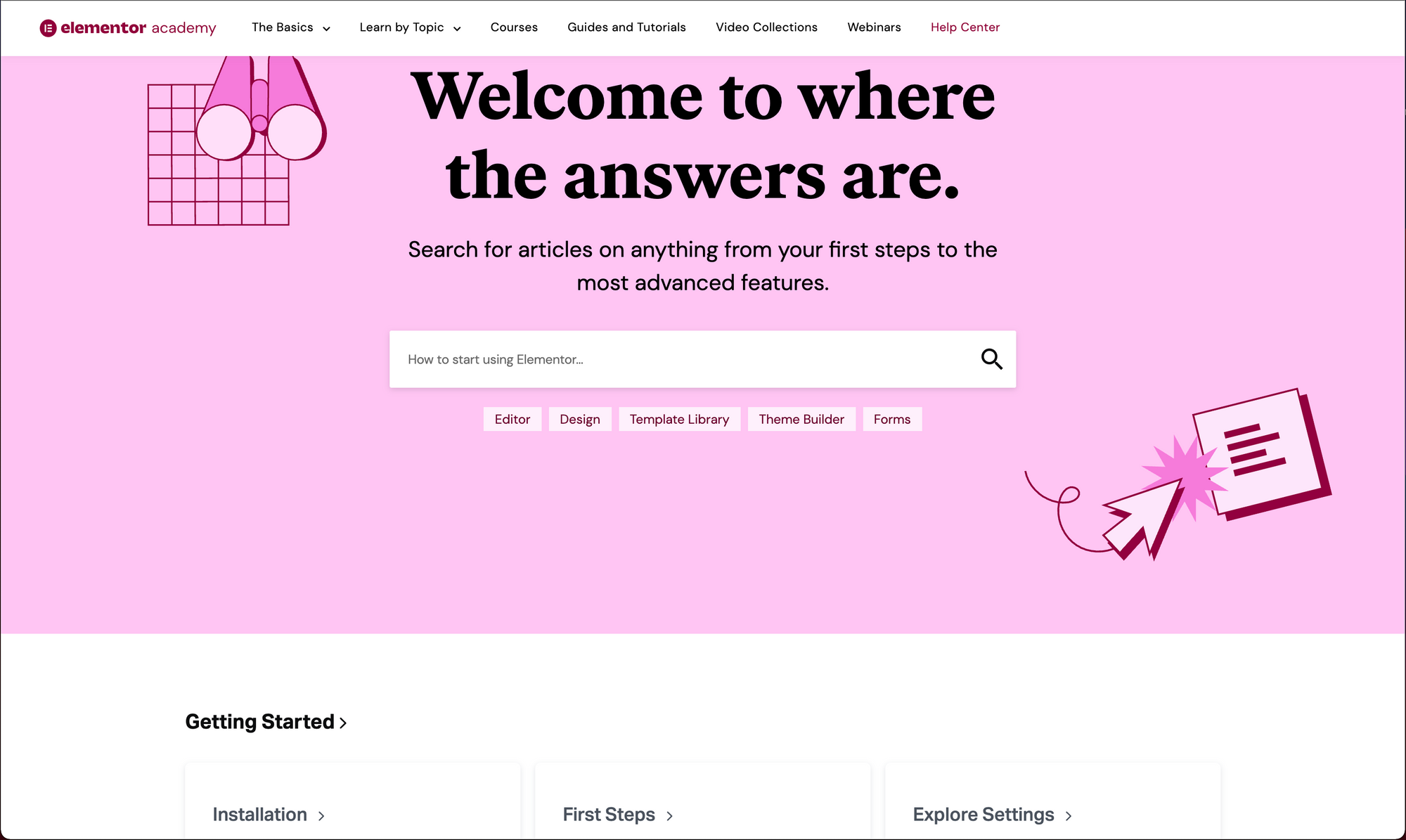
Elementor is another example that does a great job of letting customers know that they are in the right place to find answers to their questions. They emphasize the search tool for customers to ask their questions. The reason this is powerful is that the search tool is very responsive and inclusive, providing relevant answers and articles in real-time as the customer searches. Customers that prefer to browse can simply scroll to see a clean interface with high-level questions and categories.
How to create an FAQ eCommerce page?
Now that you are inspired, you’re ready to create a delightful FAQ page for your eCommerce site that converts. Start by consulting your customer support and product teams, your competitors’ websites, and Google to curate your list of questions to be answered. Next, write simple and concise answers that resolve your customers’ questions completely.
Then choose how you will make your FAQs easy to find. Consider using a tool like Stonly that can make your FAQs easy to find anywhere on your site, and infuse your answers with interactivity to improve the customer experience on your site. Finally, regularly monitor interactions with your FAQ page and update the answers to stay relevant and helpful for customers.
Feeling inspired by these eCommerce FAQ page examples? Use Stonly to build similar FAQ pages for your eCommerce platform. Start a FREE Trial.
Feeling inspired yet?
In a world of self-service, the way your website answers questions and addresses potential customers’ concerns will directly impact your bottom line. A great FAQ page helps customers know that this isn’t your first rodeo. You’ve anticipated their questions and have provided an informative, enjoyable experience for them in finding the answers.
These examples also highlight the different approaches to adding an FAQ section to your website. While many companies are able to answer their customers’ questions through a typical FAQ web page, others go above and beyond by using knowledge base tools and widgets to provide a better experience. Tools such as Stonly can improve your customers’ experience by answering questions with step-by-step guides from any page using the no-code widget.
Now you’re ready to use your inspiration from these examples to build an FAQ experience your customers will love.
