
Trigger types
Triggers are interactive prompts you can place on any page to launch Stonly guides, tours, or even entire knowledge bases.
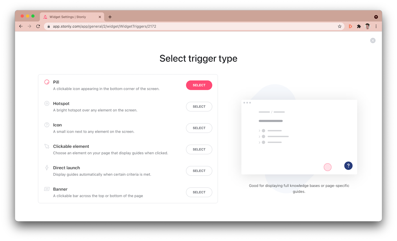
There are six types of triggers:
Pill. A large icon appearing in the bottom corner of the screen.
Hotspot. An animated spot next to an element on the page.
Icon. A small icon next to an element on the page.
Clickable element. A trigger that makes any element on the page interactive, displaying guides when clicked.
Direct launch. A modal pop-up launching automatically.
Banner. A bar across the top or bottom of a page.
Different triggers might also have different features. Use this guide to learn about each type.

Basic trigger configuration
While trigger types differ in appearance and options, these settings apply to all of them:
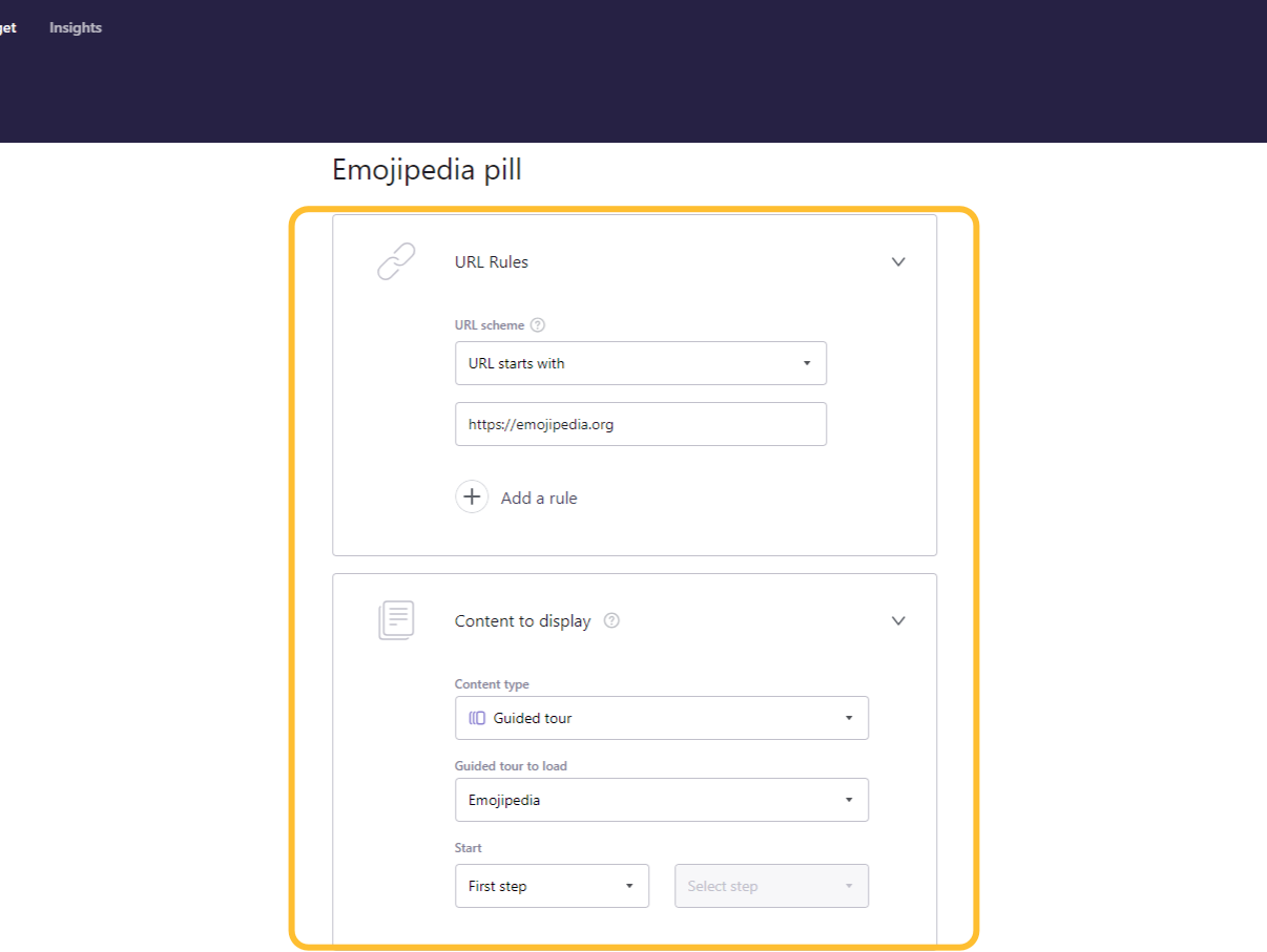
URL rules. Let you define on which pages the trigger should activate, based on the address.
Content to display. In this block you can select content that will launch inside the Stonly widget when a visitor engages with the trigger.
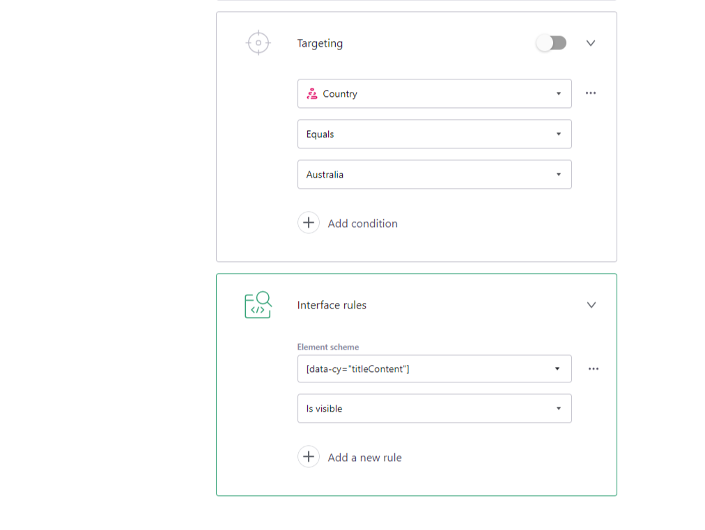
Targeting. With targeting you can fine-tune who should see the trigger, based on user data.
Interface rules. They allow to adjust when the trigger should launch based on the state of elements (CSS selectors) on the page, like inputs, menus, and buttons.
Type-specific settings
Select trigger type below to learn more about it.

